Yesterday & Tomorrow: An Orbit Obit

It dawned on me. Yesterday & Tomorrow was closed. I kept driving  past it on my way home from work and nothing was happening. The plantings around the house were overgrown. No one seemed to be entering or leaving. I’m not sure if I noticed any lights on in the past but the business was deserted.

As most Orbit Obits go I tend to write about places that have gone too soon, too soon for me to visit, that is. It seems like a place that had always been there and always would be there.  I was curious and had meant to visit some time in the ten years I’ve lived in Portland. There a sadness to my procrastination when I realize a store I’ll never experience has closed.

Yesterday & Tomorrow was a business run out of a house which felt like a barrier. It was hard to get past the idea of shopping in a personal environment. I remember the sign that sat on the corner next to the electrical pole, but I still had a hard time getting a feel for the kind of art they sold. I saw stuff for decorating lawns and imagined more of that inside. The deteriorating sign couldn’t have made it any clearer. This business was an art gallery. I missed my chance to see any of the type of art that had been displayed in the various rooms. Art of any kind would have been worth checking out at least once.

The unkept front yard was full of sculpture. It didn’t look like your typical big box store lawn ornament inventory. What I saw when I visited the site this summer reminded me of the work of Carlton Bell. This store was a possible link to the work of this mysterious artist that might remain unexplored.

I blame myself for the demise of a business like this. Local businesses, especially those in a different setting, need support. It’s a lesson. Never put off until tomorrow, what you’ve been meaning to do for years. If you think you’re going to do something someday, consider the one thing I remember from seeing the play Sacramento 50 Miles in elementary school.  “Someday may never come.”


Special Flag Edition 2018: You Can Critique the Flag

I begin this holiday realizing that I’m trying to keep up with the Pittsburgh Orbit and their stupendous, annual flag tribute. They’re already well ahead of me having posted so they can get to the cook outs, hot dogs, and fireworks. Ah, well keeping up with the Pittsburgh Orbit is something I’ll strive for all year.

An additional thought occurred to me this Independence Day. Maybe it’s not all thought out but here in America we have freedom. That freedom allows me to be critical of the flag design, which I’ll get into later. Other nations might be less tolerant of such expressions. Of course I’ll see what kind of social media backlash occurs, mind you I am not a trained flag critic so my guess is it will not ruffle many feathers. Few media outlets and social critics pore over my words.

While seeking to bring unusual forms of creative expression to the masses, I find it challenging to highlight flag displays. There’s not much creativity in running a flag up a pole. Each year the Special Flag Edition of the Portland Orbit seeks flags displayed in unique ways.

Flags in the Looking Glass

What better way to display a flag than behind glass in a window. It may fade in time but it’s less likely to become frayed from the elements. It’s subtle, alluring even and allows for display any time of day or night.

Lone Star Nation

Spotted in the Mt. Scott-Arleta neighborhood, this flag decoration may be store-bought but it brings out a sentiment straight out of the Pledge of Allegiance. We are one nation indivisible and all that. This lone star represents this ideal of singular unity and it does it well.

A Better Door 

Sure you can make a door out of a flag like this one spotted in the Kerns neighborhood at a business located off of East Burnside Street, but you will lose some stars and stripes along the way. The flag does add bold colors to some drab, brown surroundings.

Crafty Flag

I went searching for yet another flag in a window in the Kenton neighborhood. That proved too challenging to photograph. Then I stumbled on the flag next door. It’s a gem. This flag puts the glory in Old Glory with what I want to believe is a homemade design made from fuzzy pipe cleaners. The stars are a jumbled mess shooting into the night sky background, but have you considered the state of our nation lately? It’s almost perfect and celebratory in all it’s flag waving energy. It’s one well done seasonal decoration.

Since learning about Vexillology, the study of flag design among other things and a word I still can’t pronounce, it seems like a good time to consider the layout of the American flag. I’ve realized that the rectangle within a rectangle no longer works for me. Why do the stars have to be contained in the upper left hand corner? It cuts off stripes and limits the blue to one section of the flag. I’d prefer the 50 stars spread over the entire flag. Time for an upgrade. While we’re redesigning, we could add a couple of new states. The resistance to new states seems to be that so many flags would become obsolete. My flag design would result in 13 rows of 4 stars. That’s two states added. I’d create an example but my Photoshop skills are lacking. I can’t demonstrate exactly what it would look like but don’t you have to admit it’s a concept worth considering. In the meantime have a happy Fourth Of July.

More Flags: https://portlandorbit.wordpress.com/2017/07/01/fourth-of-july-flags-unfurled/

and: https://portlandorbit.wordpress.com/2016/07/04/go-fourth/

Post Script:  A friend posted this on Facebook a while back. I didn’t get far watching it, but I found it interesting to hear Williams riff on coming up with the original design of the flag. Besides I owe him one for comparing his Mrs. Doubtfire look to the look of Evelyn Collins.


All Things Prince and Purple, Another Tribute

Mural behind Motivasu Coffee Shop

Prince has little to do with Portland. He was an occasional work related visitor, but who can help missing the guy especially on the anniversary of his birth. As I write this, there’s a Pedalpalooza event with bicyclists pumping to Prince jams and biking through the tears. No matter when Prince died it would have been too soon. His birthdays remind us of this. Sure he left his music but that isn’t as tangible as his physical being.

Thinking about Prince, a purple haze drifts through my mind. Every last purple object reflects his essence. It’s a color deeper than red, bolder than blue that remains regal and rich. It adds depth, beauty and elegance to any object. Other hues in the purple family are also admirable. This isn’t coming solely from a Prince endorsement. Paint sellers at Home Depot steer the undecided to purple pigments every day. I’ve never had my colors officially done but I was told I once that purple was a good color for me. I never forgot that. One day out of the year, at least, it’s good to commemorate all things Prince and purple.

Purple Moped

There can’t be a better mode of transportation when taking a date on a visit to the healing waters of Lake Minnetonka than this purple scooter spotted in the Alberta neighborhood.

Purple Flamingo

I had never considered, nor thought about, the idea of a flamingo being purple until I saw this North Portland species. All flamingos, living and plastic, should be purple. I haven’t figured how this could happen but it should. These gallant birds wear purple well.

Purple Cage

If I had to be kept outdoors in a cage, I’d hope it would be this one spotted off Columbia Boulevard. This purple spruces up the exterior and interior of this impenetrable contraption.

Purple Plastic Scrap

Any other shade of scrap plastic would likely go unnoticed. This fragment jumped out at me after garbage pick up. It seemed in desperate need to be immortalized in a blog.

Purple Logo

It maybe the eye-catching font, but the use of the color purple contributes to a design, seen in the Kenton neighborhood, that could sell anything, including racing tires.

Purple Prius

I happened upon this vehicle parked at a SW Portland fast food establishment. It dawned on me. Purple is the best color for a Prius, really, the only option.

Purple Door

What could be more welcoming than a purple door? I doubt I could enter this house in the Kenton neighborhood if I were invited. I’d prefer to gaze in admiration at the exact right color choice for this edifice entry.

Purple House


Purple houses are beautiful and they make me wish there were more around town. This one in the Mississippi neighborhood does it right.

Purple Shudders

Since shudders have been relegated to a decorative element and aren’t as functional as they once were, this purple especially highlights their decorative nature. They look even better in the early morning summer light.

Purple Shoe Boxes

No one could possibly spend too much time considering what color a shoe box should be but it’s amazing to think how they outshine even the shoes within them in this shade in the purple family.

Thanks Prince for opening our eyes to beauty that’s found in the color purple in all it’s many shades, forms and hues. 

Garage door in the Cully neighborhood.

Keep Kicking it Old School, Please

Unsure window designs that work.

Sure there’s plenty to be concerned about with the future of education but I’ve been thinking about the schools of tomorrow and whether all the charm and cool characteristics of Portland’s old schools will one day be wiped out. My guess is that new schools built from scratch will reflect our current fast and cheap world of building practices. Schools are more likely to resemble big box stores than the traditional schools of yesteryear.

Maybe not even a real gargoyle.

Schools in Portland have decorative elements that are cool in their subtly. These are things that students might not notice for years until one day they begin to wonder about the concrete designs up near the roof line or they spot a lion head gargoyle and point it out to a classmate. I am no student of architecture. I’ve have seen enough schools in the district to have the opinion that when new schools are built an effort should be made to keep things interesting inside and out.


Mrs. Tom Jolly

I work with elementary school children which has had me wondering what the kids that surround me will remember about their school experience. There may not be much to recall about what their school looked like. This theory is based on my own murky memories of my first school, Jolly Elementary in Clarkson, Georgia. It was your basic, boxy, one story, red brick building. The only memorable thing was a large, framed photograph of Mrs. Tom Jolly, the school’s namesake sitting on an easel in the main lobby. I couldn’t have told you a thing about her then. No one at the school ever talked her up. I didn’t know her first name or why she was the school’s namesake. The picture of an ancient woman haunted me every time I saw it. It wasn’t until recently that I found out what she did to help educate children in her community and what made her worthy of having a school named after her. My point here is give kids something to remember about their school.

Brick brack

This really is one of those they don’t make ‘em like they used to pieces. Back in the day delicate design accents were included in schools. Souped up windows, columns, carvings, latin phrases inscribed in concrete and Roman numerals appeared on schools. You could almost imagine kids of that era speaking Latin as a second language and maybe knowing their Roman numerals. I appreciate subtle architecture elements in school’s exteriors knowing it creates a better educational environment, if only on a subconscious level, that might inspire students somehow. It’s the least the older schools in Portland have to offer.

Windows so beautiful.

Old schools with over the top window designs still look great. They might combine these looks with concrete doohickies (not an architectural term, I know) as well as cravings and fake columns that border huge windows. One day, while substitute teaching, I noticed a malt liquor can in the well of the faux balcony. I never did get around to letting the janitorial staff know but it seemed out of place. What about these faux balconies? Sadly I have no picture to illustrate this but when would you ever need a balcony at a school?

Roman scholars unite!

I always loved the entrance to Benson Polytechnic along with the name of the school as I’m a graduate of a Polytechnic Institute. The front doors seem epic with real looking columns. I was supposed to learn in school whether they’re doric or ionic but at times like these it’s of no significance and not even worth looking up. They are gorgeous. If I had gone to that school I would have worn a toga regardless of whether  it was allowed according to the school’s dress code. I would have been proud to enter that school every day but it’s more likely this facade would have been so distracting that I would have hung around the columns for much of my class time never learning the difference between doric and ionic columns.

This way to the auditorium.

The Kenton School, now De La Salle, was built over 100 years ago. It’s further proof of what was done right then. Concrete carvings, a nice entrance and the labeling of certain buildings like the auditorium are all admirable design offerings.

The old Kenton School with planters.

This school has nice concrete trim around the windows and roof along with it’s own school crest  and a mysterious lion gargoyle that proved challenging to photograph. Announcing to the world that the school was erected in 1913 probably opens itself up to a preponderance of sophomoric jokes and would not be the type of thing that would appear on a  school building these days.

Every school needs a crest.

One of the Kellogg School owls.

To anyone designing and building schools in Portland make the effort to create a bit of mystery and decorative work in schools that will help students thrive.  Keep alive the spirit of intrigue that still exists in Portland schools today through the use of artistic masonry. Something like the Kellogg School owls outside one of the doorways would might seem like something insignificant, but it has possibility of making kids feel special like their school is a unique and wondrous place.

Kenton School detail: Lined up to learn.

The Kennedy Files: Kennedy on Columbia?


There’s a loneliness to the concrete bust in the front yard of a house on Columbia Boulevard across the street from the Humane Society. I’ve spent years driving past the sculpture that casts his gaze across the bustling four-lane roadway. I can’t remember the first time I got a good look at it but it was in a car going 40 miles an hour. I imagine I thought to myself when I spotted the bust, “that’s John F. Kennedy.” Every time since then I’ve looked for the concrete replica because of this resemblance. The Kennedy hair, the Kennedy face and the Kennedy torso, although I can’t say I’m all that familiar with the torso; it all seems a match. I have not confirmed whether it is Kennedy. There’s a tiny twinge of doubt that has me considering that the bust could represent an legendary Oregonian who happens to look a lot like our 35th president.

The bust sits in front of an old house, the kind of place suited to someone’s grandparents. I was motivated to finally take pictures when a for sale sign popped up in the area. It had me wondering if this section of Columbia Boulevard was going to be redeveloped. The house sits between a similar house and one with a garish paint job that once headquartered a private dancer club. It’s a safer bet that the club was targeted for sale and demolition with the two houses remaining in their awkward placement along this industrial thoroughfare. Update: I saw no evidence of a for sale sign on a recent visit.

At Halloween time I dropped by because the bust had been dressed in a costume. On that visit I noticed the base of the sculpture included elk carvings. This created my initial doubt. The appropriate images would have been a PT-109 boat or something symbolic of the Kennedy essence. Sure the Kennedy family has a compound in Maine but there was never a legend, that I heard, associating John Kennedy with an elk or even a moose.

Detail: bust base elk.

After my usual speculation I’m ready to make my case that the bust is Kennedy. Then I’ll make a case that the bust isn’t Kennedy. Of course this goes against everything Perry Mason stood for–I mean trying to argue both sides of the coin is a bit of a conflict unless we’re talking about a two-headed nickel which make no sense because Kennedy is on the 50 cent piece.

The most Kennedy aspect to the bust is the hairstyle. It’s exact. If that was a popular hairstyle at any point in time and for anyone else then I could see the statue being someone who was sporting the Kennedy hairdo back in the day. The hairstyle is singularly representative of one person and one person only: John F. Kennedy. Maybe, I want to believe it’s Kennedy because my roots are in the state of Massachusetts and I grew up on the Kennedy mystique.

img_8042

As to why this may not be Kennedy lies in whether the face of the bust captures the JFK identity. It’s close enough for anyone taking artistic license but the shirt with the pockets threw me off. Any image of this president should depict him looking presidential–in a suit. Any other representation has the feel of the guy being out of uniform.

All of this has the Portland Orbit pledging a year-long investigation into this matter. There will be actual research, phone calls, letters and a door knock if necessary to find out the true identity of this bust. You’ll have to wait until the next anniversary of Kennedy’s passing for an answer. In the meantime the Kennedy Files will return next month to cover a bona fide Kennedy tribute.

The Foster Files: The Super Hero Tree

Just a regular tree.

At first glance it looks like any other tree. People pass by every day and don’t notice a thing. Like other street trees in the Foster-Powell neighborhood this one on SE 64th Avenue has branches, a trunk and leaves. Within the canopy are objects that, with a bit of imagination, combine to create scenes that tell a story, albeit one that has the feel of a failed attempt at a DC or Marvel movie.  Perhaps the unread, failed screenplay for the project featured an evil Tree Lord but he’s no where to be seen. I may have arrived too late, with the Tree Lord having fled after leaving the remaining characters frozen and stuck in the tree.

This trunk contains visions of Dino Wars.

Scattered items allow a story to be pieced together, including relics of past Dino Wars, with Old Glory surviving the fray.

Blame it on the Gamma Rays.

Helplessness is not a trait I like to see in my Super Heroes. They’re strapped down by the decorative Christmas lights. While cheery and soothing at night and in season, they now appear menacing. Superman seems the most active as he thrashes away at unseen gamma rays in hopes of freeing himself.

Captain America gets fuzzy.

Captain America stands aimless on an old gray hoverboard. The string of lights remain tight around his chest offering him no chance for escape. Hovering in static perpetuity won’t allow him an opportunity to flee the tree.

Lot of good that hammer does you.

Thor seems the most burdened. A light cord binds his waist while his hammer hand is wrapped up at the wrist. This is a cliff hanger in suspended animation. I’d like to think that it won’t end but plastic weathers and Christmas lights break. Thor’s freedom might come as the result of a lost limb. Our Super Heroes play a waiting game.

Folk peacocks–the anti-super hero.

What I’m attempting here is an appreciation for anyone who wants to decorate anything. It’s not really a critique on drab neighborhoods where the lone decorated tree stands out. No one expects all the neighbors to be hard at work pouring every bit of creativity they can muster into yard art, tree art and pole art on the off chance that I might stroll by and see this brilliance through my bug eyed, quivering peepers but I will find these subtle explorations of found art camouflaged in street trees when they appear and sing their praises.

The Foster Files: A Feat in Feet

To begin this series I must be upfront about being a transplant. It’s may be obvious. With all the other people who have moved here it’s not necessarily a bad thing. My ten years of living in Portland feels like a badge of honor. It takes the sting out of being a newcomer because I’ve hung on and I’ve lived a bit of local history. I write out of my interest in Portland and the opportunity it presents to make discoveries and learn the history of the area. The transplant comment came from someone on Facebook. It felt like it was alluding to cluelessness on my part. All I had done was write about Portland’s Liberty Bell. I discovered it’s existence years after living here. The Liberty Bell was a new discovery for me. I couldn’t figure out why it took me so long to stumble upon it. The thing was hidden in plain sight.

One of my recent discoveries has been SE Foster Road between 50th and 72th Avenues. My phone tells me this is part of the Mt. Scott-Arleta and Foster-Powell neighborhoods[1]. I had not explored this part of Portland before visiting with some friends living in this area with an out-of-town guest. While driving through this section of town to get to the Gorge this summer, I had a look around. There were run down buildings, different businesses and restaurants–a part of the city I was experiencing for the first time. Weeks later I got a chance to explore the area when I dog/house sat in a house off Powell Boulevard.

The foot prints arrived out of nowhere.  They were spotted on SE 72nd Avenue heading towards Foster Road from Powell Boulevard. The prints were noteworthy for their uniformity and being more artistic than realistic. Visually they seemed to be blaring out as if something from an out-of-this-world wilderness had visited the area. Nothing breaks up a dog walk like giant foot prints. Most sidewalks are undecorated, dull concrete. I stopped, took in the oversized, clawed images, grabbed a few pictures and moved on. The foot prints brought me a moment of brief joy and entertainment.

Someone jazzed things up around this neighborhood. I couldn’t tell if this was a tribute to Bigfoot hunters or if it spoofed them. An argument could be made that it has nothing to do with Bigfoot. Then again a Bigfoot expert could tell me if Bigfoot prints reveal long toenails and yeah, of course whether these are authentic. The image of any big feet makes me think of only one thing–a big foot. It can’t be simpler. I’d have to be a biologist to determine if the prints were specific to an ancient species of some sort. It’s possible another type of statement entirely is being made.

The prints congregate from two directions, mingle together then head under a chained and padlocked gate. One always has to wonder why research for the blog posts on the Portland Orbit is rare. Where is the investigative reporting, the knocking on doors which in this case would have involved high jumping a gate? In this situation it is obvious. Initially, I didn’t notice the locked gate. It was revealed in one of my photos. If I had charged towards the house to get answers and the story behind the prints, I would have been stopped in my tracks by that locked gate. Besides I was doing my dog walking duty at the time. I would also admit to being uncomfortable with the possibility that whatever made those foot prints could be real and living in the house.

I was at risk of confronting a big footed being but it makes more sense that the work was done by friendly, foot print makers, at least I’d want to believe they’d be good natured and fun spirited. It’s more of the attitude that’s reflected by the whimsical nature of the foot prints. It is possible that someday I may get a lead on the story behind the prints. In fact, I rely on sleuths and the hope that there is someone out there who knows more than me and can provide me with answers that I can pass on in another post. But hope isn’t facts. Until I get them, I’ll hold out in hopes they arrive. All I offer now is some, somewhat mysterious, and marvelous footprints that appeared out of the blue in an unfamiliar neighborhood.

[1] It has to be obvious to anyone who lives in that area that SE Foster Road runs through the neighborhoods of Foster-Powell and Mt. Scott-Arleta.

An Orbit Obit: Dark Island Exotica


Hang around long enough and everything will change, practically in front of your eyes. Businesses will close and others will open. Houses will get demolished while new ones or condos will spring up like stringy fungi. I held on to a quiet comfort whenever I passed by the intersection of North Argyle Street and Columbia Blvd. I made a point to look at the pipe sticking out of a cement pad. At the base of the pipe I would spot the Dark Island sign. There was a certain satisfaction about being clued into a secret world. The mysterious origins of the sign and function of the pipe sparked my imagination. There’s subversion in these parts I always thought. The who, what, when, where, why and how didn’t really matter. Somebody put up a goofy sign and it managed to stick around. This freed me to wallow in the ecstasy of suspended speculations. In a previous blog post I vowed to place a call or, my guess, a series of calls to the Portland Water Bureau in an attempt to solve this Dark Island mystery. Procrastination to make such a call was made easier by the fear of getting tangled in buearcratic channels of our local government’s water department risking ridicule, ignorance and incompetence (my own more likely) in figuring out a way to ask about or explain the Dark Island sign.

It is no longer an issue. The pipe including the sign has been painted over. Looking cleaned up and refreshed, this piece of sewer equipment has been spruced up with beige paint. What other color than the most inoffensive one could be considered to paint a pipe connected to the nearby sewage building and in the meantime obliterate that Dark Island sign? It’s somehow more than perfect.

The mysterious sign in gone. It’s more likely that it was peeled off unceremoniously in the refurbishing process rather than painted over. It’s the end of Dark Island. I’ll always remember the unsolved mystery and think about the legend. Whether there’s a sign or not there will always be a Dark Island in my mind. I queried the Facebook group Hidden Portland for the Curious and received responses that gave me more of a sense of the function of the pipe but no one offered information about the sign. There’s no need to speculate anymore. The storm cloud that seemed to be perpetually hanging over my little island, the one that kept me in the dark, has been brushed away with beige paint. I feel like that mysterious reminder and my need to contemplate it have been taken away.

Dark Island, I will miss you as you have passed from this world and into your current role of a subtle, yet sad landmark to not much of anything.

Exotica

I’ve already written the obituary for Exotica. It seemed obvious at that time that the place would be closing for good. I’m mourning my inability to take a satisfactory photo of the establishment that I thought it deserved. Back then my assumption that the place was kaput was proven wrong by a sign on the cracked glass door stating the place was closed for repairs. A reprieve! Thank you, Governor! I wasn’t even embarrassed that I had written an obituary for a place that wasn’t dead yet.

The promised repairs never occurred. Months later there was no evidence of visits from interior painting crews or teams working to replace the carpet. There was no sense of anything was getting fixed. I would have been curious to know if any exterior renovations had been planned. The death knell for me was when the bird bath on the side lawn went missing. This, even more than the smashed door window, the missing “L” on the Lounge sign and the graffiti bombing to the building’s facade, seemed to be an indication that the efforts to bring the club back weren’t going to happen. It felt like defeat. When I read about the tribulations of the Exotica owner in an article in the Willamette Week which described a minority business owner being hassled by the City of Portland it made sense.

To me Exotica was a mythic place in a strange location sandwiched between a fast food restaurant and a cookie factory. Not one to frequent strip clubs, I was never sure what went on there besides what was probably the usual barrage to the senses of late night ladies gyrating to loud music (in this scenario it’s Middle Eastern disco) while lights swirl around the club’s interior. Billed as an international establishment, I’d like to think it was a place where people of all nationalities could appreciate this environment together.

Late one afternoon, I discovered it unceremoniously being bulldozed. I didn’t get back for photos until it was mostly demolished. Portland has plenty of strip clubs but it has lost its international club. Regardless of whether I partake in this kind of business it’s important that these places exist to provide an outlet for the subcultures that need them.


Update: It looks like a Carl’s Jr. will be built on the site of Exotica. It will next to a Jack in the Box and across from a McDonald’s. I see a “hot corner” of fast food happening at this intersection of MLK and Columbia Boulevard.

Who Cares? Portland’s Ubiquitous Owls

Owls are everywhere. They’re on buildings, schools, signs, kid’s t-shirts and their lunch boxes. I can’t go anywhere in my own home without seeing an owl. I’d like to say I’m owl indifferent but that’s only when I’m not seeing them everywhere. I prefer real owls with big yellow eyes and rotating heads to the cartoon variety.

If owls  ever got a bad rap it would be because too many people have turned them into cutesy, cartoonish images and not portrayed them as the gallant woodland creatures they are. Caricature may be an expression of owl love and appreciation, a way to create joy from fun images, but I say it’s overkill and too much joy. By spotlighting this out of hand owl phenomenon, I’m hoping to stop these cartoony depictions of owls and get them the respect they deserve.

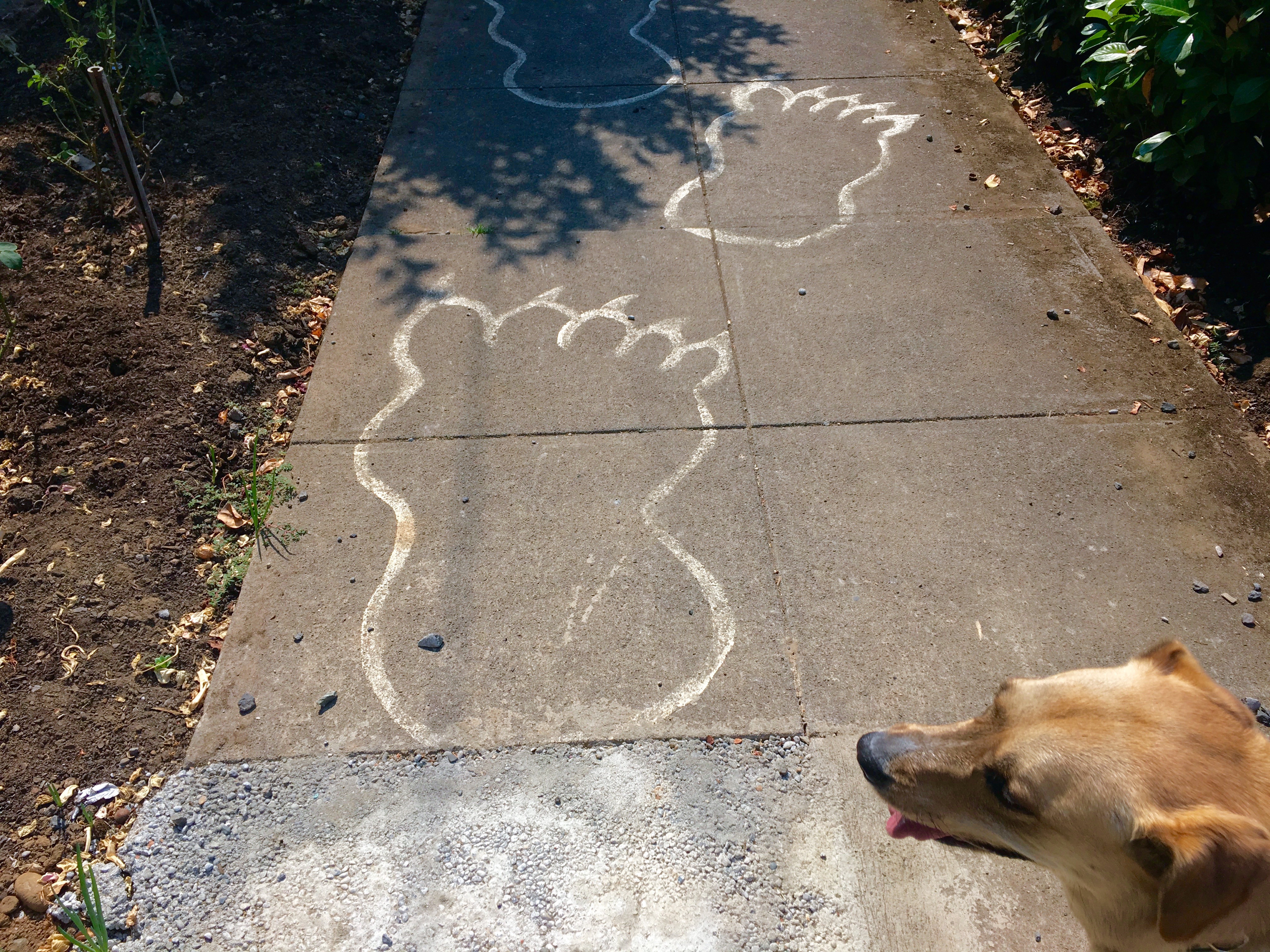
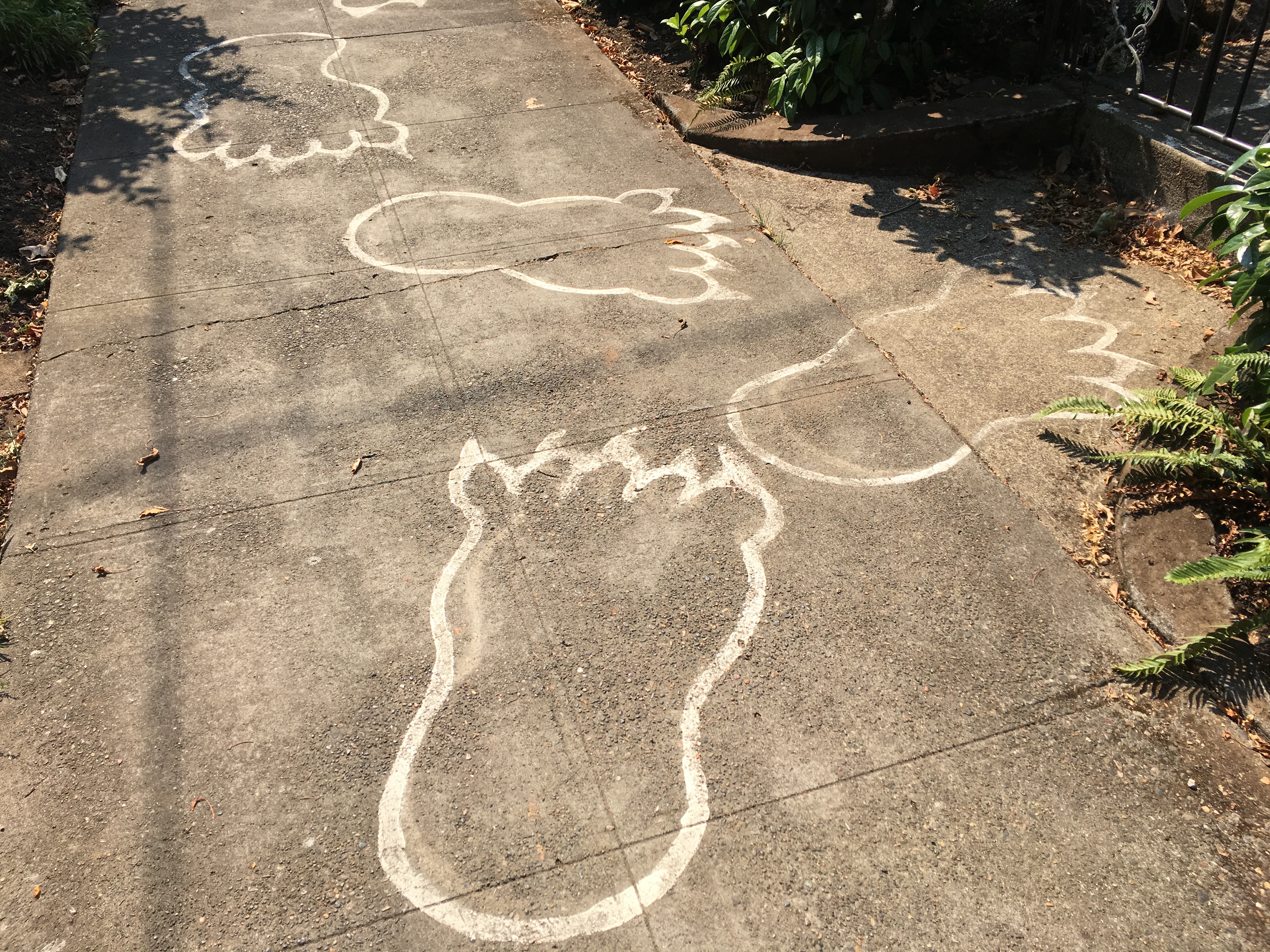
This pair of owls intrigued me when I saw them at the Kellogg Middle School in the Foster-Powell neighborhood of SE Portland. Owls have that reputation for being wise. I’m not sure if these birds represent the school’s mascot but they embody what learning will get you if you stick with it. It’s funny, owls are wise without ever attending school.


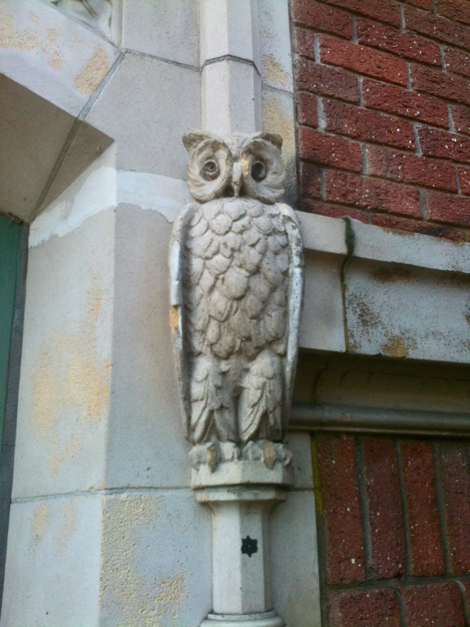
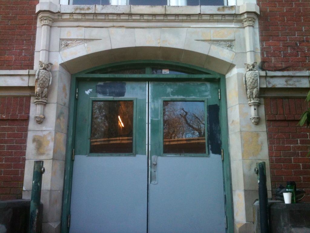
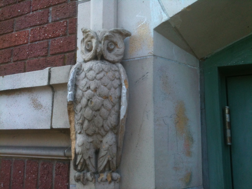
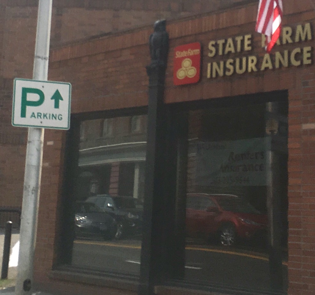
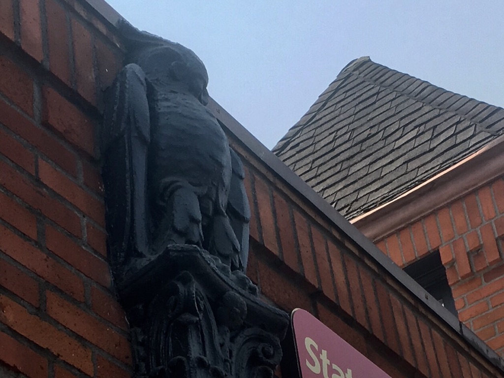
The owl on the State Farm building on West Burnside St. downtown is an ornamental part of a downspout. Maybe it’s subtle and hard to see, and in my case, hard to photograph, but an owl with bulky, arm-like wings that’s part of an old brick building is a cool thing indeed.

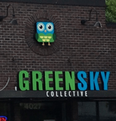
GreenSky Collective cannabis dispensary, now called Jeffery’s, used a squat Owl Jolsen looking caricature as a symbol for their business. It’s hard to say if it was good for business. It’s possible that if you sampled their product you might experience owls in that vivid technicolor visual pattern used in their logo design.

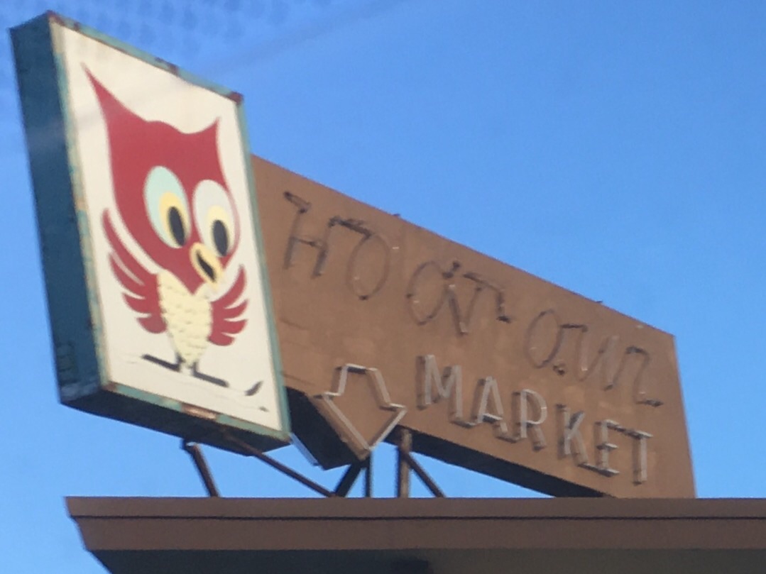
If your business is called the Hoot Owl Market on SW Capitol Hwy, it’s a given what image will be on your sign. This owl is a hoot. He’s friendly. He wants a hug. His red coloring is attention grabbing. It’s a less offensive portrayal of owls in my view. A realistic looking owl sitting on a roof as if he’s ready to swoop down on shoppers would not be good for business. This owl looks like he’d be your goofy best friend for a few minutes encouraging you to buy Pringles.

owl the perch (1)

Hey you’re The Perch in St. Johns so why isn’t there a fish on your sign? Okay, I get it, owls hang around in the forest on a perch. The owl on the sign has been perched on a bar stool so long drinking beer and eating jo jo fries that he’s gotten round. What does this owl add to the sign design? Ah hell, of course, that owl makes the whole world smile. I, myself, can’t even go back to Frownland after seeing him.

hooters owl

“Delightfully tacky yet unrefined,” is the Hooters motto as seen on the clock face on the other side of this sign. The tackiness come from hooters being a nickname for a part of their waitresses’ anatomy and having little to do with owls but owls hoot and have big round eyes that in a logo design can be made to look like the aforementioned anatomy. I’m not trying to be crude as much as I just really enjoy circular logic especially when it alIows me to break out words like aforementioned. The owl is portrayed in as authentic way as possible except for the orange eyes which are the restaurant’s colors but unnatural for owl eyes. The beauty of it all, for the owl’s sake, is that being Hooter’s mascot means it’s unlikely that owl’s wings will ever be on the menu.


Skin wise takes the cake using a literal owl reference and image with their business name. It’s simple, artsy, abstract and sophisticated and a different take on the usual breed of owls. It’s all the things you want owl images to be. It occurred to me that owls have smarts but not skin. Do they represent the product that well? Who cares? Consider that a business name like Feather Wise would never bring in enough customers.

While trying to put this story to bed I felt surrounded. Just because you’re paranoid doesn’t mean owls are lurking everywhere, with those over sized eyes staring away. On the way to the Alberta Street Fair I saw a sign for Vernon Elementary School,  another school with an owl mascot. While this sign expresses love for its neighborhood school, I’ll try to find love for owls or be less annoyed by them.

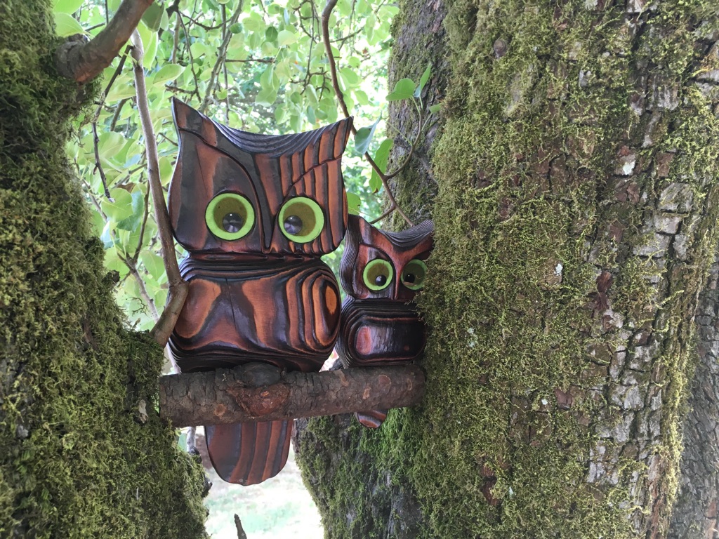
Hiding out in the trees near the Pittman Addition Hydro Park in the Overlook neighborhood of North Portland, this decorative pair seems a bit kitschy, retro and out of place. Since when does nature need to be decorated with imposter owls? Then again if it’s this tasteful and fun, I say decorate away.

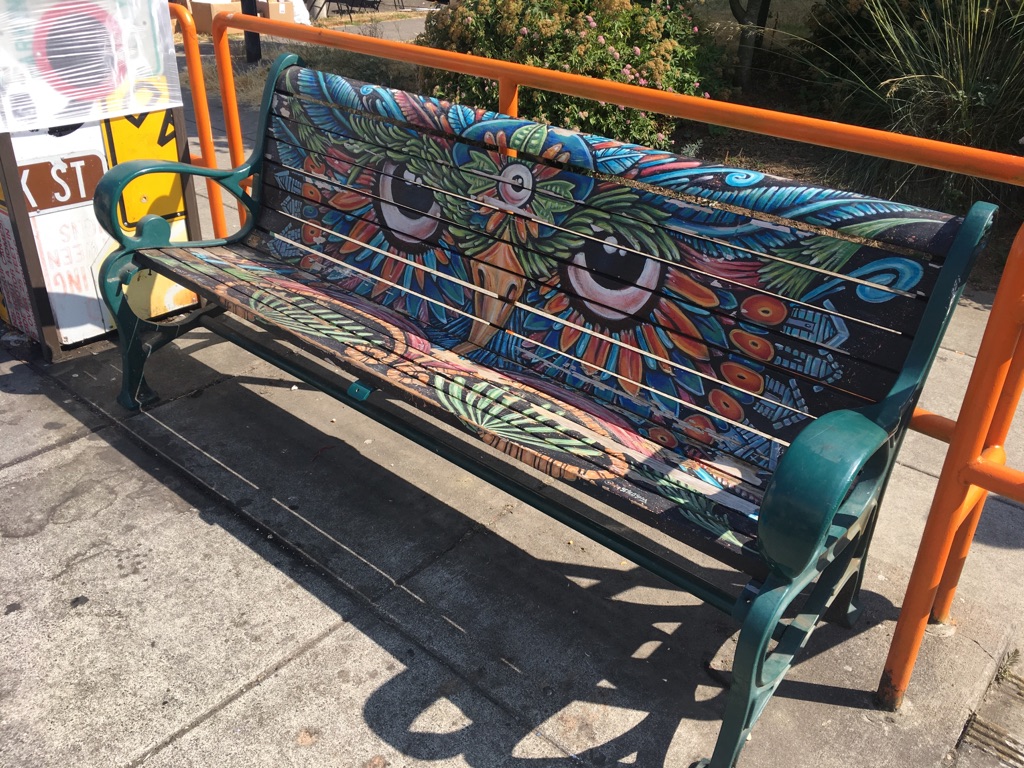
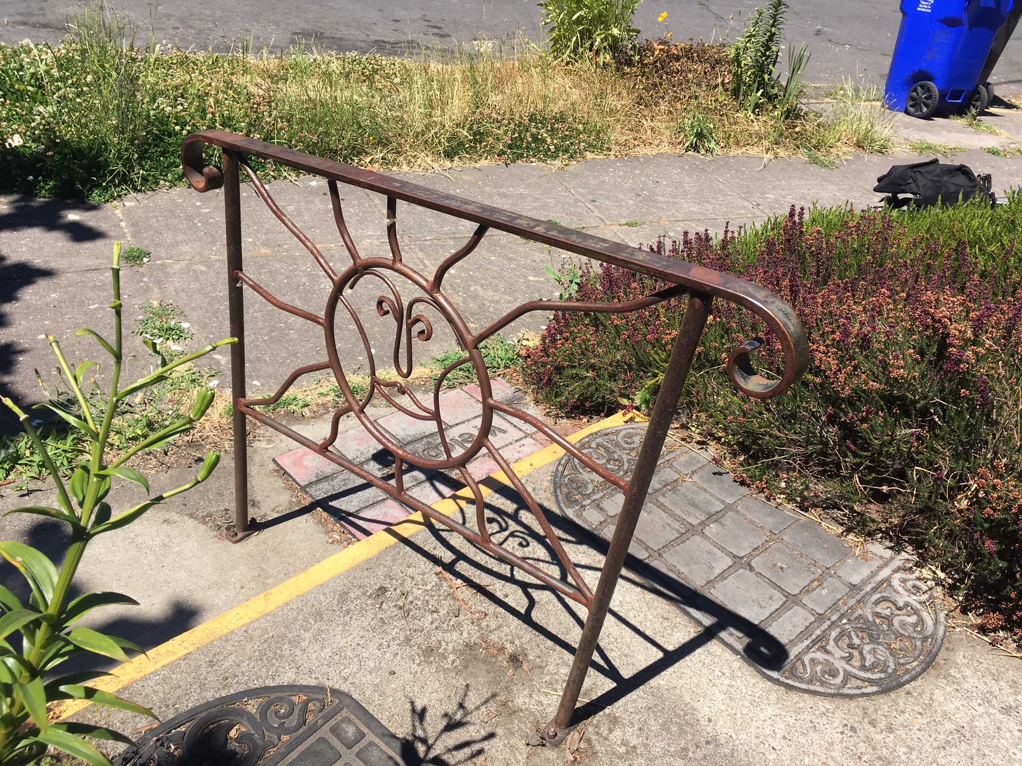
I was interested in painted benches on Alberta Street. I didn’t realize until later that this was a brightly decorated, psychedelic, owl possibly of Aztec descent. The look in his eyes makes me think he might be angry about  people sitting on his beak. I can’t imagine how many more owls I’ll see since I’ve opened this can of owls. Perhaps, by now, you’re as sick of them as I am.

Special thanks for the art direction offered by Will Simmons on a couple of the photos that appear in this post.  “Come on! Get closer!”

Because you haven’t seen or read about enough owls: https://portlandorbit.wordpress.com/2015/01/15/owls-take-over/

Summeritis: A Wall and Some Bridges

Last week, I was out of town but still managed to write a post. I wrote it using my iPhone and sporadic wi-fi. Talk about phoning it in! This may have me resting on my laurels. There’s a post vacation malaise that took over as I was working on this week’s piece. I haven’t totally envisioned the concept, and the theme is happening as I write. My “summeritis” is hitting a wall.

When I became a car commuter this spring, I started spending time on I-5 South and in SW Portland. I went from bike commuting to taking the train and bus to my current job. Once I had a car available, I drove. I began to see things in a different section of town, and stuck in traffic. This had me examining my surroundings.

This post wouldn’t have happened if John Lennon hadn’t named one of his solo albums Walls and Bridges. That title was on my mind. As oblique and simple as it is, it had me considering the category. There were probably more walls that I overlooked but I discovered a bridge less glamorous but no less notable than other bridges in Portland. My summertime brain is mushy, but I can hear the cries of the universe begging for a blog post like this one.

It occurred to me one morning that this retaining wall along I-5 was well conceived. It’s not that I can’t point out a couple of faults, but most mornings when I looked at this heap of rolling concrete, I was pleased. Someone had executed a nice design. The wall’s grooved stucco texture and gentle curves look great. This slab did seem to be begging to be covered with impossible to clean graffiti. We’re talking about an accessible canvas in a high traffic area. I always try not to worry about the inevitable and enjoy the view. My only problem with the wavy wall of clean concrete is the chain link fence crowning it. Were there no other fence options? Anything? It’s not a classy accompaniment. It’s chain link.

Bridges in the area are classy for the most part.  How would it feel to cross a pedestrian bridge named after you? Darlene Hooley knows. The official name of the bridge pictured above is US Congresswoman Darlene Hooley Bridge. There may be only a few people who could name this I-5 crossing by the Tram station. There’s nothing fancy about it besides the name. It’s utilitarian as bridges go and gets the job done.  Foot traffic passes over the highway without the fear that comes form dodging cars.

If I had a bridge named after me I would walk up and down it often asking people, “Do you know who I am?” Maybe that’s why no one has named a bridge after me.

I often road over this crossing on SW Barbur Blvd after work. The cement arches are aesthetically pleasing. The plaque piqued my curiosity, so I made plans to stop to take photos. It offers information concerning the Oregon Electric Railway.

The word in the second line is in shadow so I can’t make it out. I know it doesn’t say “ottercrossing.” Further research filled my head with information about the Oregon Electric Railway, the historical society and trolley cars. I almost lost an afternoon delving into local railroad history, so I will leave it up to my readers to take it from here.

Another bridge in the SW Portland area boasts impressive metal work. This is a bridge that carries SW 19th over I-5. I would have no problem walking across it often, perhaps if I were on my way for a bite at Humdingers. Pattern and detail are lacking in modern slapdash bridge designs.

Looking across to the other side, I noticed what happens when a car crashes into the railing. This doesn’t appear to be something that can be straightened without some effort, so there’s no reason to get bent out of shape about it. This post was desperate for a pun–ah, rock on anybody!

Who couldn’t resist the view of a bridge behind a rain splashed windshield? This bridge leading in or out of Multnomah Village has old world charm, nice curve appeal and looks sturdy. It allows for car traffic above and below. With all of it’s grayness, it almost blends in with the gray skies. There was something quaint about this image as I saw it looming through the windshield. Like the rest of Multnomah Village it has a certain charm even  through rain drops and glass.