My Decal Obsession Conundrum in Part 4 Harmony

img_0611

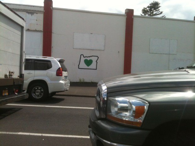
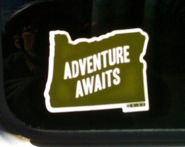
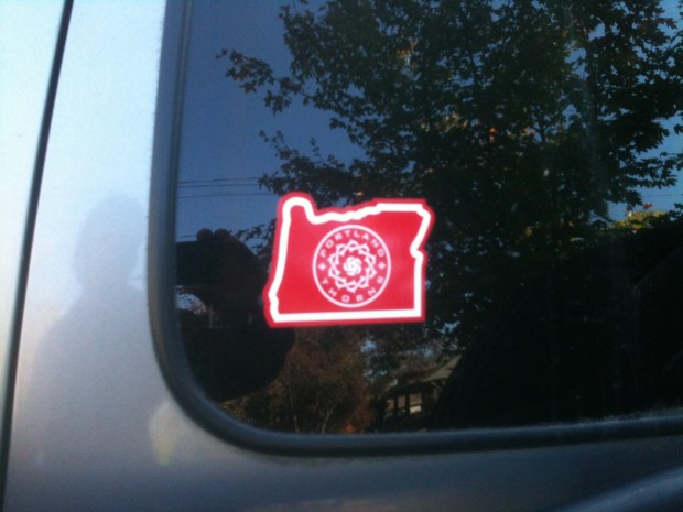
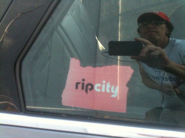
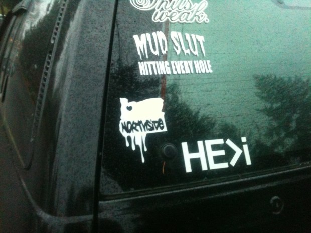
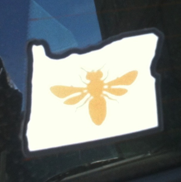
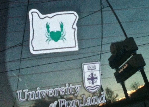
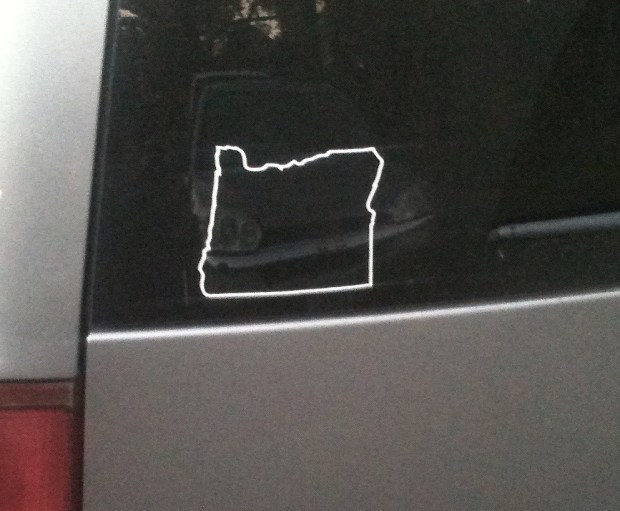
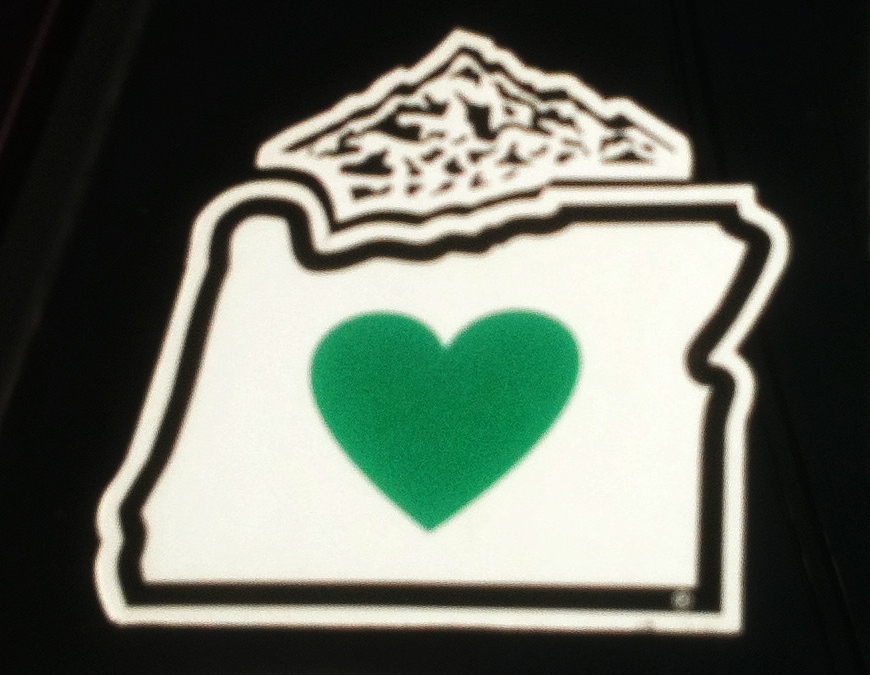
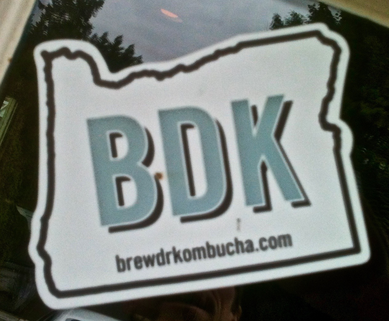
What is it about stickers shaped like the state of Oregon? I look for new ones everywhere and I often spot them. I’m blessed with an eagle eye, a talent that gets me no where. I feel obligated to share it with the world. The state of Oregon outline is a hot commodity in the sticker culture. Everyone wants a part of it which means I’ll keep finding variations on this theme. I can’t shake my obsession for these Oregon decals so it’s nice to have an outlet for displaying these images.

Rain Make Rainbows

img_1956

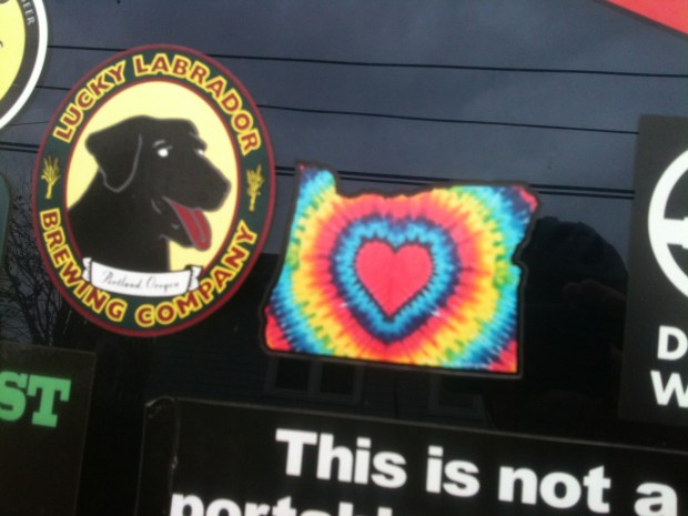
The state outline in a rainbow slice might be wishful thinking in upholding the ideals of love and acceptance once you get out of Portland but it can’t hurt to dream about and promote thoughts of a gay friendly state.

Stuck in Place

img_1634

Any locale within the state can put themselves in the state borders and create a sticker design. Obvious right? Why not scream out: We are a place in Oregon and create a design. Upon Further Review: I wasn’t paying much attention making the assumption this was a decal promoting Estacada tourism if there is such a thing. In the middle of admiring the literal sky lines, earth tones and abstract trees, it dawned on me that this was a sticker from a weed business. Wow, man. 


img_1624

This sticker calls out against laziness and should inspire “place stickers” to create slogans. You have to appreciate this effort. It does make me think I have copy editing skills. Why not, “It’s Good in the Hood!” Or was that slogan already taken?

Dead Giveaway

img_1826

You’re a Grateful Dead fan, an Oregonian and you’re not Bill Walton. You can broadcast this message with ease with this sticker.

WTF is NWSS?

img_1825

A peacock, a heart and an acronym where it’s an easy guess the NW stands for northwest, the SS, I’m not sure I want to know. All this on a green background with a thick black outline. I’m getting too critical about this thin lined drawing and the fluttering letters but boy do I like those thick black lines.
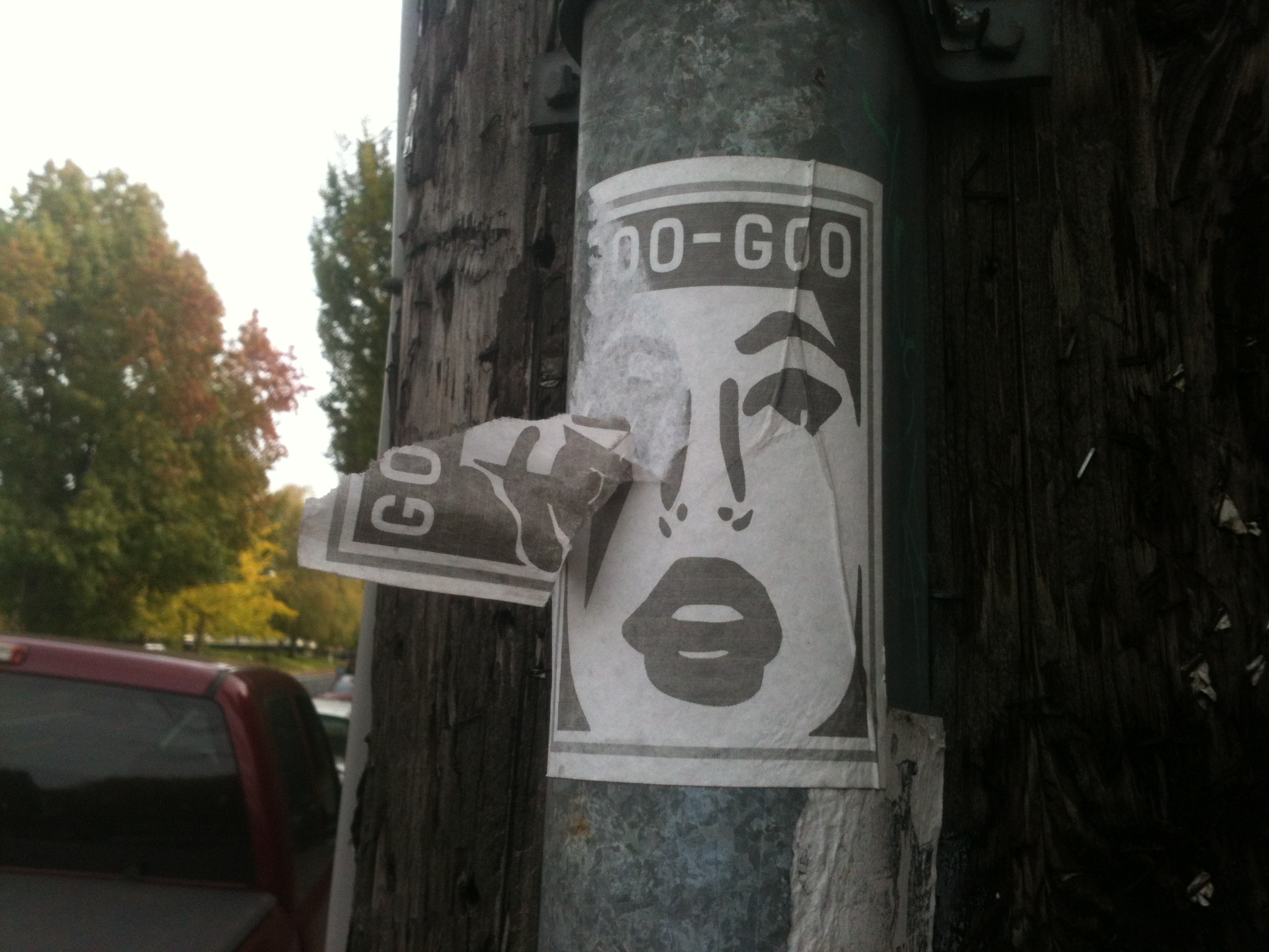
Go What?

img_1923

I’m lost. Is it a group of skis or a fort down in the empty quarter of the state? It doesn’t matter but it’s cluttered. I mean what’s with the kids skis in the middle? There is no life for a sticker critic. Go West is a tired sentiment. How about “Go Somewhere Else?” I know, curmudgeon much? I am a sucker for plain and simple black and white designs that may or may not be trying to sell me something.

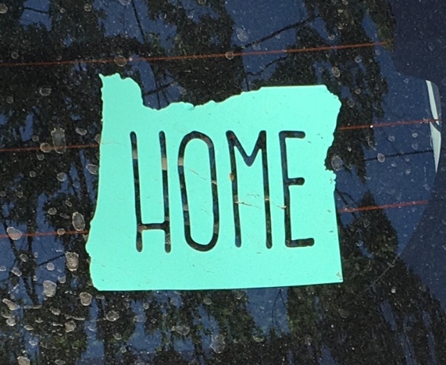
Home is a State of Mind

img_1351

It’s okay if you need to proclaim you’re from Oregon. It can be the home of anyone who lives here. Go crazy on that letter “O.” Is it a wave or Mt. Hood getting tweaked like an ice cream sundae top?


img_1354

Is there a hidden double meaning in placing the state abbreviation inside the state border? Who am I even asking? Am I hoping an Oregon sticker expert happens by and reads this post? Perhaps. This simple design is eye popping if you can see past the redundancy.
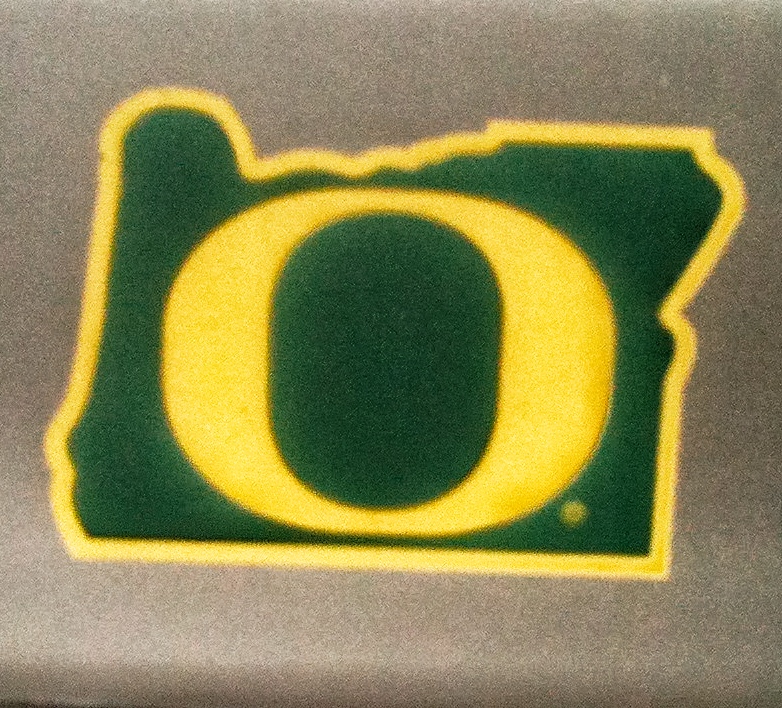

Stuck on Sports

img_1922
Of course I’ve learned all about “CorVegas” from the C&C guys and there’s no faulting Oregon State for taking as much pride in their state as their football team. The beaver logo is even extra fierce looking. So, yeah, Go Beavers!

img_0766

Washington fans in Oregon, okay, but come on! Is there anything less nesessary than Huskies fans needing to tell people they’re from Oregon? I try to keep my critiques focused on concept rather than execution which is why this one bothers me so much. As for the design, I like purple and pin stripes. 
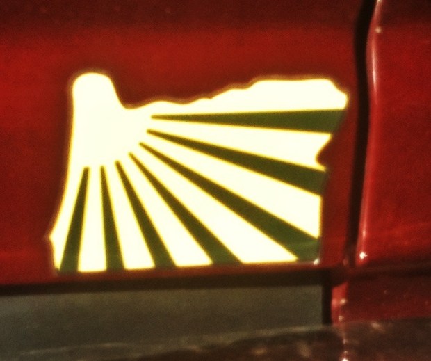
Stick it Out

img_0731

Go to town with that crazy blend of colors on a silver back ground. I’m enthralled. This has to be the most beautiful background of an Oregon outline sticker I’ve seen. It’s lacking a concrete message. Shiny, happy, tacky, perhaps when it’s paired with a grouping of flamingos representing the family unit.

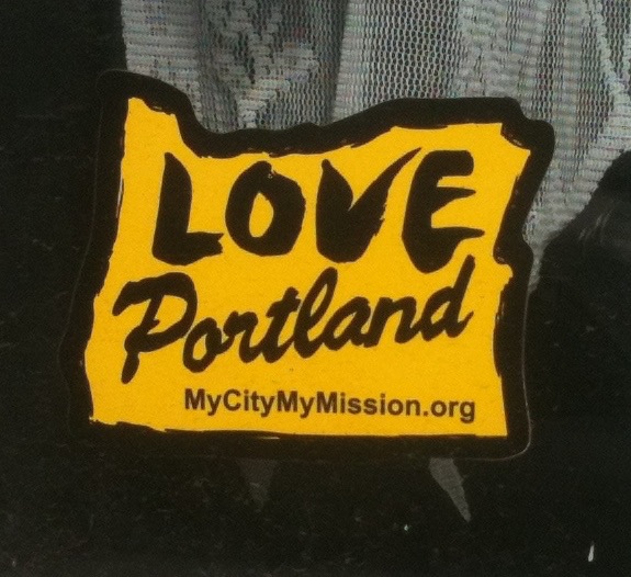
Love, A Many Splendid Thing

img_2229

At the very least this sticker gets props for doing something different. Who knew you could form the letter “O” out of the outline of the state of Oregon. I have to say I love this one even though all this love stuff makes me a bit queasy. It’s an ingenious take on an overdone concept. I can only imagine how many word combinations exist that might use this style of the letter O.

Antsy About Antsi

The name, or tag rather, intrigues me. It’s part of a culture that I find fascinating when I should find it repellent. As an old curmudgeon, homeowner type, I’m expected to dislike graffiti. For me, I’m working on understanding it and living with it. It’s everywhere. Antsi graffiti has seized the zeitgeist with a spray painted, nervous penmanship. Antsi, spelled with an i, may not refer to the word antsy but it feels weirdly reassuring to be reminded of these times living in the United States of Anxiety. We’re dealing with the work of vandals creating an unstoppable visual clutter as well as the mystery of who is making it.

I didn’t realize how much of a graffiti star Antsi was until I wrote a post that mentioned the tag in passing. It began to get a slow and steady trickle of readers before becoming my most read blog entry. It’s not hard, on a typical day traveling from North to SW Portland and back for work, to see evidence of Antsi. The name is out there. Sometimes it’s small, other times it’s big and bold and it includes a black outline, my preferred method. Graffiti has to rise above the tiny nuisance scrawl.

Here’s where I feel the need to offer my typical disclaimer. I come to bury graffiti not to praise it. While a third-rate Shakespeare reference will do nothing to stop this expression, I once again run the risk of glorifying graffiti. Antsi can’t be ignored. The sheer amount of tags, the word it implies and the audacity of some of the locations, especially around I-5, makes me realize that this is, in some way, a special tag that’s due consideration. It will continue in the cycle of spray painting, clean up and more graffiti. Antsi survives by staying ahead of the clean up crew. Meanwhile, additional thoughts on  graffiti will be explored in a second post. My appreciation for graffiti involves unique looking efforts, examples created under death-defying circumstances and tags that makes sense and might carry a message, a challenge when we’re dealing with a lone word.

In a sea of “rafts,” “qwilts,” and “napkn” tags Antsi stands out. The real message may have more to do with my imagination applying meaning. I know the city and highway department have better things to do than cover up graffiti. It is a waste of tax dollars. That money could find better ways to be wasted. For me, it’s become the strange entertainment of obsessing over new tags and spray paint designs on my commute to work. There doesn’t seem much else to experience trodding back and forth with other disillusioned souls. Here’s a few tales about the good times I’ve experienced through the work of Ansti.

Antsi on a Truck

It’s hard to tell if the owner of this truck gave permission to have his vehicle painted. It seems like there was an opportunity to make the paint job spiffy. It’s apparent that no effort was made to paint over the side panel which allows Antsi an opportunity to have a moving billboard promoting his brand. Not wanting to miss a chance to get this photo, I had to drive down a side street to wait for this truck to pass by.

Antsi and the Donut King

I do have to admit to playing with my phone while driving. This was one of these moments where I was hoping to catch an image of the Donut King’s house for a future story. A decent image would save me a trip for more photos. Looking at the image later, I noticed the Antsi tag on a jersey wall in the lower left corner. The red color adds a splash of vibrancy, something different from the usual black and white color scheme.

Antsi Tags Portland City Market

It’s not everyday that you get a sense of the personal experiences that come from someone having their property tagged. I’m writing about this from a memory of a while back based on what I read on Nextdoor. The feeling I recall was pure rage. The business owner had a legitimate complaint about an Antsi tag that appeared when his Lombard Avenue business was in the midst of a renovation. Antsi managed to keep the paint mostly on the temporary plywood.

Stuck on Antsi


In the Albina neighborhood, I may have found the answer to what the Antsi promotion is about: Boasting sticker sales. Going from graffiti to stickering seems like a natural progression with opportunities for cross marketing, double branding or other phenomenons of our current times that mystify me. I’m getting more antsy trying to figure it out.

Oregon Decal Obsession Part 3: State of the State

Please allow for a continutied dip into the pool of sticker insanity. We’ll get back to our regular scheduled blog posting soon but at this point we’re stuck, (brilliant pun acknowledged) in the world of Oregon Decals, not that I know the difference between decals and stickers. For the most part these seem to end up on the rear windows of people’s cars and not on the back of traffic signs.

This being the third installment of this series, I have to reiterate that my interest in the stickers is the homage to the Grand Daddy of all them all, the green heart with a white background surrounded by the state border. Until I am proven wrong I will always believe these stickers are making a homage to this idea, or is it outright theft? The designs continue cropping up in inventive ways inspiring me to collect these images.

Everything that’s special about Oregon or Portland seems to be announcing itself within the state’s outline. Most of these stickers could have considered a different design. I am insinuating that decal designers might be on the lazy side. In the end, it’s okay because of the local and state angle begs for border usage. As luck has it, the Oregon border is more interesting than other geometric shapes like squares and rectangles that could be used as framing.

Attis Shrugged

The internet can make it easy to solve the mystery of what Attis is. It takes two seconds but I procrastinate and still don’t know what an Attis is. This inverse use of the heart in Oregon design, white on a black border instead of green on white is a novel approach. Attis is where the heart is.

Mountain Sale

The Mountain Shop advertises itself with a bold gold outline,  blue background and a dynamic double mountain graphic that sneaks into an almost lightning bolt. It’s worthy of being paired with the Grand Daddy of Oregon border stickers

A Batch Of Bachelor

In my guesstimation, Mt Bachelor resides close to the middle of the state, or not. The sunny 70’s style logo and loopy, conjoined font, refer to the mountain that would then be appropriately centered in this state bordered design. It’s a pleasant thought to consider Oregon mountains having their own PR departments.

Dirty Old Town

Of course the reindeer, or stag, to be more specific, is making an effort to leap out of the sticker. This design captures the look of the iconic downtown Portland sign. I can’t tell if the sticker has an aged feel that puts the old in Old Town or if the effect is coming from my bad photography.

State Bird?

Here’s where I’m thrown for a loop even before I get loopy writing all this. I will say this is a fun design but I’m not sure if it’s trying to promote a type of bird that lives in the area because I don’t know enough about the region’s birds or if this is a cartoon bird. The leafy eyes seem to point to the latter. Then again, this may be the state bird. The research department is not returning my calls.

Pip’s Peak

This design is just plain nice, like an old State Park poster. The color is serene and the images are scenic and rustic. It’s hard to imagine a sticker that could transport me into the world of a winter’s afternoon wilderness but this one has that effect. These folks do unique things with donuts so why should I expect anything less of their decal design.

Scumdom

A sticker like this, on a beat up bumper, seems ironic enough. I knew the message well enough to disregard the duct tape covering the first word “Die.” Then I started wondering if the tape was intentional. The sticker now reads like an embracement of the moniker. You are the label you adhere to.

Bigfoot Retriever

I’m big enough of a Bigfoot believer to consider that there has to be at least a few of these creatures running around the backwoods of Oregon making this decal honoring them all the more spot on.

Scary Face

This is one intense sticker. It image has little to do with Oregon but it does capture the vibe I sometimes get from the state. The reason for using the border design escapes me, but let me tell you it’s a free country and if you want to make a scary monster face shaped state of Oregon decal and put it on the back of a traffic sign, well, you go right ahead and do that.

Wandering Around

The charm and a cutesy message of this sticker are not lost on me and neither is its wandering border. It offers hope to all wanderers. It’s a subtle beer sales tactic or maybe not so subtle given that the brewery’s name is Vagabond.

Home Stuck Home

If you have homes all over the state you need this sticker. I know, this design points out how at home people feel in Oregon. I could go on and on with theories about what’s being said here with each theory becoming more farfetched then the next but I’ll just give this sticker props for its use of a distinctive, skinny font on a verdant background. Home is where the heart should be.

Hawking

Sports team insignia? Tribal affiliation? I’m not familiar with the image that pops out from the red background. I would have spent weeks tweaking the angle. Here I can’t tell if the hawk is flying or if it really should be sitting up, ready to fly off toward its prey. Maybe it’s just me considering the use of all that space the state outline offers. This mysterious bird leaped off a totem pole and is now soaring through this sticker.

Property Tax

While I like the colors used to create the property tax message and the hostage communique lettering, it’s sad to say that I can’t tell if the design is pro or con on the property tax issue. This one screams out to have a Portland city boundary around it because the rest of the state seems wary of rising property taxes.

You’re Welcome California

Out in the Gorge last summer, I spotted this on the back of the laptop of an artist painting a landscape of the fantastic view from Crown Point. We had a bit of a laugh and while it’s not exactly true I appreciate any attempt at humor on an Oregon decal.

Santa Conned

A great event such as SantaCon deserves its own sticker. The design gets bonus points for “coloring outside the lines.” Like the Old Town sticker reindeer-like creatures are doggedly determined to jump out of decals.

Pacific Wonderland

This sticker can’t encourage enough people to relocate to Oregon and live in a steel box condo. With the promise of giant trees everywhere, people will expect them in areas of the state where they actually aren’t. No one will be able to resist a state full of beautiful trees. I’m not sure why this sticker revels in a falsely advertised version of wonderland but I already fell for it.

The Pursuit of Goo-Goo (Part One)

Goo-Goo won me over with prolific stickering, the use of a baby sound proclamation and an image that reminded me of KISS frontman Paul Stanley. Despite Goo-Goo stickers filling me with an unexplained irrational fear of the unknown, I still need to make sense of them. I turned to a valued resource in all things counter-culture my old friend Jeff Bagato who lives in the Washington D.C. area. As an avant-garde artist/musician and author of poetry books and science fiction novels, Jeff is a scholar of all forms of creative expression, a category that Goo-Goo stickers fall under. “I’m assuming that Goo-Goo is a tag, but it could just be a weird phrase; both would appear on stickers,” Jeff noted by email when I queried. “I see it all the time on IG feeds. There seem to be a million sticker artists in Portland and Seattle,” he added. “Tag” and “IG,” those references left me a bit mystified but I’m playing up my ignorance for dramatic effect.

The problem with getting to the bottom of a mystery means it will cease to be a mystery. Once explained my imagination won’t fill in the gaps and my interpretation will probably become invalid. I suppose that will only inspire me to search out other unexplained phenomena.

When thinking about the application of these stickers around town my mind conjures images of a shadowy figure in a Jack the Ripper cloak and wide brim hat. Why this guy, in my mind, is not trying to look less conspicuous is beyond me. I’m sure sticker art is not like that at all. The act of disobedience by decorating the backs of traffic signs is probably duller than I realize. People are sure to be casual and not mysterious about it.

The stickers caught my attention because of the variations of design, color, size and the subject matter. Their ubiquitousness helps. I’m partial to those in my neighborhood. When a Goo-Goo sticker appeared close to my house it led me to think the sticker artist was clairvoyant and had caught on to my Goo-Goo obsession.

Speculation on the meaning of Goo-Goo abounds. Jeff astutely commented that it’s unlikely a reference to the band the Goo Goo Dolls. To me it calls forth the beginnings of language itself, the first attempts a baby makes to speak. The great unknown is the combination of the letters and the face that I so want to believe is a homage to Paul Stanley. That the lead singer of KISS could end up as part of an underground sticker art project is something that has held my attention and kept me on the look out for more of these images. While some would could say Paul Stanley never wore his make up as it is on the sticker others might be quicker to ask: Who is Paul Stanley?

The first time I wrote about Goo-Goo was when a sticker was placed next to a piece of Bill Murray art. I used the power of my limited graphic arts abilities to remove the sticker from one of the images mainly because I didn’t like one piece of street art encroaching so hard on another.


When I reached out to my friend Jeff to help me sort this out he offered an online resource to assist me in my quest to understand Goo-Goo culture. Originally I was too naive, neurotic or nervous to dig into sticker art in a way that didn’t include some support. I was afraid my mind would be blown and I knew I’d need some help putting the pieces back together.


Skullz

What’s with all the skulls? I see them everywhere. The images signify our current apocalyptic culture. Doom stares me down all over town through empty sockets. Beneath a few layers of skin and whatever wig weave we’re sporting, or not sporting, we’re all walking and talking skulls supported by skeletons. I continue to contemplate what the message and symbolism of all this skullduggery could be.

Eyes: The Window of the Skull

For part of the decoration of the Art Car known as the Space Taxi, an unknown artist included swirling eyes on a skull. Most of us are aware that eyes will dissolve right out of their sockets as we decompose but these artistic liberties pay off with an artier image.

Skull Primitive

Rough looking skulls take on the appearance of head bones that have been kicked around a while or stacked up in catacombs for centuries, especially when they look like they’ve been painted with white out. It’s was the subtle placement on an East Central Industrial area furniture store doorway that caught my still intact eye.

Color My Skull

Hyper realist (look at those teeth!) and reflective, this sticker creation seen on SE Hawthorne Boulevard has the added bonus of taking on different colors depending on the viewing angle.

Day of the Dead Skull

Day of the Dead Skull

This Day of the Dead image that includes a key hole in the forehead has the look of being mass-produced but it seems like an ornate way to cover a spare tire.

Skull Transformations

A skull with a third eye and four rows of teeth transforms this transformer box on SE Division Street into a roadside Skull Art kiosk.

Moon Skull

A temporary memorial, it’s since been painted over, sprung up around the time of Fred Cole’s passing on a metal door gate on N Albina Street. I didn’t realize it was a Dead Moon album cover reference at first. Some street skulls have significance. It’s a shame this one didn’t get a chance to live on.

Skulls and Bones

Annoying family stickers get the skull treatment which is way less annoying yet still annoying in that family sticker on back windshield of a car way proving that skulls can’t make everything cool.

Skulledelic

The colors are vibrant, the eye sockets look like bike tires and while it’s more skull and crossbones than solo skull, the psychedelic, folk art nature of this piece seen on Hawthorne  Boulevard knocks my socks off.

Raise a Skull

There’s skull branding going on, especially with the design in the eye socket that you’ll see in various incarnations all over town. This one was spotted in the Hawthorne shopping district. Hoisting wine and wearing a classy shirt makes for one stylish skull. I’m not sure what he’s selling besides an upper crusty life style for the after world. Whatever else it is, I’m buying in.

Skull Diving Swayze

The Mississippi neighborhood has so many skull images up and down the street that you’d think there was a morgue in the basement of one of the buildings. It may be the skull capital of the city it wasn’t already the name of a state.

Wall of Skulls

The whole side of a building has been taken over by various skull images on N. Mississippi Avenue.

Skullage

Another view of various skulls mixed in with other cultural referencing forms of street art.

A Slice of Skull

A pizza skull has to be the greatest skull design ever conceived. I can’t see it selling pizza but it looks delicious.

The Eyes Have It Even When They’re Empty Sockets

There’s something in these two designs found in the Mississippi neighborhood that screams evil eye skull. I like the colors and the hypnotic skull sockets additions. The variations are sure to lull people into a sense of uneasy satisfaction which happens to be my current state of mind being surrounded by skull imagery.

Oregon Decal Obsession Part 2

IMG_5955

I’m back to my Oregon Decal obsession and until I find out otherwise, I’m convinced it all started with the green heart in the state boundary design. I’m working on tracking down the creator of this image which really shouldn’t be too hard but my self-imposed deadline is approaching and I’m still planning on one more part to this series before I exorcise this obsession from my consciousness. The last blog post was titled Oregon Decal Spawn Part 1, or some such title, which in hindsight seems terrible so I reworked the title based on what these decals have become to me—something of an obsession. While maybe a casual obsession, they’re images I’m focused on collecting. A snapshot is satisfying enough, the need to possess some tangible remnant of these decals hasn’t over taken me. I have only seen a few of these decals for sale which means tracking them down would have proven impossible.

Adventure Awaits (1).jpg

While on my bike my eyes scan the bumpers of parked cars. The state outline usually jumps out at me. After considering whether the design is something I’ve seen before I either stop and grab a picture or keep pedaling. I’m surprised by the number and variety of designs that represent all manner of Portland and Oregon related subjects. I want to think that as Portland-centric as we are, a Portland border would be a far more specific and authentic a representation, in some cases, of this sticker concept. There’s only one problem. The Portland city limits prove to be a design flaw mess. No one would recognize it and it would never work as a decal outline.

streets

Portland: Not a decal inspiring border.

Last summer I ran into Rob Campbell who is among other things a T-shirt designer. He showed me a T-shirt design which incorporated the use of the Oregon border. This got me blabbing about my Oregon decal obsession. I asked him why he thought so many people use the state to frame designs. He was succinct when he explained that it’s “effective.” And that makes sense. As I pointed out before, people immediately know the image involves regionalism, whatever the symbol happens to be, sometimes it’s not clear, but it’s stuff in this state or even something being promoted specific to Portland. Regardless, it makes for an eye-catching decoration for a car bumper or anywhere else it gets stuck.

So let’s get to it.

IMG_7032


Love Portland City Limits

Why not love Portland? Again if you slapped these words on top of the city limits map it wouldn’t look right so the use of the state border. Everyone knows there’s a city named Portland in Oregon.

IMG_6586

It’s greek to me, except it’s not Greek, it’s Latin. It’s the Latin translation of the state motto which when translated back into English is: “She flies with her own wings.” Who knew you could get a  lesson in history and Latin from a sticker.

IMG_6534

IMG_6169

Tie-dye could be symbolic of almost anything but seems specific to Dead Head/hippie culture. The top design is bold and colorful and has heart so I’m not going to trip out on it. The other one has a peace sign which is also a nice touch. If I’m any kind of decal critic, well these messages of peace and love are mellowing me out. Tie-dye is a bit of a psychedelic cliché but I have an appreciation for colorful design

IMG_6533

This one is saying all kinds of things about Portland. It references the White Stag sign, mentions old town and frames it with an eye catching golden state border. The quality of the photo does it no justice but this vehicle owner is loving Portland.

IMG_6522

IMG_6152

These two seem like homemade designs. The stripes, rays of sun maybe, made me think of   Arizona. The other sticker looks like a basic art project with the tiny blue heart sticker marking Portland’s location on the pink state map.

IMG_6531

IMG_6403

IMG_6251

Every Portland sports team does the Oregon decal with gusto. Thorns, PSU Vikings, and Rip City!


Any kind of advertising receives a boast with a state of Oregon decal design.

IMG_6884

Northside shoes were founded in Portland. The  little heart is a nice touch and for whatever reason the state is depicted as dripping, or is it oozing?

IMG_6489

Even Pabst ran like a stallion/unicorn with an Oregon design for their Pabst music festival.

IMG_6402

And yeah, Portland and Oregon have a few tea drinkers.

IMG_6490

Adorned plays off the Keep Portland Weird campaign requesting that people “Keep Oregon adorned.”

IMG_6727

Well, no one can exactly advertise snow but it’s another mix of borrowing an advertising slogan and mixing it with a state decal.

IMG_6416

Even Bernie Sanders gets in on the act with an Oregon inspired reminder to vote for him.

IMG_6037

IMG_6463

Do we have bees and bartenders or martini makers in this state? According to these decals, we do!

IMG_6184

This one doesn’t make me groan. I could not resist that lame pun. It’s seems like a statement about farming or it insinuates that the owner of the car is a native Oregonian. It could well be there as a show of support for local farming or hauling around vegetables.

13.1 (1)

IMG_6370 (1)

Oregon Crabbing (1)


bike (1)

Other decals offer identifiers by way of symbols. We run half marathons, love animals, depending on the foot print, crabbing and ride bikes. It can all be spoken in decal.

Indian Land (1)

This one speaks for itself. It has one of the best uses of the Oregon border since it serves as a reminder of the original inhabitants of these parts.

Gotta run to look over more car bumpers. The obsession will rear it’s ugly head again in this blog soon enough.

Oregon Border (1)

Note to Mrs. Yuchmow:  I feel the need to justify my use of the word “and” to start a sentence. I know you taught Will Simmons from the Pittsburgh Orbit that this usually isn’t a good thing to do but in the case of my usage it needed to happen.


A Bridge To Nowhere, Almost

bridge 2 (1)

Living in a city surrounded by two rivers, bridges are a necessity. It’s possible that we may not have enough bridges, at least to keep traffic moving. I found myself considering a bridge over N Columbia Blvd. more than I ever thought necessary.

bridge 1 (2)

Hours in the dark room pay off.

It’s a foot bridge really, although the ramps that go up three levels make it fun to ride a bike over. After substitute teaching in the area and crossing the bridge a few times I realized it was unnecessary for me to use, especially going home, as I still had to cross back over a four lane road. On my way to the job it made more sense to ride with traffic and use caution when crossing the road. N Columbia Blvd. is the thoroughfare for our northern industrial zone so there’s major truck traffic hurling and screaming back and forth to and from an industrial park at St. Johns. It also feels like a foggy section of town with giant trees and perpetual mist as if from one of those Twilight movies. These hazards and the barreling semi-trucks make it necessary to provide children with a safe way to cross the street to get to the middle school on the other side.

IMG_6441
What color do you paint a bridge?

When I used the bridge I took note of its dark forest green color. Let’s face it, it is a nice shade of green. I have no idea who decided or even has to think about what color any bridge should be but they nailed it. It looks great in any weather, sunlight or foggy, gray dawn mist. Surely something that has to be considered, visibility factors, current trends or stylishness when picking a foot bridge color. The ramps take some pedal power to get up which makes the winding trip down worth it but in the end it takes too long to get up and down, making bike traverses a hassle. I was struck by some tasteful and subtle decor.

IMG_6427

There’s was a nod to Star Wars but not every last character so it’s not overdone. Another screen printed decal featured a microscope. How inspirational would that be for students to get their days started or ended with a reminder of science or maybe a reminder of science homework or a test.

IMG_6439 (1)

IMG_6430

Same goes, in a way, for the light bulb sticker. Ideas might start percolating as people walk up and down these ramps to cross the road. Objects from bygone eras like the old timey microphone have a quaint appeal.

IMG_6436

I returned weeks later to see that some of the decals had peeled off or been peeled off and some less artistic graffiti had cropped up.

IMG_6649

The bridge seems like a fine way to get to school. I can imagine that the bridge will have an impact on the students that use it. They will boast to their own kids someday about how, in their day, they had to walk up three levels of ramps and cross over a treacherous road on a forest green bridge to get to school.

Oregon Decal Spawn (Part 1)

If we lived in a square state like Colorado or Wyoming an Oregon border style decal would not work. It would look square much like any old frame or square, so it’s amazing how unique and appealing a frame in the shape of the state of Oregon is. Any symbol can be placed within the state border to make a statement that says, “we do this in Oregon.” What’s more it’s a message that suits a decal. If I had not been searching in vain for a Portland Flag decal, I may not have caught on to the decal phenomenon.  My search focused on decals people put on their car windows and bumpers.  I saw many of the green heart within the Oregon border sticker but then noticed variations on this design. Images of golfers, bikes, and sports related designs within the Oregon border cropped up.

Mt Hood Heart of Oregon

The Oregon Decal Grandaddy with Mt. Hood.

I have to believe it starts with the heart of Oregon image. This is by far the most popular Oregon state border decal I’ve seen on cars. I would estimate seeing it on one out of ten cars. It’s like the gateway decal. If someone is going to have one Oregon outline decal it’s at least going to be that image. I even know a guy who had the green heart in Oregon tattooed on his right calf. It’s likely that a decal historian could confirm or disprove my theory that all the rest of the Oregon related decals borrow from the original green heart design. The Portland Orbit crack investigative team researched the wikipedia entry that says the green heart design was created in 2003 which has me hard pressed to imagine that there were other Oregon border designs before then.  I would be happy to accept any information from decal historians out there who can set the record straight. Also any decal statistician would be welcome to set me straight on my one out of ten cars estimate.

The state of Oregon border decals now come in many variations and themes.  The ones I’ve discovered so far and documented consider Oregon and Portland related themes–the stuff we do here. It’s great to see them paired up with local stickers touting the the community radio station KBOO and the St Johns Bridge .

Oregonians Rule decal

Airport Carpet Decal

How can you not get excited about an airport carpet reference.  It wasn’t until all the clamor started about replacing the carpet that I even realized there was such an interest in it or even noticed it and I had been to the airport more than a few times.

A certain mystery lies in exactly what these decals are promoting but put it in the border of the state of Oregon and that has to at least mean it’s an Oregon thing, whatever the thing is.

mystery decal

green decal

Sometimes the decal makes it statement in writing:

wild decal

Other times it’s symbolically obvious that Oregonians are as addicted to their coffee as any other member of any of the other states in this union.

coffee cup decal

I’m loving the sports references.  Portland teams are Oregon’s teams so seems to say this one:

Timbers decal

Go Timbers!

UofO

The University of Oregon has a design which makes me wonder what aspect of U of O life the one below represents:

pink U of O decal

Who cares! It’s colorful, cool and small for some reason.

Then there are the flat out promotional decals doing it in the Oregon border style:

Powell's Decal

   kombucha decal (1)

This one struck me as the most beautiful with it’s quivering border outline, faded heart and wood grain.  It shouts, “I love wood working in Oregon, plenty of trees, great lumber” etc…

wood decal

If you haven’t seen enough Oregon border decal inspirations this one proclaims, “I run marathons in Oregon, none less than 26.2 miles thank you.”

26.2 Decal

The REI decal is usually found in basic black, but it wouldn’t be an Portland Orbit post with out a reference to graffiti in some way. So here’s how REI represents with some additional artistic flare.

REI Decal

Note:  Having Part 1 in the title means another onslaught of decal photos is in the plans. I’ve noticed more decals out there that I was not able to photograph either due to being in a hurry or seeing car decals in traffic. Hang tight for more images related to activities like running, golfing, Indian rights and Woman’s soccer as well as more discussion of this decal phenomenon.

Another note: At times I wish these photos had been a bit better but there is only so much you can do with an iPhone 3 under these conditions. Here’s hoping a soon to be acquired macro lens will help the situation.