Antsy About Antsi

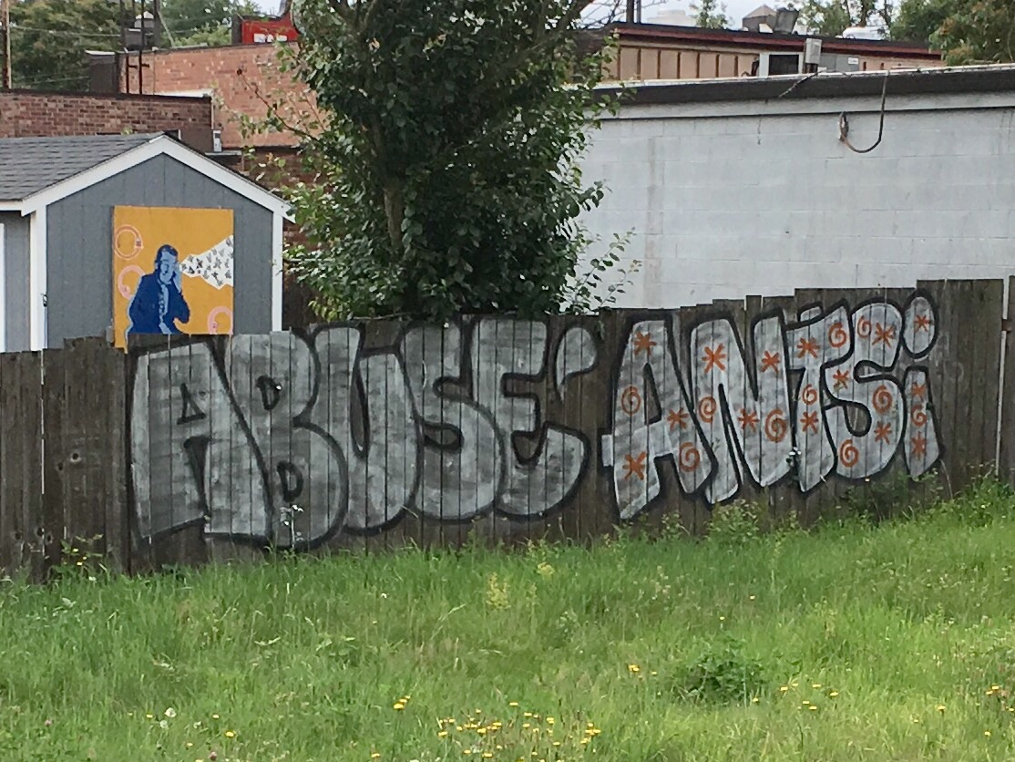
The name, or tag rather, intrigues me. It’s part of a culture that I find fascinating when I should find it repellent. As an old curmudgeon, homeowner type, I’m expected to dislike graffiti. For me, I’m working on understanding it and living with it. It’s everywhere. Antsi graffiti has seized the zeitgeist with a spray painted, nervous penmanship. Antsi, spelled with an i, may not refer to the word antsy but it feels weirdly reassuring to be reminded of these times living in the United States of Anxiety. We’re dealing with the work of vandals creating an unstoppable visual clutter as well as the mystery of who is making it.

I didn’t realize how much of a graffiti star Antsi was until I wrote a post that mentioned the tag in passing. It began to get a slow and steady trickle of readers before becoming my most read blog entry. It’s not hard, on a typical day traveling from North to SW Portland and back for work, to see evidence of Antsi. The name is out there. Sometimes it’s small, other times it’s big and bold and it includes a black outline, my preferred method. Graffiti has to rise above the tiny nuisance scrawl.

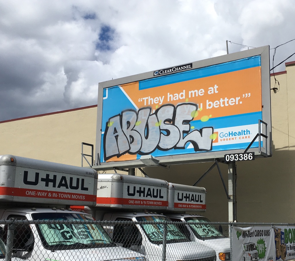
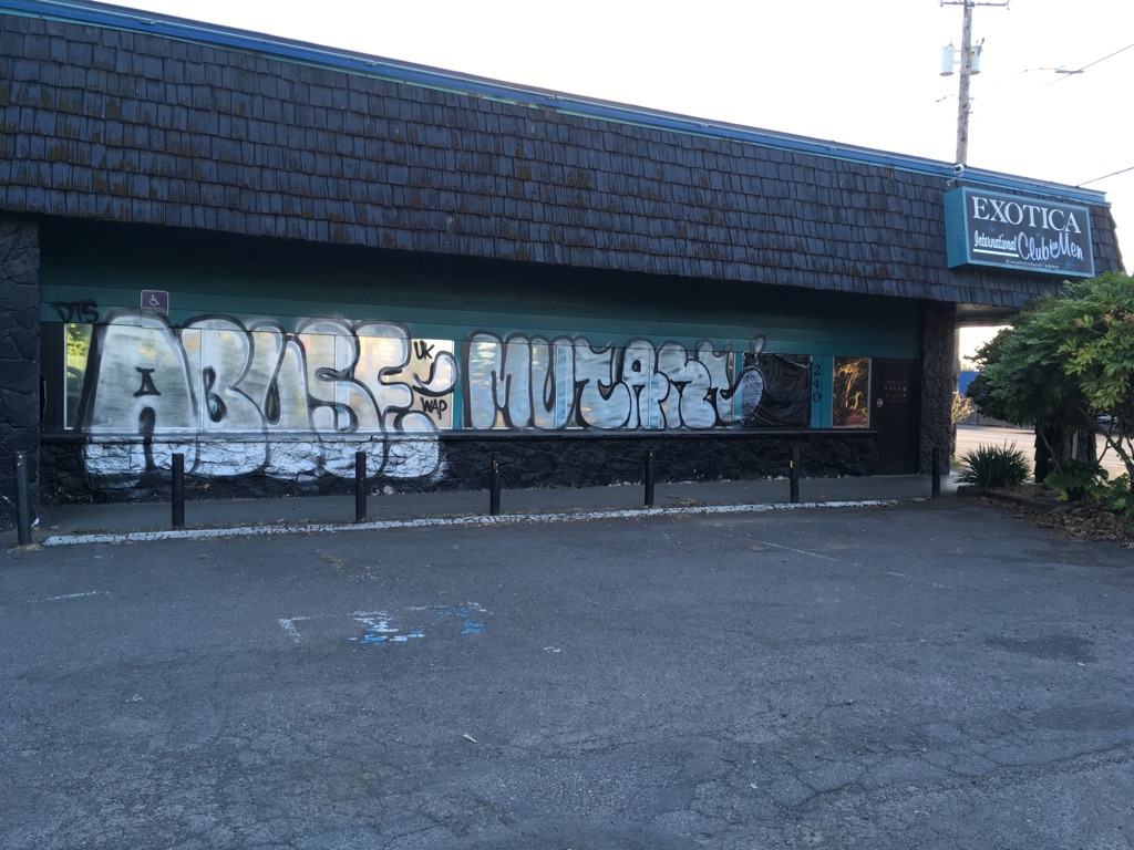
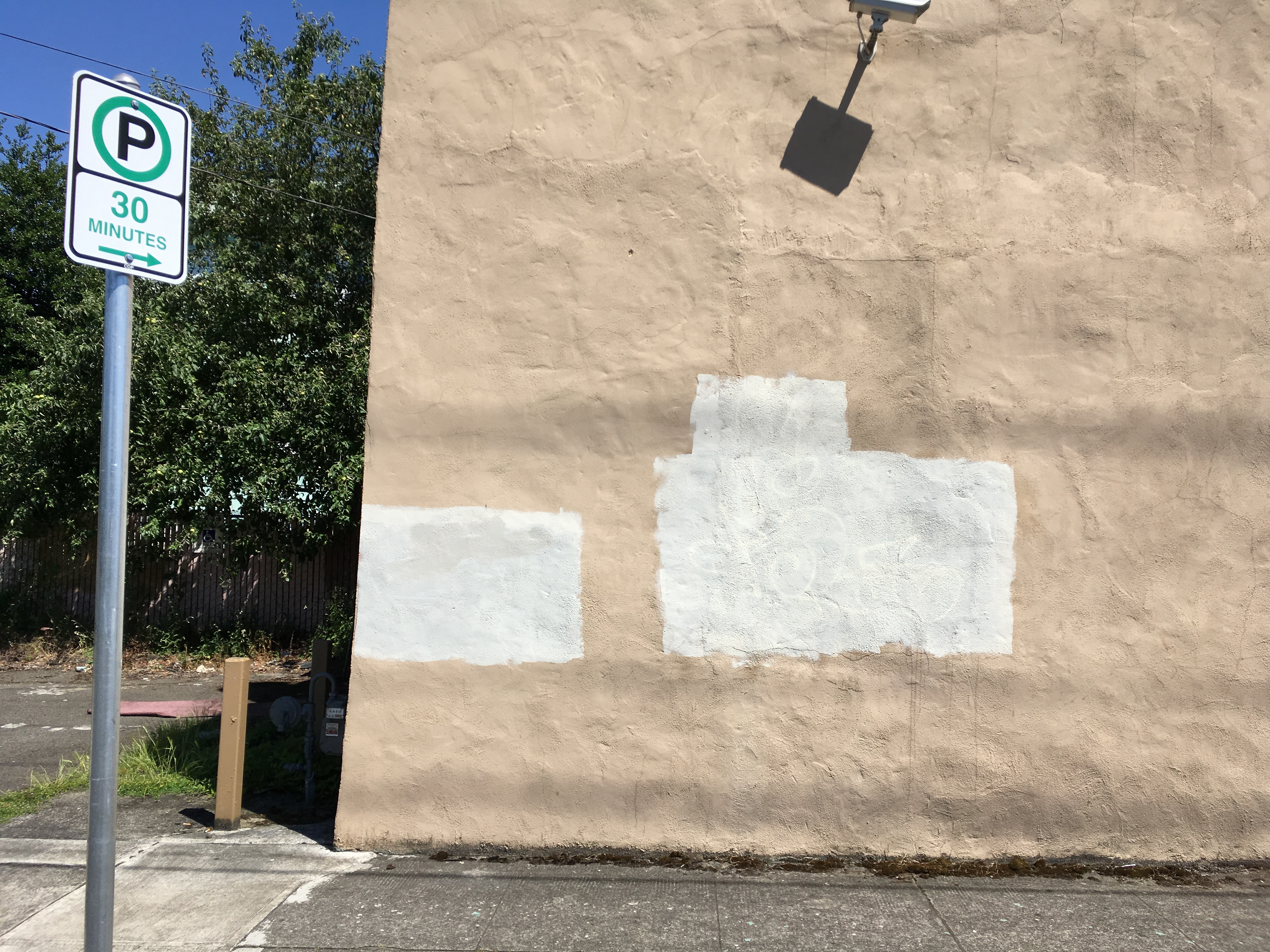
Here’s where I feel the need to offer my typical disclaimer. I come to bury graffiti not to praise it. While a third-rate Shakespeare reference will do nothing to stop this expression, I once again run the risk of glorifying graffiti. Antsi can’t be ignored. The sheer amount of tags, the word it implies and the audacity of some of the locations, especially around I-5, makes me realize that this is, in some way, a special tag that’s due consideration. It will continue in the cycle of spray painting, clean up and more graffiti. Antsi survives by staying ahead of the clean up crew. Meanwhile, additional thoughts on  graffiti will be explored in a second post. My appreciation for graffiti involves unique looking efforts, examples created under death-defying circumstances and tags that makes sense and might carry a message, a challenge when we’re dealing with a lone word.

In a sea of “rafts,” “qwilts,” and “napkn” tags Antsi stands out. The real message may have more to do with my imagination applying meaning. I know the city and highway department have better things to do than cover up graffiti. It is a waste of tax dollars. That money could find better ways to be wasted. For me, it’s become the strange entertainment of obsessing over new tags and spray paint designs on my commute to work. There doesn’t seem much else to experience trodding back and forth with other disillusioned souls. Here’s a few tales about the good times I’ve experienced through the work of Ansti.
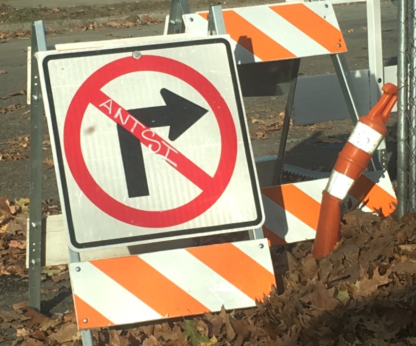
Antsi on a Truck

It’s hard to tell if the owner of this truck gave permission to have his vehicle painted. It seems like there was an opportunity to make the paint job spiffy. It’s apparent that no effort was made to paint over the side panel which allows Antsi an opportunity to have a moving billboard promoting his brand. Not wanting to miss a chance to get this photo, I had to drive down a side street to wait for this truck to pass by.

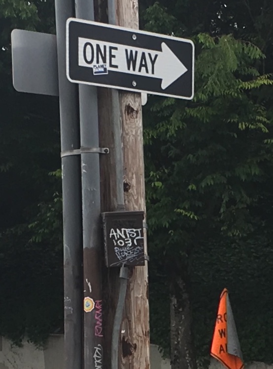
Antsi and the Donut King

I do have to admit to playing with my phone while driving. This was one of these moments where I was hoping to catch an image of the Donut King’s house for a future story. A decent image would save me a trip for more photos. Looking at the image later, I noticed the Antsi tag on a jersey wall in the lower left corner. The red color adds a splash of vibrancy, something different from the usual black and white color scheme.

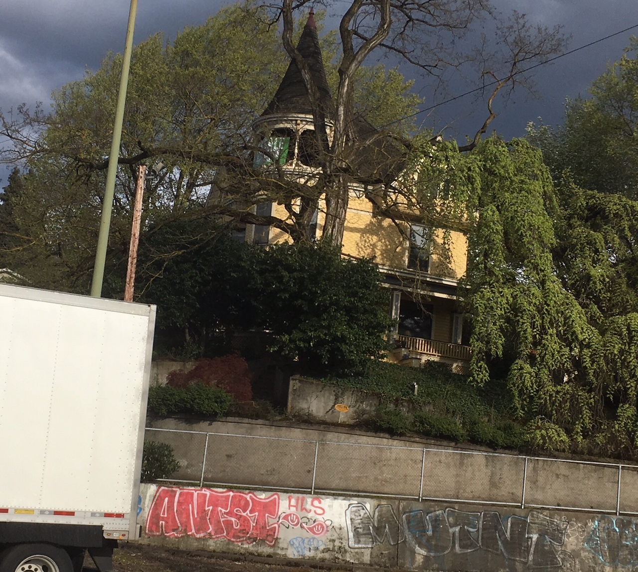
Antsi Tags Portland City Market

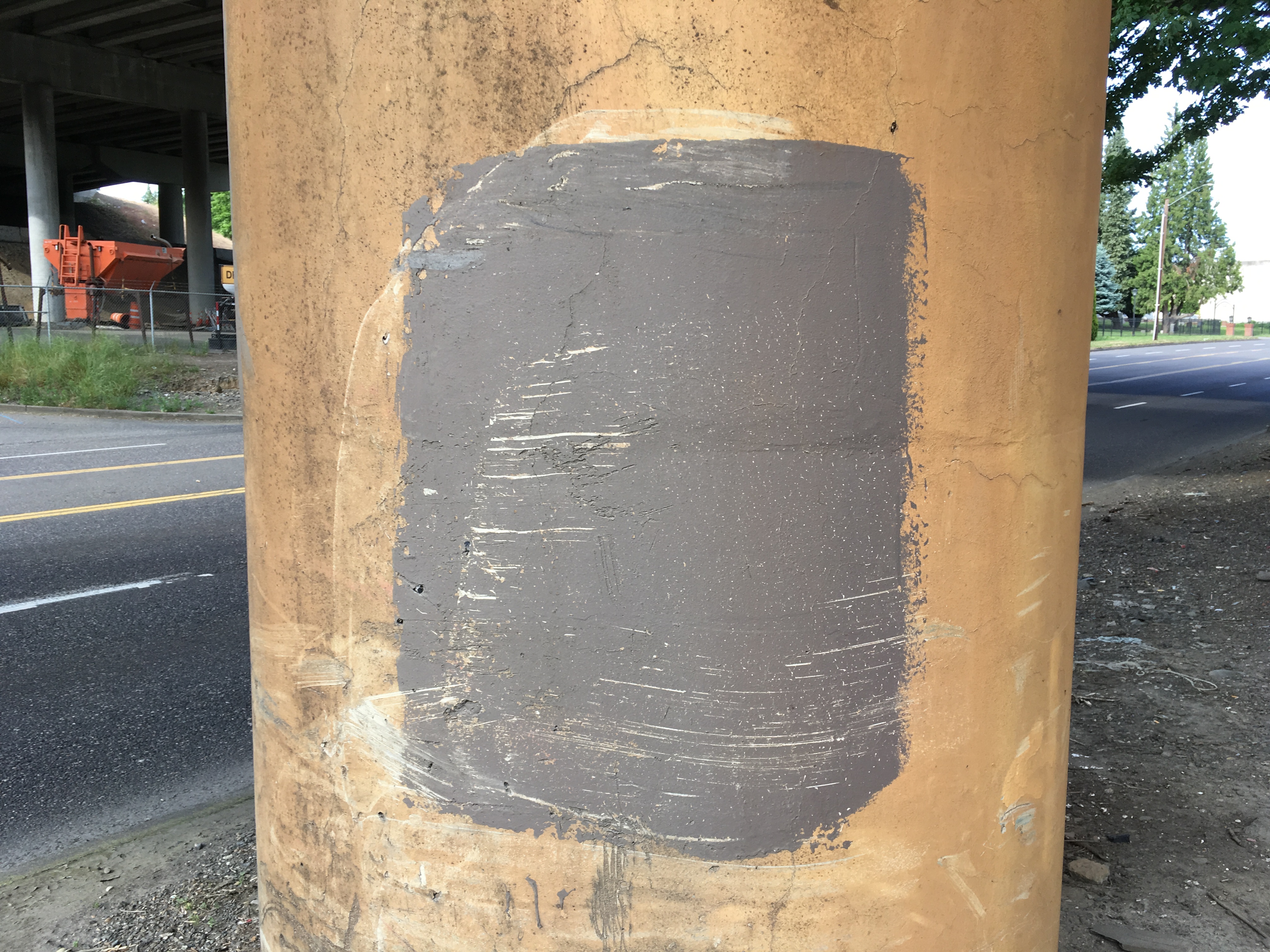
It’s not everyday that you get a sense of the personal experiences that come from someone having their property tagged. I’m writing about this from a memory of a while back based on what I read on Nextdoor. The feeling I recall was pure rage. The business owner had a legitimate complaint about an Antsi tag that appeared when his Lombard Avenue business was in the midst of a renovation. Antsi managed to keep the paint mostly on the temporary plywood.

Stuck on Antsi


In the Albina neighborhood, I may have found the answer to what the Antsi promotion is about: Boasting sticker sales. Going from graffiti to stickering seems like a natural progression with opportunities for cross marketing, double branding or other phenomenons of our current times that mystify me. I’m getting more antsy trying to figure it out.

A Message of Mystery: Graffiti Abuse

abuse-graffiti-nov-3-9

My goal in creating this blog is to document creative pursuits. I’m interested in any form of expression. Graffiti keeps sneaking in as subject matter because it’s everywhere and hard to ignore. I worry that in bringing attention to an art form rooted in vandalism, I’m encouraging these efforts, but really, it’s hard to imagine anything that could stop it. The more I live with graffiti and see examples of it that I appreciate, the more tolerant I become.

I’m partial to graffiti that’s clear and easy to understand whether it’s in legible lettering or words that make sense. If you’re dropping Cy Twombly-like scribbles I end up with a giant question mark in my brain. Letters from the English alphabet allow me to consider the message behind the spray painted designs. Often interpretations are based more on my imagination than anything else.

A case for the Abuse graffiti would start with that word. It’s a powerful word that could mean anything depending on the context. Abuse graffiti is usually paired with a second word that compounds the message. The lettering, big, bold and round, is hard to miss. The message seems be spotlighting the world’s wrongs.

abuse-graffiti-nov-9

Words like deep, mutant and “antsi,” a play on the word antsy, maybe?, add a layer of mystery. These feel like brief poetic phrases that point to an underlying unease. I find it refreshing. Give me something to think about graffiti artists! If you want to shout, get to it. Wake me up with your message and watch me wax Walt Whitman style! These efforts are also appreciated for keeping it clean, not that there’s that much profanity in the graffiti I see.

abuse-graffiti-nov-9-copy

The abuse graffiti tends to be done in a large format. That takes space and explains why one paint job hijacked a billboard. This earned points for effort and climbing skills. Billboard advertising is often annoying so a bit of “abuse” breaks up the monotony. I noticed the billboard was advertising a health care program. This led me to wonder if our artist is making a political statement or if the billboard represented an opportunistic canvas with better visibility.

abuse-graffiti-nov-2-9

Abuse is declared on a variety of surfaces, a fence by the railroad tracks that run along Lombard/Hwy 30, an old warehouse building, another feat of daring in what looks like a medium other than spray paint and the one that bummed me out, the Exotica Strip Club. It was reported (can the Portland Orbit use that word?) on this blog that Exotica was planning to reopen after some renovation. A giant splash of paint, no matter how decorative or even intriguing, is sure to delay those efforts.

abuse-graffiti-nov-1-9

In the end depictions of abuse, however intended, can be found graffiti style for those observant folks drawn to street art. Sometimes it’s in more prominent places while other times you have to look for it on the other side of the tracks. Someone out there has a message. The need for people to express themselves against a dark force like abuse gives power to art in any form it takes.


The Color Field Cover-Up

Admittedly this idea is borrowed or maybe a better word is inspired, by a September 2015 piece in the Pittsburgh Orbit about abstract art that had been described in the post:

“created and maintained as a joint effort between some number of indefatigable spray paint-wielding taggers and what we imagine is a combination of city D.P.W. (Department of Public Works) ‘graffiti busters’ and concerned citizens taking matters into their own hands.”

IMG_7927

No. 2  (St. Johns Coffee Shop)

From that post, I recognized the local angle of the Rothko style graffiti cover-up. Mark Rothko, the abstract expressionist painter, lived in Portland during his youth. Not to make light or be too simplistic, but it seems like growing up with Portland’s dreary rainy season weather could have contributed to the depression he suffered in his life.

IMG_7940

No. 6  ( Upholstery Shop, Lombard St.)

Finding out that Rothko attended Lincoln High School blew me away. When I consider a couple of other graduates including voice artist Mel Blanc of Bugs Bunny, Daffy Duck and many other Warner Bros cartoon characters fame and Simpson’s creator Matt Groenig; they represent a hallowed trinity of creative geniuses. These guys make me think there’s a force field within the walls of the school or a hyperbolic chamber there that shaped these minds. This theory begs for more research and a separate blog post. It might also get me arrested if I were to wander into the school unannounced, spouting such theories and making demands to complete my research by being directed to the genius chamber. This trinity idea, and in the creative world I consider it holy, may be thwarted by the possibility that there may be even more famous and weirder Lincoln graduates which would create a new theory about something being in the water from the drinking fountains creating the possibility of my being arrested multiple times for trespassing to drink from these fountains. These days you don’t want to drink from any fountain in a Portland Public School due to impending lead testing.

lead testing
Get the lead out!

Field est

Color Fields in action.

fielde with extra

No. 13 (Peninsular Ave)

My aim is to acknowledge an accidental Rothko homage in a technique used to cover up graffiti that’s seen all over town. Big blotchy splotches with features from Rothko’s color field paintings are painted on building walls and under overpasses. They don’t measure up to the abstract expressionism work of Rothko, but they could be considered elementary renditions if a bit of imagination were employed. This coincidental connection is a way of honoring a man that Portland needs to claim as a favorite son. He did spend his formative years here and received most of his education in Portland before getting the hell out and going to Yale.

Brown field over pass

No. 21 (railroad bridge support, Columbia Blvd next to I-5 overpass)

A block of paint to cover graffiti serves as an accidental nod to Rothko. It’s barely in the ballpark though because it’s rare to see the more dynamic colors Rothko preferred like maroon or orange. Instead we get industrial shades of gray, brown and beige. While I appreciate the efforts to clean up vandalism, I’ve never understood the idea of not using a similar or identical paint color in order to get a less Rothko result.

multiple colorfields

In threes: Color Field, Max Bridge near the Denver Ave. Station

Ultimately, I like these unintended reminders of Rothko. I’m left to wonder if his childhood spent in Portland inspired his art style. When I think of Rothko, Portland and big blocks of paint with sharp edges it all comes full circle.

pole field

No. 28 (Columbia Blvd)

Argyle Colorfield

No. 25 (Concrete Brown, N Argyle St)

View a video edition of this blog post with additional photos: https://youtu.be/Lsi5ZOAOb9c

Oregon Decal Spawn (Part 1)

If we lived in a square state like Colorado or Wyoming an Oregon border style decal would not work. It would look square much like any old frame or square, so it’s amazing how unique and appealing a frame in the shape of the state of Oregon is. Any symbol can be placed within the state border to make a statement that says, “we do this in Oregon.” What’s more it’s a message that suits a decal. If I had not been searching in vain for a Portland Flag decal, I may not have caught on to the decal phenomenon.  My search focused on decals people put on their car windows and bumpers.  I saw many of the green heart within the Oregon border sticker but then noticed variations on this design. Images of golfers, bikes, and sports related designs within the Oregon border cropped up.

Mt Hood Heart of Oregon

The Oregon Decal Grandaddy with Mt. Hood.

I have to believe it starts with the heart of Oregon image. This is by far the most popular Oregon state border decal I’ve seen on cars. I would estimate seeing it on one out of ten cars. It’s like the gateway decal. If someone is going to have one Oregon outline decal it’s at least going to be that image. I even know a guy who had the green heart in Oregon tattooed on his right calf. It’s likely that a decal historian could confirm or disprove my theory that all the rest of the Oregon related decals borrow from the original green heart design. The Portland Orbit crack investigative team researched the wikipedia entry that says the green heart design was created in 2003 which has me hard pressed to imagine that there were other Oregon border designs before then.  I would be happy to accept any information from decal historians out there who can set the record straight. Also any decal statistician would be welcome to set me straight on my one out of ten cars estimate.

The state of Oregon border decals now come in many variations and themes.  The ones I’ve discovered so far and documented consider Oregon and Portland related themes–the stuff we do here. It’s great to see them paired up with local stickers touting the the community radio station KBOO and the St Johns Bridge .

Oregonians Rule decal

Airport Carpet Decal

How can you not get excited about an airport carpet reference.  It wasn’t until all the clamor started about replacing the carpet that I even realized there was such an interest in it or even noticed it and I had been to the airport more than a few times.

A certain mystery lies in exactly what these decals are promoting but put it in the border of the state of Oregon and that has to at least mean it’s an Oregon thing, whatever the thing is.

mystery decal

green decal

Sometimes the decal makes it statement in writing:

wild decal

Other times it’s symbolically obvious that Oregonians are as addicted to their coffee as any other member of any of the other states in this union.

coffee cup decal

I’m loving the sports references.  Portland teams are Oregon’s teams so seems to say this one:

Timbers decal

Go Timbers!

UofO

The University of Oregon has a design which makes me wonder what aspect of U of O life the one below represents:

pink U of O decal

Who cares! It’s colorful, cool and small for some reason.

Then there are the flat out promotional decals doing it in the Oregon border style:

Powell's Decal

   kombucha decal (1)

This one struck me as the most beautiful with it’s quivering border outline, faded heart and wood grain.  It shouts, “I love wood working in Oregon, plenty of trees, great lumber” etc…

wood decal

If you haven’t seen enough Oregon border decal inspirations this one proclaims, “I run marathons in Oregon, none less than 26.2 miles thank you.”

26.2 Decal

The REI decal is usually found in basic black, but it wouldn’t be an Portland Orbit post with out a reference to graffiti in some way. So here’s how REI represents with some additional artistic flare.

REI Decal

Note:  Having Part 1 in the title means another onslaught of decal photos is in the plans. I’ve noticed more decals out there that I was not able to photograph either due to being in a hurry or seeing car decals in traffic. Hang tight for more images related to activities like running, golfing, Indian rights and Woman’s soccer as well as more discussion of this decal phenomenon.

Another note: At times I wish these photos had been a bit better but there is only so much you can do with an iPhone 3 under these conditions. Here’s hoping a soon to be acquired macro lens will help the situation.

Scribbles Speak

scribble art 1

I usually eschew graffiti writing it off as noisy scribbles marring the neighborhoods but one sunny Friday afternoon I caught this image and between the shadows, sunlight and even the spray bottle in the window I recognized art! This appeared in the window of The Office on Interstate Ave, a strip club that never seemed to open or operate for long.

scribbe art 2