Pole Art 2

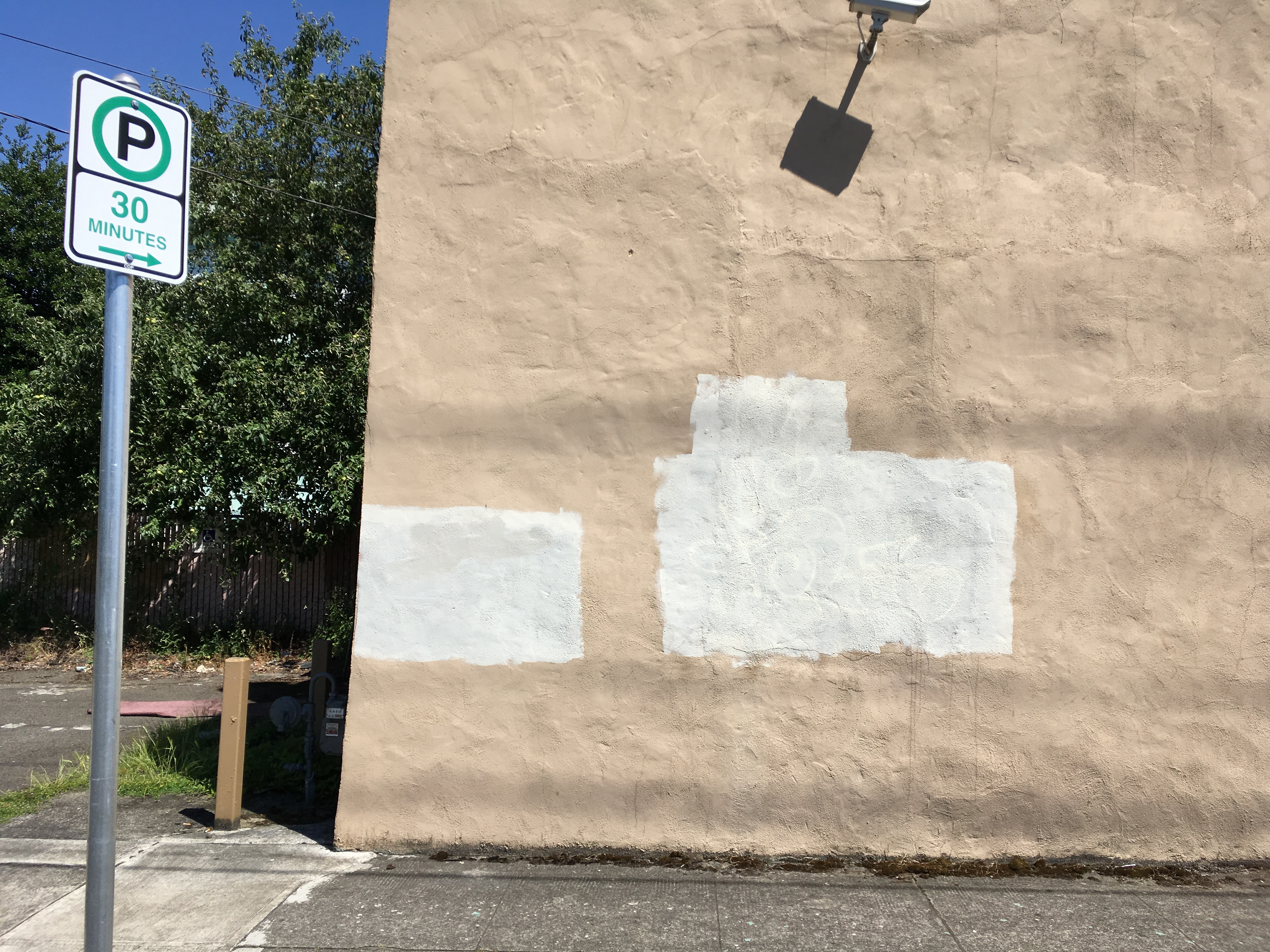
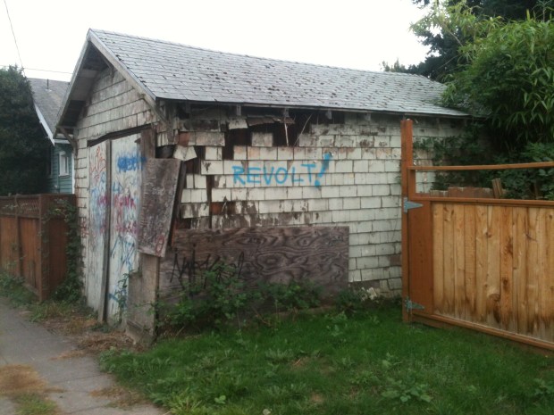
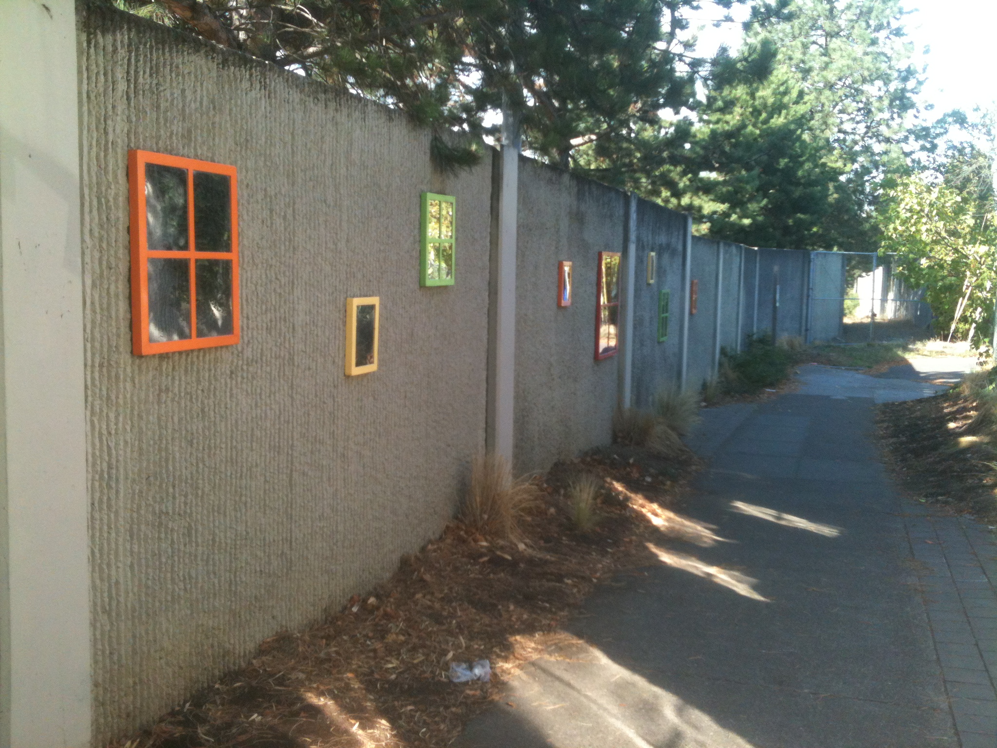
Anonymous artists are at work adding pizazz to mundane telephone and electrical poles. These adornments are sometimes subtle and unnoticeable. There is a fine line between Pole Art and Pole Decoration. If a pole is decorated in an artistic way then surely it should be elevated to Pole Art status. It’s as if a committee of scholars and experts is needed to conference at a Holiday Inn somewhere next to an airport to make Pole Art status determinations and establish Pole Art guidelines.

IMG_0737

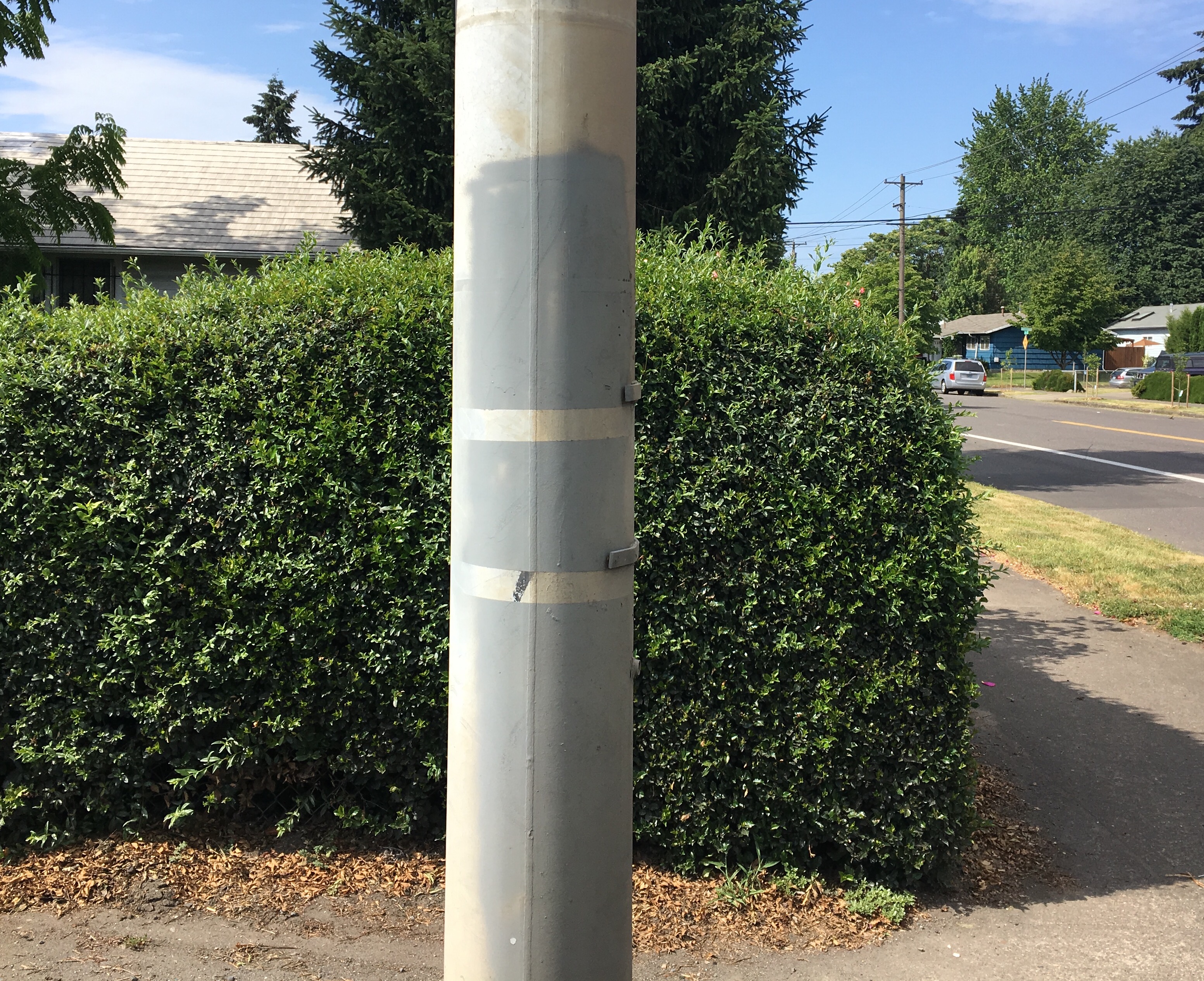
Strands of clear tape slapped on a pole dance in a breeze. Poles become small scale bill boards for a variety of expression. Eventually whatever use the tape served morphed into weathered abstract sculpture.

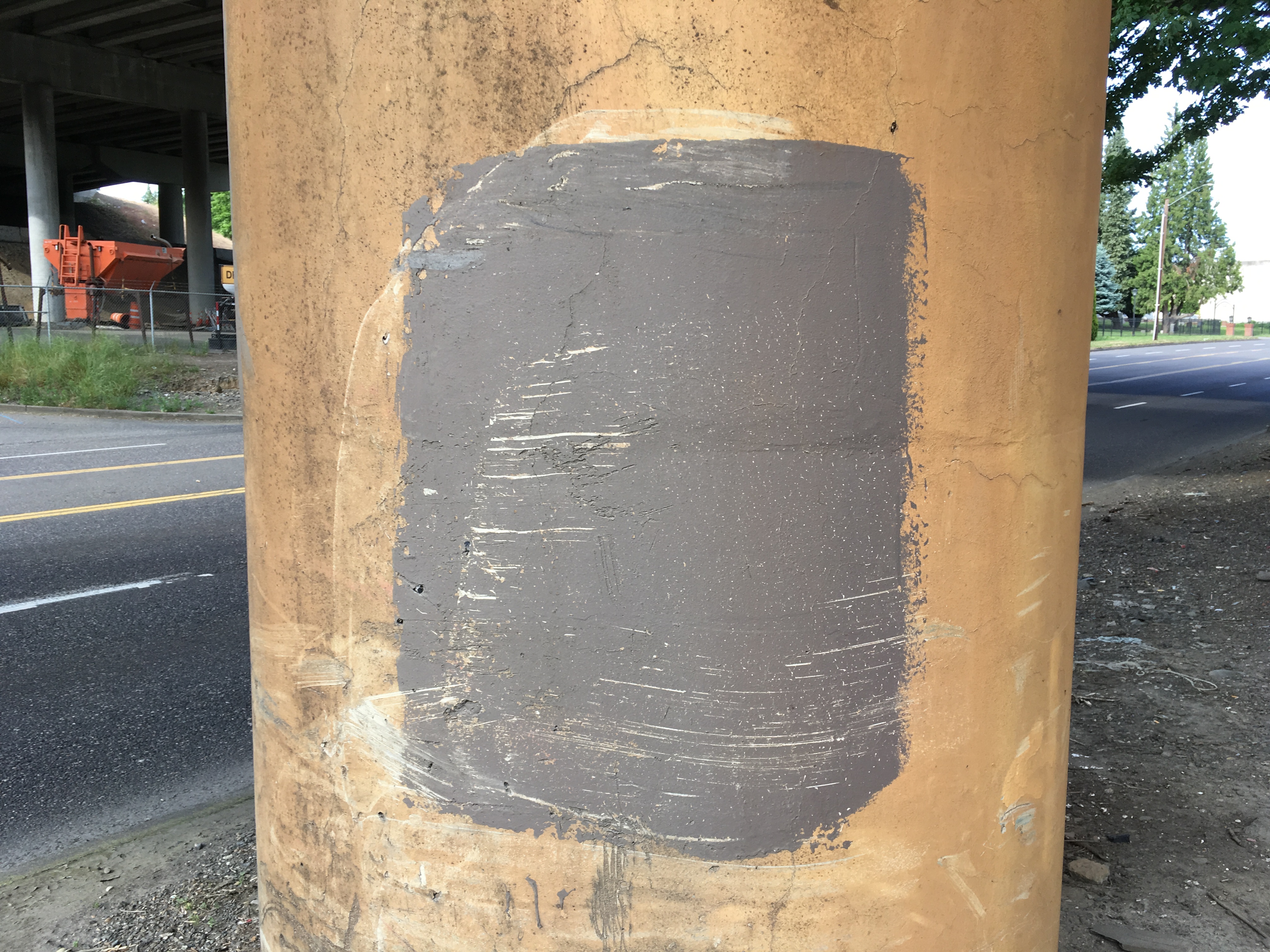
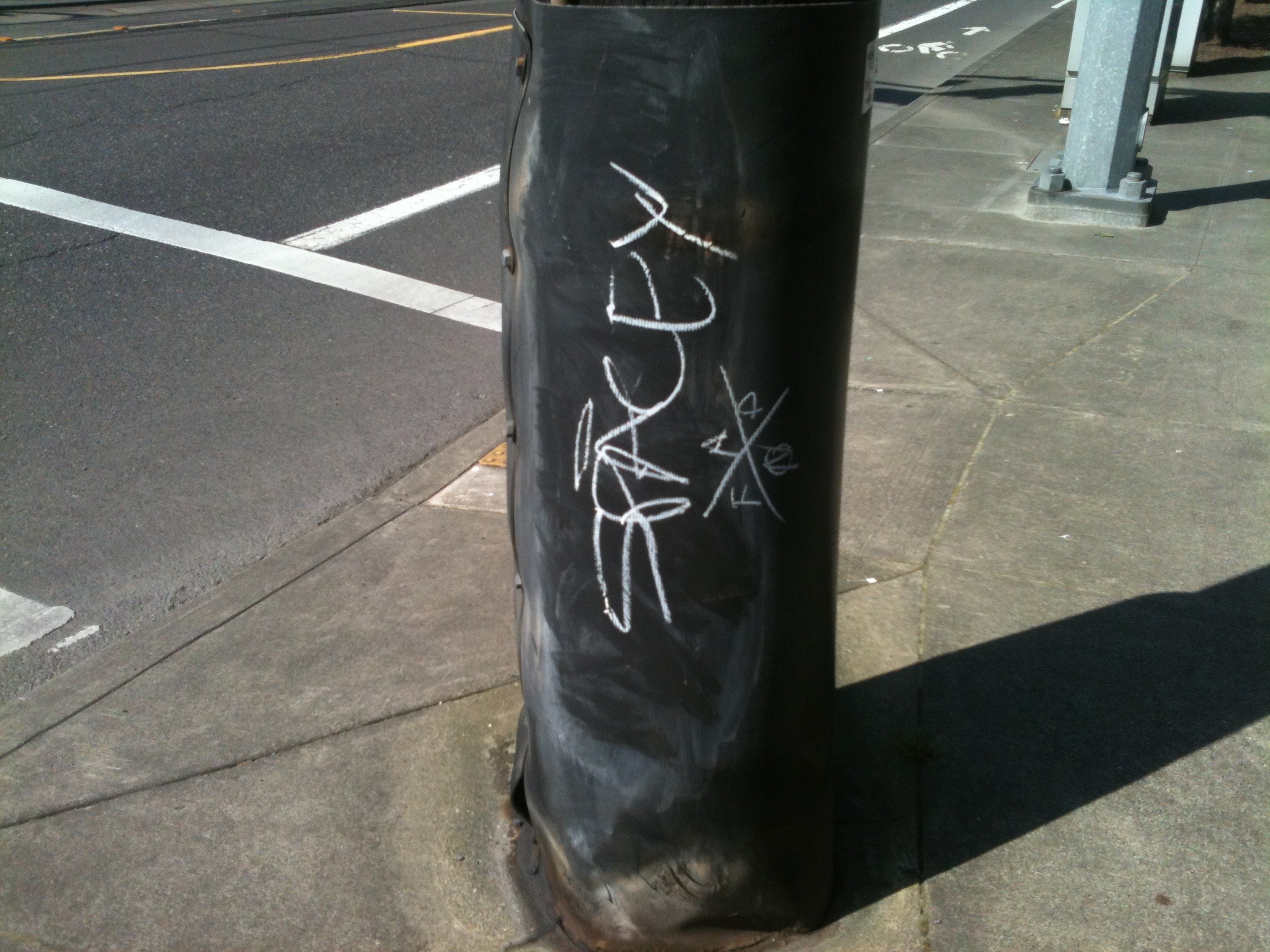
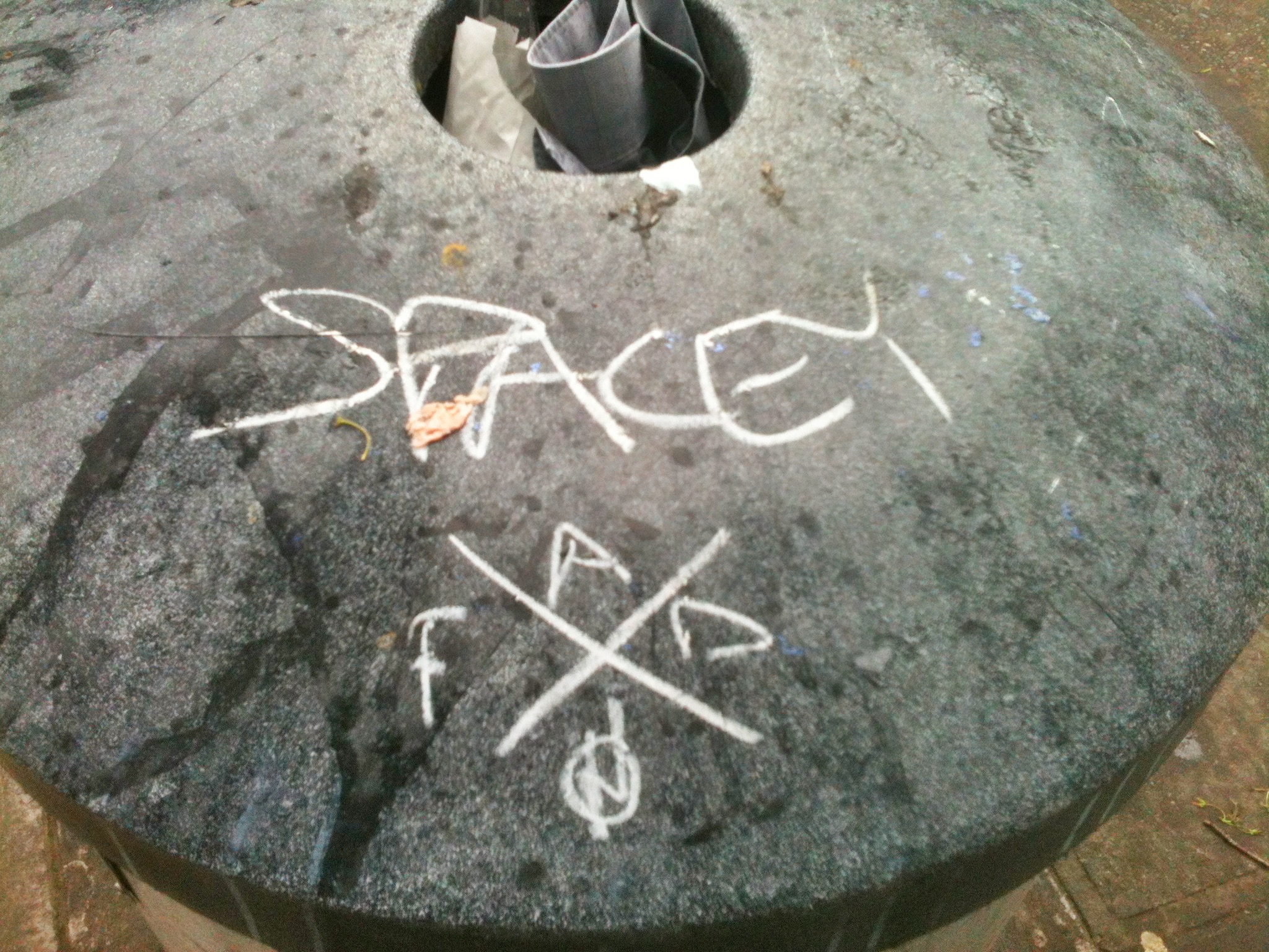
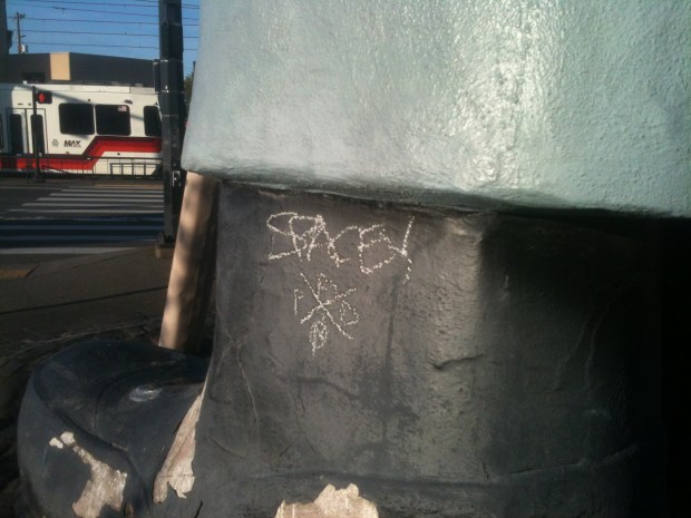
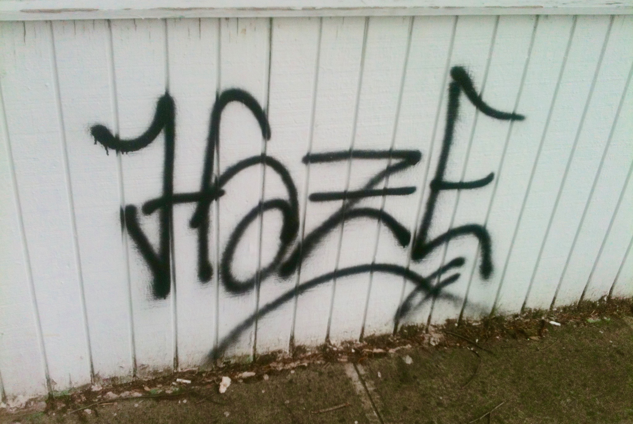
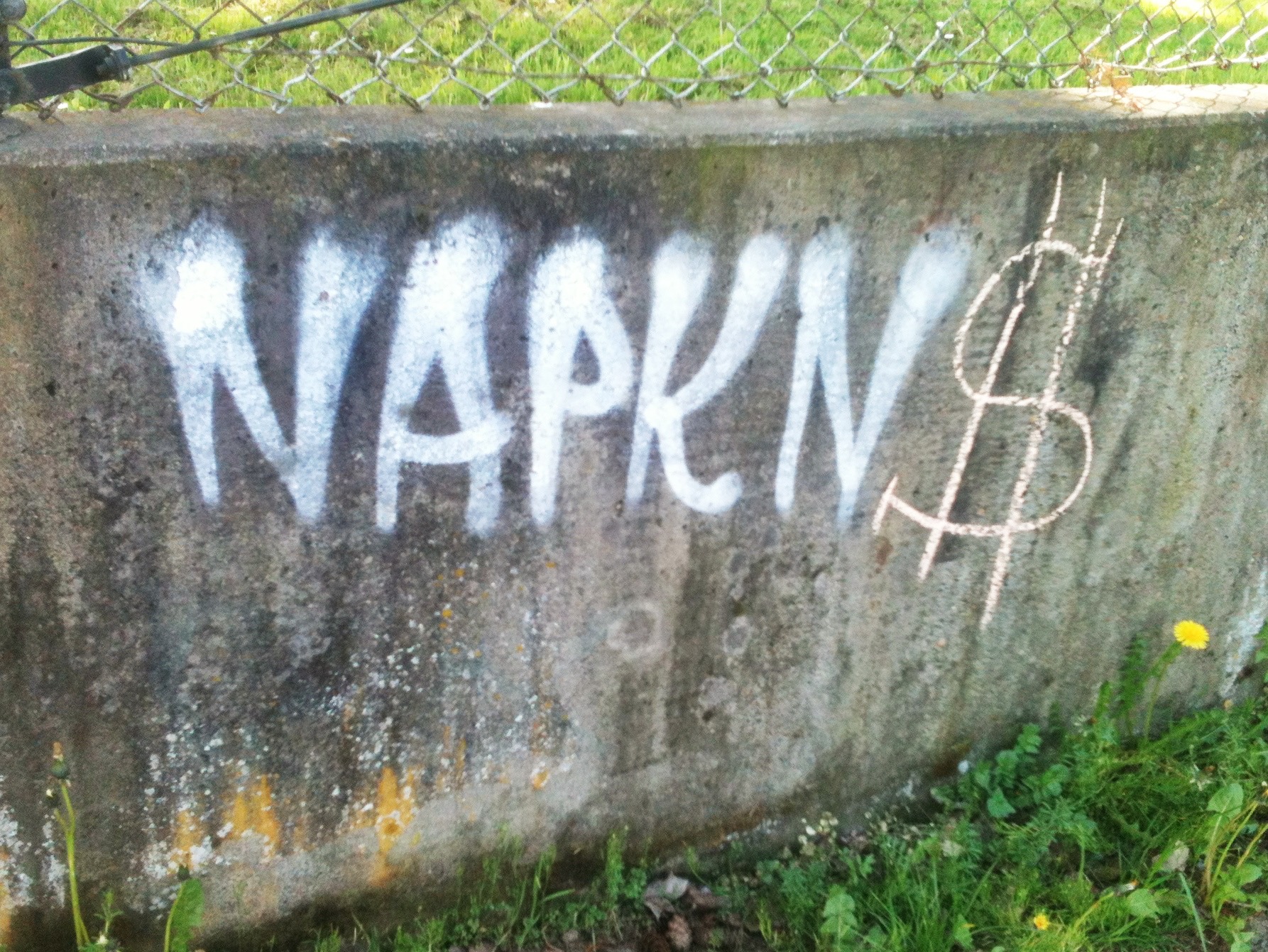
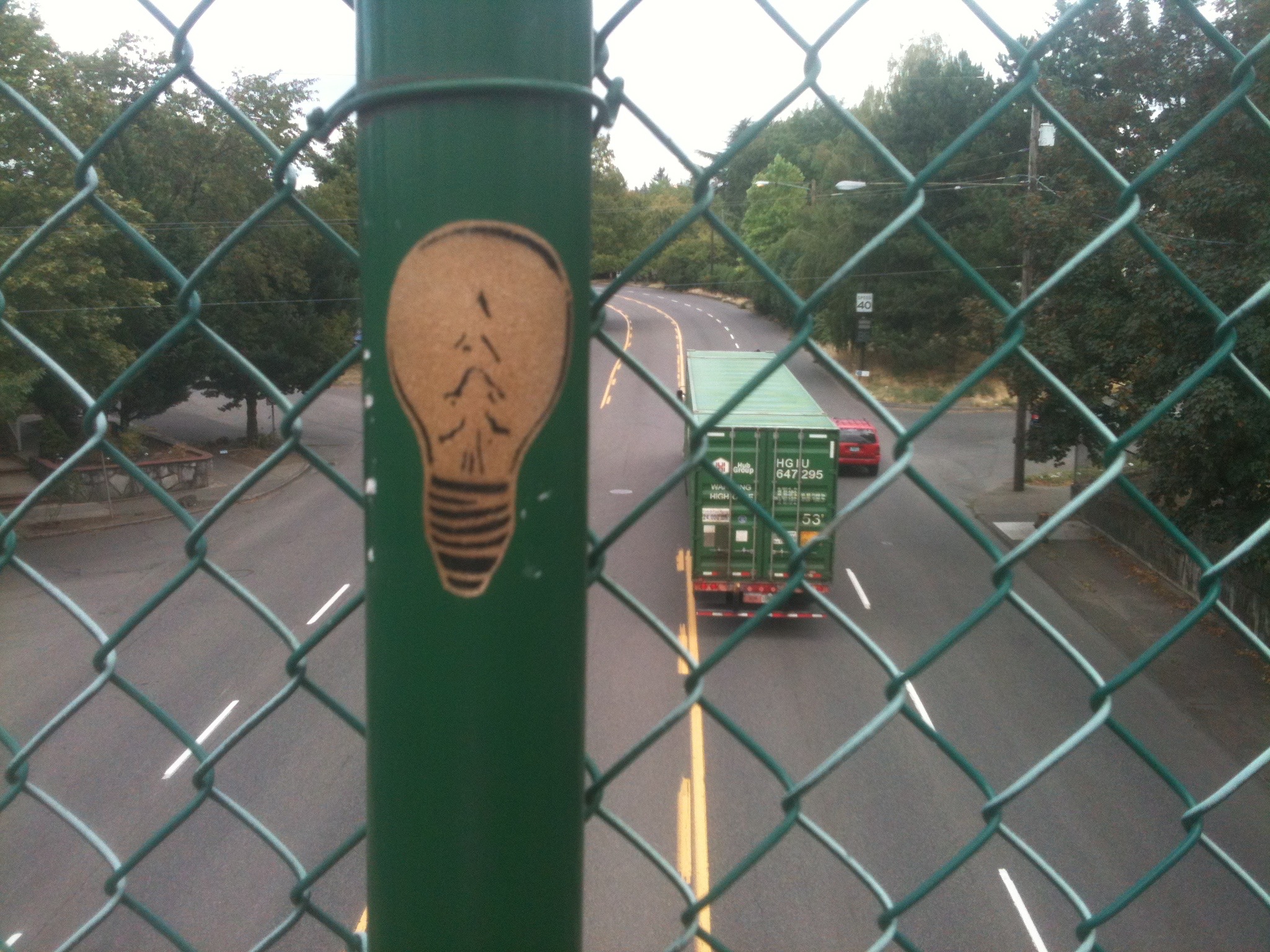
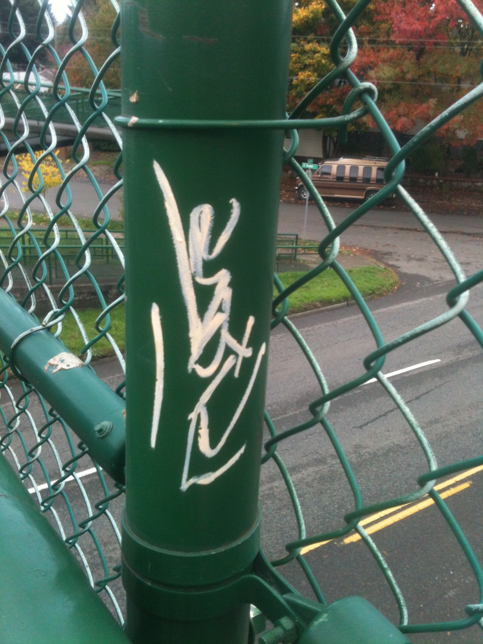
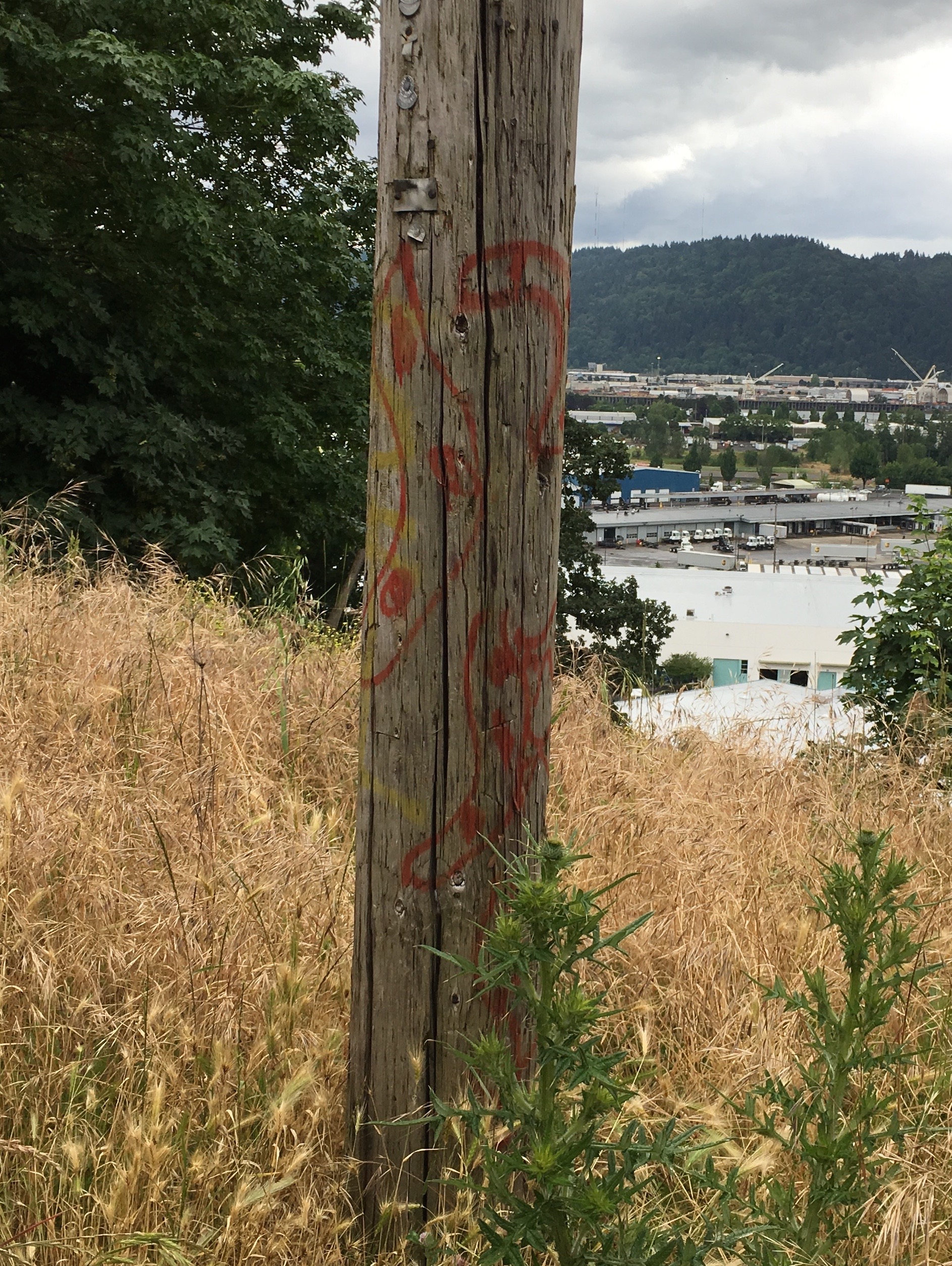
Some pole artists take it upon themselves to spray paint directly on to the pole.

IMG_0878

This redundant replication of the speed limit seems to over emphasize the need to slow down.

IMG_0879

Spray paint creates half-assed designs resembling bananas that, at least in the past, could be seen being unloaded on Swan Island below. Pole Art can and will imitate life at times.

IMG_0269

Electrical looking crap, for lack of a better word, left on a pole on Lombard St. can look artistic in its own right. Giving it the old black and white will help it to resemble art.

IMG_0269 (1)

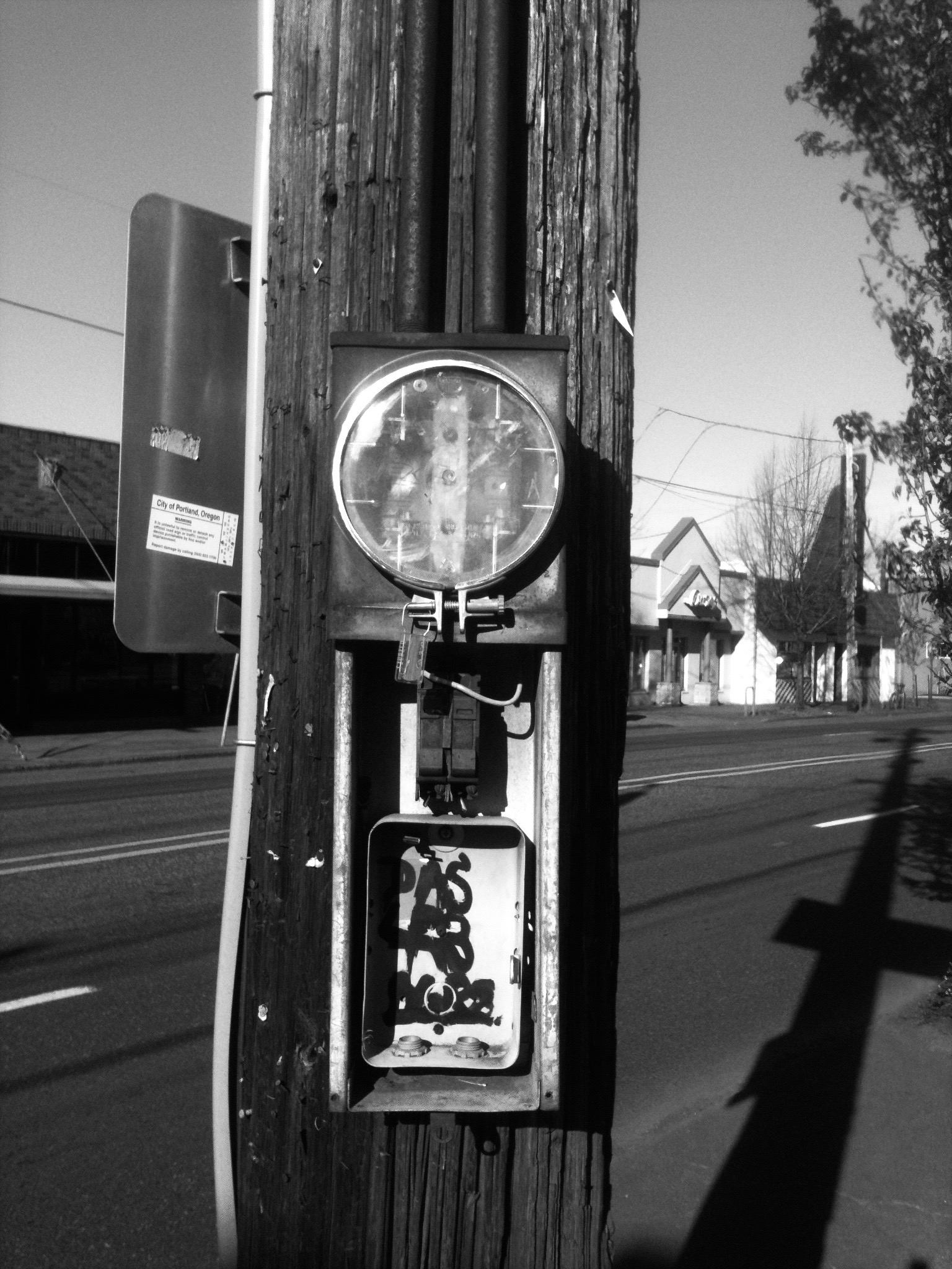
Black and white photography is key to making pole decor artistic.

IMG_0952

Pole step hangings have a sub genre feel in the Pole Art movement being more decoration than true art. It is an easy way to spice up a pole. All it takes is the right object to hang. The Pole Art Definition Committee will spend many days and possibly nights in the hotel bar perfecting the exact language necessary to distinguish Pole Art from Pole Step Art.

IMG_0948

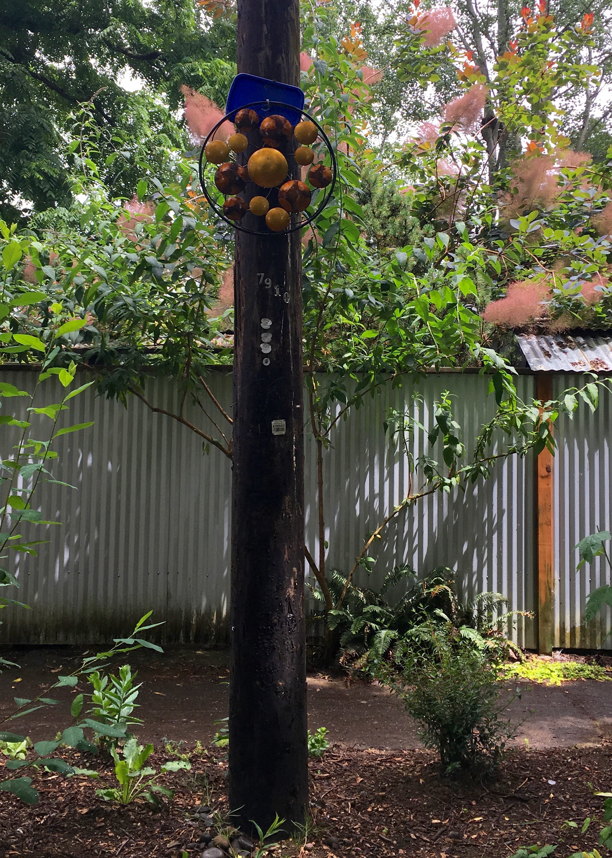
I am curious about who gets inspired to hang Pole Step Art. The question isn’t necessarily “why” so much as “why not?” Is it one neighbor doing all the hanging or is it contagious in the neighborhood in that cliched “Keeping Up With the Joneses” way? Is it all about finding the perfect hangable object that would look exactly right on a pole step rather than inside a house on a wall? Only the neighbors on N. Dana Ave. know for sure.

Would you believe there’s enough Pole Art documentation for a sequel to this blog post? Sorry to cut you off from this fascinating Pole Art world and send you back to reality. We’ll give it a rest but you can bet that someday you will barely be able to believe your eyes when you’re reading a blog post entitled Pole Art 3.

In the meantime I hope this Portland Orbit Report on Pole Art will suffice. Click here: https://www.youtube.com/watch?v=2jmz2zdqKPE


The Color Field Cover-Up

Admittedly this idea is borrowed or maybe a better word is inspired, by a September 2015 piece in the Pittsburgh Orbit about abstract art that had been described in the post:

“created and maintained as a joint effort between some number of indefatigable spray paint-wielding taggers and what we imagine is a combination of city D.P.W. (Department of Public Works) ‘graffiti busters’ and concerned citizens taking matters into their own hands.”

IMG_7927

No. 2  (St. Johns Coffee Shop)

From that post, I recognized the local angle of the Rothko style graffiti cover-up. Mark Rothko, the abstract expressionist painter, lived in Portland during his youth. Not to make light or be too simplistic, but it seems like growing up with Portland’s dreary rainy season weather could have contributed to the depression he suffered in his life.

IMG_7940

No. 6  ( Upholstery Shop, Lombard St.)

Finding out that Rothko attended Lincoln High School blew me away. When I consider a couple of other graduates including voice artist Mel Blanc of Bugs Bunny, Daffy Duck and many other Warner Bros cartoon characters fame and Simpson’s creator Matt Groenig; they represent a hallowed trinity of creative geniuses. These guys make me think there’s a force field within the walls of the school or a hyperbolic chamber there that shaped these minds. This theory begs for more research and a separate blog post. It might also get me arrested if I were to wander into the school unannounced, spouting such theories and making demands to complete my research by being directed to the genius chamber. This trinity idea, and in the creative world I consider it holy, may be thwarted by the possibility that there may be even more famous and weirder Lincoln graduates which would create a new theory about something being in the water from the drinking fountains creating the possibility of my being arrested multiple times for trespassing to drink from these fountains. These days you don’t want to drink from any fountain in a Portland Public School due to impending lead testing.

lead testing
Get the lead out!

Field est

Color Fields in action.

fielde with extra

No. 13 (Peninsular Ave)

My aim is to acknowledge an accidental Rothko homage in a technique used to cover up graffiti that’s seen all over town. Big blotchy splotches with features from Rothko’s color field paintings are painted on building walls and under overpasses. They don’t measure up to the abstract expressionism work of Rothko, but they could be considered elementary renditions if a bit of imagination were employed. This coincidental connection is a way of honoring a man that Portland needs to claim as a favorite son. He did spend his formative years here and received most of his education in Portland before getting the hell out and going to Yale.

Brown field over pass

No. 21 (railroad bridge support, Columbia Blvd next to I-5 overpass)

A block of paint to cover graffiti serves as an accidental nod to Rothko. It’s barely in the ballpark though because it’s rare to see the more dynamic colors Rothko preferred like maroon or orange. Instead we get industrial shades of gray, brown and beige. While I appreciate the efforts to clean up vandalism, I’ve never understood the idea of not using a similar or identical paint color in order to get a less Rothko result.

multiple colorfields

In threes: Color Field, Max Bridge near the Denver Ave. Station

Ultimately, I like these unintended reminders of Rothko. I’m left to wonder if his childhood spent in Portland inspired his art style. When I think of Rothko, Portland and big blocks of paint with sharp edges it all comes full circle.

pole field

No. 28 (Columbia Blvd)

Argyle Colorfield

No. 25 (Concrete Brown, N Argyle St)

View a video edition of this blog post with additional photos: https://youtu.be/Lsi5ZOAOb9c

The Spacey Napkn Haze

  IMG_7579

Spacey hit the town with a mad dash, autograph rage, tagging everything in his wake. He left his name to carry on. What a handle! That’s what they used to call a nickname during the CB radio craze of the late ‘70’s. My appreciation for the name Spacey comes from liking the song “Lazy, Hazy, Spacey” by Charlie McAlister.* It’s easy to imagine Spacey, lost in a cloud, spray paint fumes buzzing, improvised blank urban surface canvas crying out for his name. Spacey should prove to remain as anonymous to the world as this blog may be to him. It seems innocuous enough, but it’s disappointing to see a neighbor have to deal with this name writing rampage.

IMG_7596

Spacey splashed a homeowner’s wooden gate which made the crime hit closer to home. It feels like a waste of time and money for anyone who doesn’t want to display the grandeur of his name to have to clean it off their property. In the end we all pay when Spacey goes on a tear. It’s advertising for a product that doesn’t exist and no one really needs. We get the Spacey brand on top of a garbage can. On those blocky, utility boxes, the Spacey name attempts to liven up the industrial gray paint job. There’s no escape from visual clutter. I’m getting eyeball fatigue from the constant name drop.

Spacey on Paul

IMG_7589

Yet, Spacey isn’t as bothersome as the Napkn graffiti. It’s obvious that Napkin, without the letter I, is still napkin. So it’s not enough that this has to be written all over the Interstate Business Corridor and in the Kenton neighborhood in capital, white letters. While Spacey conjures whimsical visions of astronauts floating in the solar system a napkin is what you wipe your face with when you have a chicken dinner. It lacks street cred. The misspelling or weird spelling doesn’t bother me when my mind automatically fills in the missing letter. As a tag it’s not bad assed and it lacks Spacey’s cool factor.

IMG_7590

Haze Mustard

Haze New Seasons Gray

While working up this blog post, I discovered that Haze had tagged the Interstate New Seasons and a nearby Chinese restaurant. There are times when I consider that if vandals hit a business resources are available to take care of the clean up effort and that puts my mind at ease, a bit. The mysterious color of the New Seasons, is it yellow, green or mustard?, must have proven an irresistible backdrop for Haze. I was puzzled by the change in script but impressed with an ability to carry multiple colors of spray paint. There are some flexible chops at work here with the ability to deal with encountering a white building.

Haze wide (1)

Haze restaurant (1)

It all had me daydreaming about Spacey and Haze starting an intergalactic, multiracial hip hop group. Napkn could lug around the turntable. Or better yet I don’t think you could find a better name for a marijuana dispensary than Spacey Haze. It’s time to go legit. The advertising campaign is in full gear.

IMG_7595


Post Script: Since these pictures were taken two of the Napkn tags have been removed.

IMG_7593

NAPKN tag  and chalk $ sign, added latter, have been removed from this cement wall.

See a Portland Orbit Report video based on this blog post.

*Actual name of the song is “Lazy. Spacy. Hasty. Crazy.” It’s from the Flannel Banjo release titled I’m Wounded I Don’t Think So.

Quotable Graffiti

I like graffiti that makes a statement. If I can get a literary reference out of the deal I’m more than half way home. It’s juicy to chew on some thought while experiencing rampant vandalism. It’s feels like a pyrrhic victory.

So It Goes.

IMG_6641

Off the top of my head I can’t tell you the book but I know this slogan appeared in a Kurt Vonnegut novel. I know this even without having read his books since my teenage years, because he used the phrase often in the book. Seeing it on this traffic warning sign is oddly comforting. I’m not sure how it relates to the cul-de-sac being sealed off by the guard rail, but it feels like a vague philosophy of life, especially if you spend any time in the area that surrounds Columbia Blvd. A quick internet consultation revealed that the line is from the book Slaughterhouse Five and that the saying relates to existentialism, one of the greatest of all the “isms,” next to bagism of course.

http://www.enotes.com/homework-help/why-does-author-continually-use-quot-goes-quot-9991

Anger is an energy.

IMG_6909

IMG_7140

How great does it get to look across Columbia Blvd and see a Johnny Lydon lyric from the PIL song Rise spray painted on the trailer of a semi-truck?—that being a rhetorical question, I don’t expect an answer, but I have to say I find it oddly inspiring. The rig seems inoperable or I would find even more inspiration in imagining this semi traveling across the country giving people in traffic a chance to read and contemplate Lydon’s words. For now it’s a message tucked away that I peek at when I’m heading down Columbia Blvd.

https://www.youtube.com/watch?v=zN-GGeNPQEg

Revolt!

IMG_6535

IMG_6536

Not necessarily a specific quote from anyone besides the odd rebellious peasant or serf from back in the day, this plain message spoke to me. I found it somehow ironic to be plastered on the side of a crumbling shed. The exclamation point is a nice touch. Seeing this enroute to Woodlawn Elementary School, I had to wonder if it was giving the kids any ideas. I found comfort in knowing that they’re not that organized.

Fight War Not Wars

Fight War 2

Photo by Ronna Craig

This message jumped out on us in the dark of night down by the frog wetlands past Linnton. It sure seems to be the kind of quote that I would liked to have heard from Gandhi or Martin Luther King Jr or at the very least Muhammad Ali. After finding out it’s from a Crass song it makes more sense as a punk sentiment. Having anything to do with fighting could hardly be related to a message of nonviolence. It’s enough of a song or slogan to inspire legible train graffiti. Considering words on trains made me wonder why freight cars are never employed as a means of being moving billboards. It could only have something to do with trainspotting never really catching on.

A Bridge To Nowhere, Almost

bridge 2 (1)

Living in a city surrounded by two rivers, bridges are a necessity. It’s possible that we may not have enough bridges, at least to keep traffic moving. I found myself considering a bridge over N Columbia Blvd. more than I ever thought necessary.

bridge 1 (2)

Hours in the dark room pay off.

It’s a foot bridge really, although the ramps that go up three levels make it fun to ride a bike over. After substitute teaching in the area and crossing the bridge a few times I realized it was unnecessary for me to use, especially going home, as I still had to cross back over a four lane road. On my way to the job it made more sense to ride with traffic and use caution when crossing the road. N Columbia Blvd. is the thoroughfare for our northern industrial zone so there’s major truck traffic hurling and screaming back and forth to and from an industrial park at St. Johns. It also feels like a foggy section of town with giant trees and perpetual mist as if from one of those Twilight movies. These hazards and the barreling semi-trucks make it necessary to provide children with a safe way to cross the street to get to the middle school on the other side.

IMG_6441
What color do you paint a bridge?

When I used the bridge I took note of its dark forest green color. Let’s face it, it is a nice shade of green. I have no idea who decided or even has to think about what color any bridge should be but they nailed it. It looks great in any weather, sunlight or foggy, gray dawn mist. Surely something that has to be considered, visibility factors, current trends or stylishness when picking a foot bridge color. The ramps take some pedal power to get up which makes the winding trip down worth it but in the end it takes too long to get up and down, making bike traverses a hassle. I was struck by some tasteful and subtle decor.

IMG_6427

There’s was a nod to Star Wars but not every last character so it’s not overdone. Another screen printed decal featured a microscope. How inspirational would that be for students to get their days started or ended with a reminder of science or maybe a reminder of science homework or a test.

IMG_6439 (1)

IMG_6430

Same goes, in a way, for the light bulb sticker. Ideas might start percolating as people walk up and down these ramps to cross the road. Objects from bygone eras like the old timey microphone have a quaint appeal.

IMG_6436

I returned weeks later to see that some of the decals had peeled off or been peeled off and some less artistic graffiti had cropped up.

IMG_6649

The bridge seems like a fine way to get to school. I can imagine that the bridge will have an impact on the students that use it. They will boast to their own kids someday about how, in their day, they had to walk up three levels of ramps and cross over a treacherous road on a forest green bridge to get to school.

Time for a Treety

I came across this scene on my way back from a sub job one afternoon. There were half a dozen construction worker looking guys in hard hats and safety vest garb standing in the dirt of a lot that had been cleared at N. Morgan and N. Williams Streets. They were tree guys. I looked over at the Redwood trees in the corner of the property and could see that some of the limbs had been cut off. Back on the ground a woman was shaken and yelling. I think it was directed at one of the men. Another woman was walking up the sidewalk. She seemed angry and involved in the scenario. The tree guys were milling around. One of them seemed to be laughing, not a hearty laugh, more like a reaction to an uncomfortable situation. And given this description it’s obvious how things ended. The trees were cut down. I rode past the scene on my bike. I don’t know what else I could have done beyond stopping and watching so I didn’t stop. As I pedaled I noticed a man keeping a silent vigil on the sidewalk around the area. That seemed to be the problem: What could anyone do? The situation made me think of the Jim Morrison story about when he was a kid coming across a car crash with his family. A spoken word piece about the incident later appeared in the middle of the song Peace Frog. There was an intensity: Pissed off ladies, indifferent tree guys and soon to be dead trees. My regret was at least not taking a picture of the living trees. The tense situation caused me to flee.

IMG_6540

It’s possible I had seen some flyers in the neighborhood leading up to the time the trees were cut. There was some mention of organizing to save them. This didn’t happen. It had me thinking about the trees in SE that were saved. TV news coverage ate up the exploits of the man who climbed up the tree to stop the chop. Surrounding neighbors banded together to put up a fight and bring awareness to the plight of the trees. A guy named Arthur Bradford seemed to be a spokesman for the protesters. I had heard that he performed a song about saving the trees at a Disjecta event. In the end it was Bradford’s connection to the world-famous co-creator of South Park who donated money that led to a deal with the developer to save the trees. I appreciated that for once something worked out. The SE trees were a statement that there can be victories for people and nature but Matt Stone can’t save all the trees.

IMG_6595

IMG_6547

Who can save the trees? The Redwoods in the episode I witnessed were massive. I noticed this more after eyeing the giant stumps and logs splayed across the lot. It didn’t make sense that trees located on the corner of the property were cut. With minimal effort the design of a house or houses on the lot could have included these trees. It also seems senseless when you consider the older growth, healthy trees being removed. The Portland nickname of Stumptown is more of a quaint term of endearment than something to continue to live up to.

IMG_6575

IMG_6572

I saw the remnants of the trees for what seemed like a couple of weeks hanging around after they had been cut. It seemed spiteful not to remove the remains as soon as possible. Spray painted messages appeared on the vinyl fencing around the property–anonymous expressions of rage. One tree stump became a makeshift altar. The messages seemed to be too little, too late but at least brought some attention to the loss of these trees.

IMG_6538

I can’t claim to be a tree hugger. But what I witnessed was disconcerting. I can explain it away as Portland growing pains but these are becoming more and more uncomfortable. There has to be a better solution to preserve noble, old trees. To compare the confrontation of the people with the tree cutters to that of the scene that Jim Morrison witnessed as a kid where people had died in a car crash is on the melodramatic side but there was an intensity, an underlying rage to that situation. In Portland people climbed trees and the top of a roof to protest various demolitions. There was also such a doomed energy to what I saw, a helpless feeling in not knowing how to stop the changes to the character of Portland neighborhoods that are happening. I left the confrontation I witness thinking that something needed to be done to make changes that may protect threatened trees in the future. I wondered what mayoral candidate Ted Wheeler would do to save trees. I’d want that concern brought up at a future debate. The regulations now seem to favor developers paying minimal fees when they want to remove a tree. You’ll see me at an upcoming Mayor debate. I’ll have it looking like a Donald Trump rally. I’ll be the crazy standing up and asking, “What are you going to do about all these trees that are getting cut down?” I damn sure better get an answer.

*****

Note to Mrs. Yuchmow:

I think I can justify the use of the word “And” at the beginning of one of my sentences in this post. I know you taught your student Will Simmons of the Pittsburgh Orbit fame not to begin a sentence with the word “And.”  He has explained to me that you also said that good writers break the rules. Let’s just say I’m choosing to breaking the rules here with a somewhat guilty conscience.

P.S. I can imagine the title pun is a bit obnoxious. I couldn’t help myself.

Wall of Mirrors

Bryant St. Bridge

The Bryant St. Bridge is a bike/walking path that crossses I-5. Most afternoons it’s encouraging to ride over it and look down on the freeway traffic jam below. The bridge fence curves to discourage people from leaping onto the highway.

IMG_6297

Not much else happens on the bridge but I did see a couple of Bernie Sanders supporters hanging a Bernie banner in the fencing. For whatever reason the sign was gone the next day.  There were also some traffic counters I spotted decked out in neon vests with each counter assigned a lane. It’s not a busy bridge besides the occasional pedestrian or fellow biker. So it makes sense to reflect on (yes, pun intended) these mirrors that hang from the gray sound barriers.

IMG_6308

I can’t remember when the public art display first appeared. My initial reaction was that the framed mirrors were too cutesy and juvenile in their primary color scheme of red, orange, green and yellow. I rode over the Bryant St. Bridge not too long ago and it hit me that I was dealing with a potential blog post. This meant I needed to consider the mirrors for longer than it took to ride past them. I want them to have some meaning more than being decoration but I’m not sure what it is. I have to admit they do break up the monotonous gray sound barrier walls. Some color, any color brings a bit of excitement to the drab exterior of the industrial wall color. I also realized the mirrors serve to allow me to see oncoming bike traffic around a blind curve while making my exit off the bridge.

Wall of Mirrors 4

While the mirrors attract graffiti, they may in the long run focus vandals attention on a smaller target and keep them from trashing the hard to clean sound barrier stucco walls with spray paint.

Wall of Mirrors3

Grafitti on the mirror not on the wall!

Then there are the strange reflections that you may only experience if you stop and take pictures. If inclined, you can check your look in one of the multiple mirrors that dot the walls. But that’s probably not an incentive to stop a bike ride.

IMG_6300

Strange reflections indeed.

Wall of Mirrors 5

The Office Too

The Office front (1)

I fixated on my last post after receiving feedback about it when I shared a link on the Dead Memories Portland group page on Facebook. I felt the need to expand on my coverage about the Office. Dead Memories Portland is a group where people post pictures of old Portland landmarks and have discussions about them. The responders to my post revealed to me how little research went into my commentary about the Office. There was also information I found out about the place worth sharing that revealed to me that many thriving businesses have operated out of the site where people did everything from buying groceries a long time ago to drinking, playing darts performing stand up comedy and briefly playing punk rock. It was also pointed out that I had completely forgotten the existence of the punk club called Saratoga that opened up between the time the U & I Tavern closed and the Office opened. Saratoga was around long enough for me to procrastinate going there for a couple of months. Some commenters mentioned that one neighbor made numerous noise complaints, which didn’t make it worth it to keep the club going. I had totally forgotten Saratoga. Once my memory cleared, I remembered the place and thought about how I had felt inspired that something cool was occupying the space and I had been hopeful that it would stick around. I remember it being the same maroon color as the old U & I. I never made it there.

One revelation on the Facebook page made me realize how misguided and lazy I had been about the opinions I offered. I speculated at the end of my post that someone may not have liked “the ugliness” going on inside the strip club and so they made it ugly on the outside. For one thing that’s more judgmental than I wanted to be and it’s silly to think that someone who had this opinion would resort to vandalism. At the very least their graffiti might reflect in words the opinions they had rather than your basic graffiti scribbles. As one commentator pointed out the graffiti was a reflection of the lack of activity going on with the space and the opportunity to decorate the “large blank walls.” That makes more sense than my off base speculation. People who don’t like strip clubs, punk clubs or noisy businesses are more apt to call the police or file noise complaints and not likely to break out spray paint.

It probably would have been better to seek information from Dead Memories Portland before I created my initial post. I could have included historical tidbits and written a sidebar about what it was like to perform stand up comedy at an open mic night in the space but I was impatient and wanted to present my opinion more than a feature story about the building. The reason I post links from my blog, in situations that really pertain to dead memories, is an effort to drum up readers. Now how far people actually read before breaking into guffaws–it’s hard to say. In my defense I have to say that I didn’t deliberately distort my memory about the punk club so I could attempt a joke about a bar becoming a strip club. I know I had been more fixated on the plight of the Office last spring when I rode up and down Interstate on my way to a substitute job at a charter school. It made more of an impact when the Office did open because the building received that new paint job so my memory was stuck on U & I becoming the Office. I have figured out that even a bit of rudimentary research might have helped me relieve my own dead memory spots.

A gentleman commented about a history project he did concerning business occupants of Interstate Ave and used the Polk’s Portland City Directories to do kind of a ten year census that revealed that the building was built in 1928 and had been the N. Elliot Grocery Store in 1940, the S.E. Cornell Grocery Store in 1950 the Bru Room Tavern in 1960 and the U & I Tavern in 1970 until 2008. I appreciate dead memories Portland because I’m interested in any historical commentary about anything that has gone on in Portland. When it’s something closer to where I live that I see more often it’s even cooler to get as much speculation along with specific information as I can get. While it’s been a bummer to see the building fall into disrepair it has been uplifting to see a flurry of activity with construction going on inside the building and plumbing trucks being parked outside. There seems to be some effort happening to bring the building back for a chance to serve the community again.

the Office with truck

Follow the comment thread concerning my last post:

https://www.facebook.com/groups/deadmemoriesportland/1132096600152493/?notif_t=like

Rough Day at the Office

The Office est

I wish I could report that the Office is a thriving Interstate corridor business that rewards it’s dedicated clientele with satisfying multi-sensory experiences. This isn’t the case. The Office never quite got off the ground. I’m not sure it ever opened for business. Something was off from the start.

 IMG_6323

Some offices aren’t a good fit, but you don’t figure that out until you’re knee deep in the job. This Office started off with the all too clever and old school name where it sounded like a guy could tell his wife, “Honey, I’m at the Office” when he was actually at a strip club. Would she buy it? Not hardly when he arrived home stinking of gin with his tie askew and lipstick on his collar. If the Office actually opened it seemed like a short time before it closed for business. I watched the progress and lack of progress for this establishment because of the Interstate Ave location. When passing, I never missed a chance to look the place over and wonder about it.

 Rerun life sorry

Before it was known as the Office the building was home to a bar called U & I, again a clever name.  If you’re trying to get people to stop at your business located on a busy street a catchy name seems necessary. U & I was a bar that also had shows. I thought their brilliant move was to have a jam band play an afterparty when The Other Ones, made up of members of the Grateful Dead, performed in town. This didn’t seem to be enough of a business model to keep the place afloat. In came the paint crew who inspired me when I saw them leave behind a snazzy paint job with maroon trim. There’s no other way to make improvements to the boxy exterior. I was curious to see what business would take the place of the bar.

Dick Hennessy

The Office Marquee close up

It wasn’t exactly clear that the Office was a strip club until information was posted on the marquee. I can’t figure out if a strip club replacing a bar is a step up, a lateral move or some kind of devolution. I suppose it wouldn’t matter one way or the other to those who patronize this kind of establishment. Please pardon my conflicted condescension. Portland is full of strip clubs so one more is like icing on the cake that a stripper jumps out of, that is if they still do that these days. I have nothing against strip clubs. I retain a certain pride towards the one in my neighborhood. In the end and the beginning, the marquee never changed. Everyday seemed like an advertisement for Sinfire Sunday. I can get a vicarious thrill imagining being in the midst of DJ Dick Hennessy slabbing down platters for the Summer Strip Off all summer long. Naming an event “Sinfire Sunday” seems like a miraculous means of drumming up Sunday business. Yet again it was strange that I never saw evidence of the place being open. No one entered and dancers never gathered outside in skimpy outfits taking smoke breaks.

IMG_6327

The place stayed dormant until it was attacked. It never recovered from being splashed with graffiti. Some time later the place was spruced and repainted but it didn’t reopen. The Office Too would have been a good name for such a resurrection. It would have offered us the opportunity to witness the triumphant return of DJ Dick Hennessy lofting a crate of 12” records above his head on his way to the DJ booth. How long it stayed clean I can’t say. I never thought to take a picture. It’s not the most photogenic building but it did have an air of class and even pride when it wasn’t awash with spray paint. Once again after it was cleaned up it became a canvas for more graffiti. As I took pictures it hit me: Rough day at the office. It seems to me that somebody had it out for the place. Maybe they didn’t like what they may have considered ugliness going on inside so they sought to add their own ugliness to the outside. Pure speculation on my part, but it leads me to hope for a better day when life, in any form, can return to the Office or whatever name it’s given in it’s next incarnation.

Office painted over

Post Script:

At press time I witnessed a man with a paint roller painting the outside of the building. I would have stopped to take pictures if I hadn’t been running late for work. That afternoon, the result of the labor was a spotty attempt to cover up graffiti. I have seen evidence of interior work being done to the inside of the Office. Keep reading the Portland Orbit for updates.

Oregon Decal Spawn (Part 1)

If we lived in a square state like Colorado or Wyoming an Oregon border style decal would not work. It would look square much like any old frame or square, so it’s amazing how unique and appealing a frame in the shape of the state of Oregon is. Any symbol can be placed within the state border to make a statement that says, “we do this in Oregon.” What’s more it’s a message that suits a decal. If I had not been searching in vain for a Portland Flag decal, I may not have caught on to the decal phenomenon.  My search focused on decals people put on their car windows and bumpers.  I saw many of the green heart within the Oregon border sticker but then noticed variations on this design. Images of golfers, bikes, and sports related designs within the Oregon border cropped up.

Mt Hood Heart of Oregon

The Oregon Decal Grandaddy with Mt. Hood.

I have to believe it starts with the heart of Oregon image. This is by far the most popular Oregon state border decal I’ve seen on cars. I would estimate seeing it on one out of ten cars. It’s like the gateway decal. If someone is going to have one Oregon outline decal it’s at least going to be that image. I even know a guy who had the green heart in Oregon tattooed on his right calf. It’s likely that a decal historian could confirm or disprove my theory that all the rest of the Oregon related decals borrow from the original green heart design. The Portland Orbit crack investigative team researched the wikipedia entry that says the green heart design was created in 2003 which has me hard pressed to imagine that there were other Oregon border designs before then.  I would be happy to accept any information from decal historians out there who can set the record straight. Also any decal statistician would be welcome to set me straight on my one out of ten cars estimate.

The state of Oregon border decals now come in many variations and themes.  The ones I’ve discovered so far and documented consider Oregon and Portland related themes–the stuff we do here. It’s great to see them paired up with local stickers touting the the community radio station KBOO and the St Johns Bridge .

Oregonians Rule decal

Airport Carpet Decal

How can you not get excited about an airport carpet reference.  It wasn’t until all the clamor started about replacing the carpet that I even realized there was such an interest in it or even noticed it and I had been to the airport more than a few times.

A certain mystery lies in exactly what these decals are promoting but put it in the border of the state of Oregon and that has to at least mean it’s an Oregon thing, whatever the thing is.

mystery decal

green decal

Sometimes the decal makes it statement in writing:

wild decal

Other times it’s symbolically obvious that Oregonians are as addicted to their coffee as any other member of any of the other states in this union.

coffee cup decal

I’m loving the sports references.  Portland teams are Oregon’s teams so seems to say this one:

Timbers decal

Go Timbers!

UofO

The University of Oregon has a design which makes me wonder what aspect of U of O life the one below represents:

pink U of O decal

Who cares! It’s colorful, cool and small for some reason.

Then there are the flat out promotional decals doing it in the Oregon border style:

Powell's Decal

   kombucha decal (1)

This one struck me as the most beautiful with it’s quivering border outline, faded heart and wood grain.  It shouts, “I love wood working in Oregon, plenty of trees, great lumber” etc…

wood decal

If you haven’t seen enough Oregon border decal inspirations this one proclaims, “I run marathons in Oregon, none less than 26.2 miles thank you.”

26.2 Decal

The REI decal is usually found in basic black, but it wouldn’t be an Portland Orbit post with out a reference to graffiti in some way. So here’s how REI represents with some additional artistic flare.

REI Decal

Note:  Having Part 1 in the title means another onslaught of decal photos is in the plans. I’ve noticed more decals out there that I was not able to photograph either due to being in a hurry or seeing car decals in traffic. Hang tight for more images related to activities like running, golfing, Indian rights and Woman’s soccer as well as more discussion of this decal phenomenon.

Another note: At times I wish these photos had been a bit better but there is only so much you can do with an iPhone 3 under these conditions. Here’s hoping a soon to be acquired macro lens will help the situation.