If you ever tried to teach your dog to read the first word he’d need to learn is poop followed by no or not here or maybe, don’t. Let’s face it dogs can’t read. I don’t care how smart you think your dog is he or she is never going to learn. I know signs are written for dog owners not dogs. To communicate with a dog it might be best to use doggie hieroglyphics.
I’ve always felt bad for dogs. When they go to the bathroom there’s no privacy. You don’t have to watch but dogs use the “facilities” in full view of the world. It’s up to each owner to pick up after their pooch. Dogs don’t do it. If the signs in this post go unheeded then it’s the dog owner who should suffer the sign’s harsh rebukes. I’m as diligent as I can be about picking up after my dog. I can deal with crap and I’m a good citizen. I spaced out once not realizing the dog had gone. I was called out by an even better citizen. I’ll listen to the busy bodies and read and photograph the work of the sign posters.
Begin sign tour here:
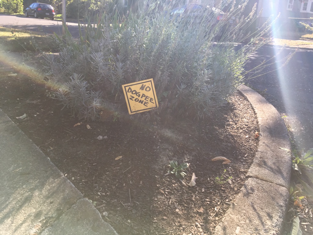
Well, if my dog can’t pee here can he poop in this no pee zone? It’s tricky. This handwritten sign resembles a traffic sign. It’s there to protect the shrubbery. There are lots of other places to pee so we’ll just move on.
Such a nice design for a profane message. I like the black outline and green lettering. This lawn does not look like a giant toilet but it might to my dog. There are lot’s of other places to pee and poop, so we’ll move on.
This message gets very specific. “My lawn is not a toilet.” This confuses my dog greatly because all he knows about toilets is that they’re a secondary water source if his water bowl is empty. As far as pooping goes, no one wants to poop where they’re not wanted. There are plenty of other places to poop, despite how inviting this lawn is, we’ll just move on.
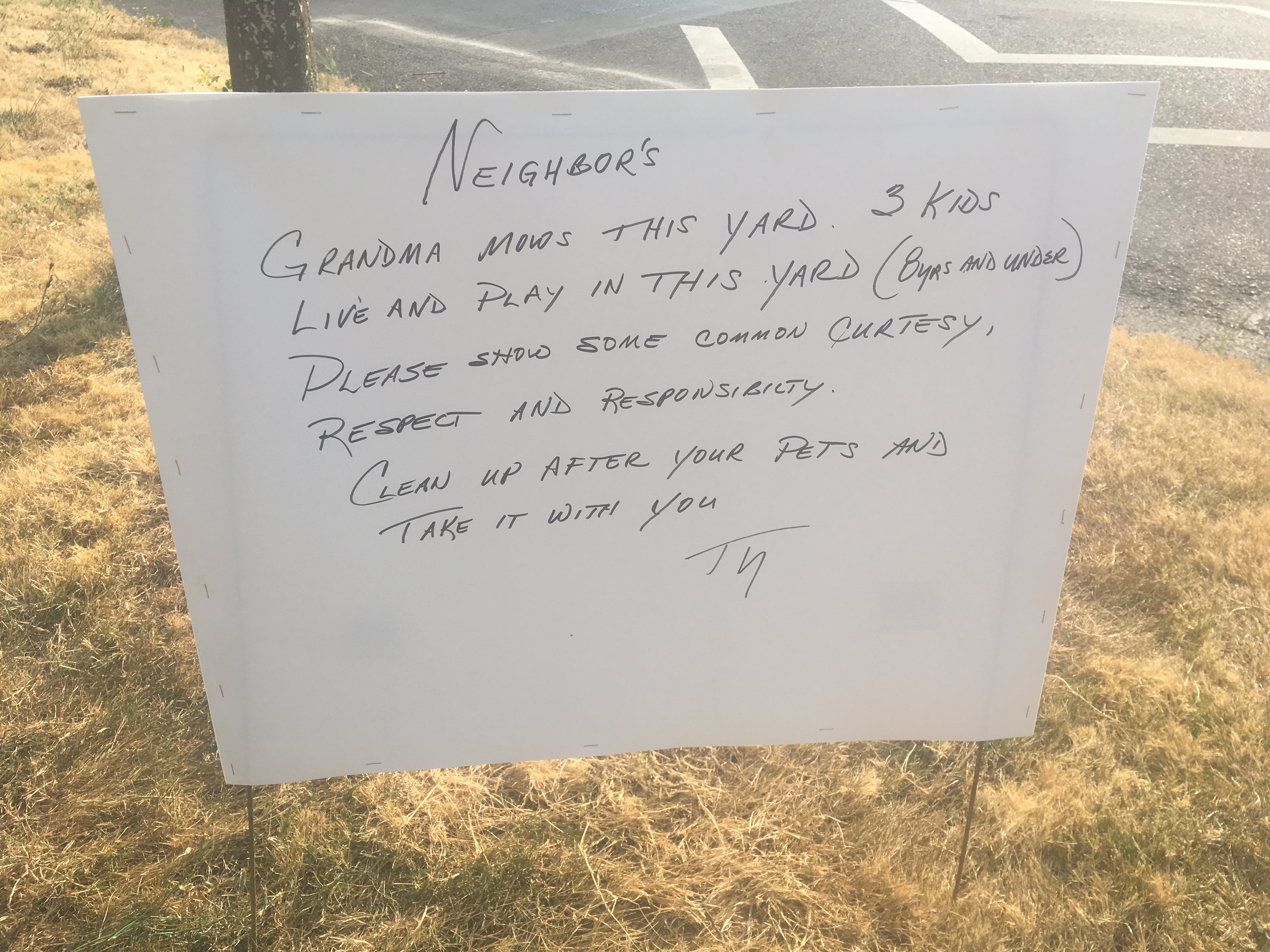
This one gets it right by using manners, exclamation points and doggie hieroglyphics (paw prints, hearts and a smile.) This looks like a nice spot, if he agrees I’ll make sure I clean up afterwards.
A store bought sign speaks in dog language if you can teach your dog that the red circle with the line across it means no. Most dogs could relate to what the squatting dog is doing. The lawn looks lush and green and tempting in the afternoon sun. If the sign is encouraging respect, the least a dog and owner can be is respectful and find another lawn.
We ran into this sign last week. It tells the whole story so I’ll take the rest of the afternoon off.
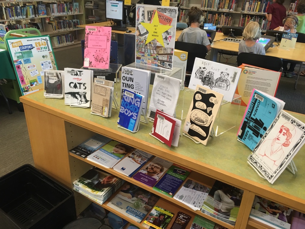
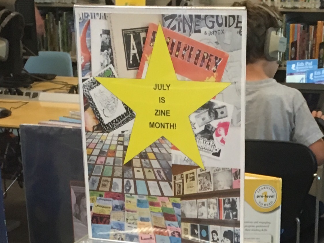
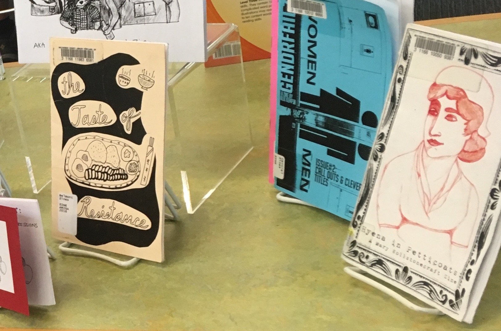
Imagine my surprise seeing a display declaring July to be Zine Month at my local library. I didn’t know. I snapped up a few of the zines and had to tidy up the display. Zines had been off my radar, but I was reminded the library offers small press publications for checkout in five of its branches including Albina, Belmont, Central, Hollywood and North Portland. With a title in mind, you can use the online system to place a hold on the and pick it up at your local branch.
I collected zines in the 90’s. They’ve ended up in a box in the basement labeled “small press publications.” Inside the box are zines with reviews of my musical releases, publications I appreciated (usually by people I ended up corresponding with) and a complete set of Mole Magazine, a zine I contributed to. Mole publisher, Jeff Bagato, did the heavy lifting. I submitted articles, wrote music reviews and participated in collating parties.
Yes, July is Zine Month!
During Zine Month, I noticed a poster in the window of my local coffee shop advertising the Portland Zine Symposium. I made plans to attend. Before heading out to the Zine Symposium, I considered what a blogger’s convention would be like imaging an uncluttered space with people gathered around computer screens looking at each other’s work.
Walking toward the meeting space in the Jade Market District, the first person I encountered was someone I knew. Matt Dan was sitting on a curb, taking a break from the hot crowded space. I knew him from his time as an animator screening work at a monthly event called “Attack of the Flicks.” He was there with his collaborators called Night Time Science who produce comic books.
Site of this year’s Symposium.
Soon I felt like I was in a spinning kaleidoscope. The printed word, illustrations and people’s voices swirled around me. I circled tables, stopping to look through the materials. The symposium was hopping. I thought if I arrived late on the second day people would be packing up and the crowd would be thinning.
Fronting the product.
At one table I paused to look at an illustration of Margaret Dumont in a zine about movies from the 30’s. This started a conversation with zine distributor Joshua James Amberson about the actress and whether she was in on the joke about being the repressed foil to the Marx Brother’s in many of their movies. Joshua runs Antiquated Future and publishes a zine called Basic Paper Airplane and a Prince tribute publication. He told me that zines are as popular as ever because the internet has created the kind of word of mouth that keeps people interested. He stays busy filling orders a few times a week and paying zine makers with a system he’s developed over the years. I wish I’d been recording because I was getting a great overview about the current state of the zine world from an avid participant but he did mention some intriguing thoughts about what he’d learned as a publisher. He’s noticed the importance of titles in deciding the popularity of a publication explaining these days they needed to be specific in their descriptions of the zine’s content which he said wasn’t as important in the 90’s.
Some of Antiquated Future’s wares.
Joshua slipped me a copy of Basic Paper Airplane which I read days later along with a hand colored one sheet zine that someone else had handed me. Both amazed me. The latter described the plight of bees and mentioned things I could do to keep them healthy. This was an inspiring piece of paper. Joshua’s zine focused on personal stories of his work history and being a writer. It made me realize how interested I was in the memoir. The personal stories jumped out at me at the Zine Symposium whether about someone trying to sell a house or dedicated to chronic pain and sporting a elaborate cover.
Don’t go killing all the bees.
Matt in the middle.
I caught up with Matt Dan inside the meeting place and learned he was promoting a comic he worked on which is set in Beaverton. He explained he chose Beaverton because “there’s no cultural coverage there.” He talked about how he transitioned away from animation due to the expense and time consuming nature of it. But any art form takes time as he acknowledged the months of effort it took to create a comic book.
Don’t forget Zine Fest.
I talked to another person behind a table. She pointed out the award winning book by Martha Grover. My attention was drawn to a zine by this author about the Fred Meyer grocery chain. I had a zines worth of information at my fingertips. The three dollar price was too high. I consoled myself by thinking that I already knew that Leo DiCaprio had once been in a Fred Meyer TV ad. At this table I was given a flyer for the Olympia Zine Fair. The woman told me that Olympia was like Portland only two hours away. I walked away having learned two things: If you go to a Zine Symposium don’t be broke, bring cash and make an effort to meet people who are friendly and interesting.
The roar of the masses.
It makes sense that the Zine Symposium is held during Zine month. I had to find out more about Zine month so I contacted Lori Moore, a regional librarian with Multnomah County. Lori and I have a history that goes back a few years to my effort to donate those Mole magazines I’d helped with in the 90’s.
Lori told me that the library didn’t create Zine Month. She believes that credit goes to Alex Wrekk, who, from what I could gather, has organized Zine Symposiums. Zine Month promotes our county’s zine collection.
Detail: Zine display
By email, Lori explained that the library supports zines, “because we had a band of library staff who read, made and loved zines and were involved in the zinester community.” It may be unique in the library world to offer zines but the Multnomah County library system strives to be different. Lori pointed out “zines reflect the perspectives and voices of people who might not otherwise be represented.”
The library’s website also mentions a Zine exchange program whereby donated zines, not a part of the library’s collection, can be picked up or dropped off to be kept or returned for some one else to read. It’s a safe bet you’ll find the Zine Exchange boxes at the library branches with zine sections.
My apologies for reporting so late, at the end of Zine Month. But zines aren’t going anywhere. You can catch the Olympia Zine Fair or browse through zines at library branches that have them. The IPRC looks like great local resource if you’re thinking about making your own zine. I was trying to relate to how things may have been different in my day but I realized things haven’t changed much. People are still looking for ways to showcase their creativity. I like the tangible qualities of paper that’s flexible, portable and perfect for hoarding. I’m only wary of accumulating more zines because I don’t need another box of stuff in the basement for the next fifty years.
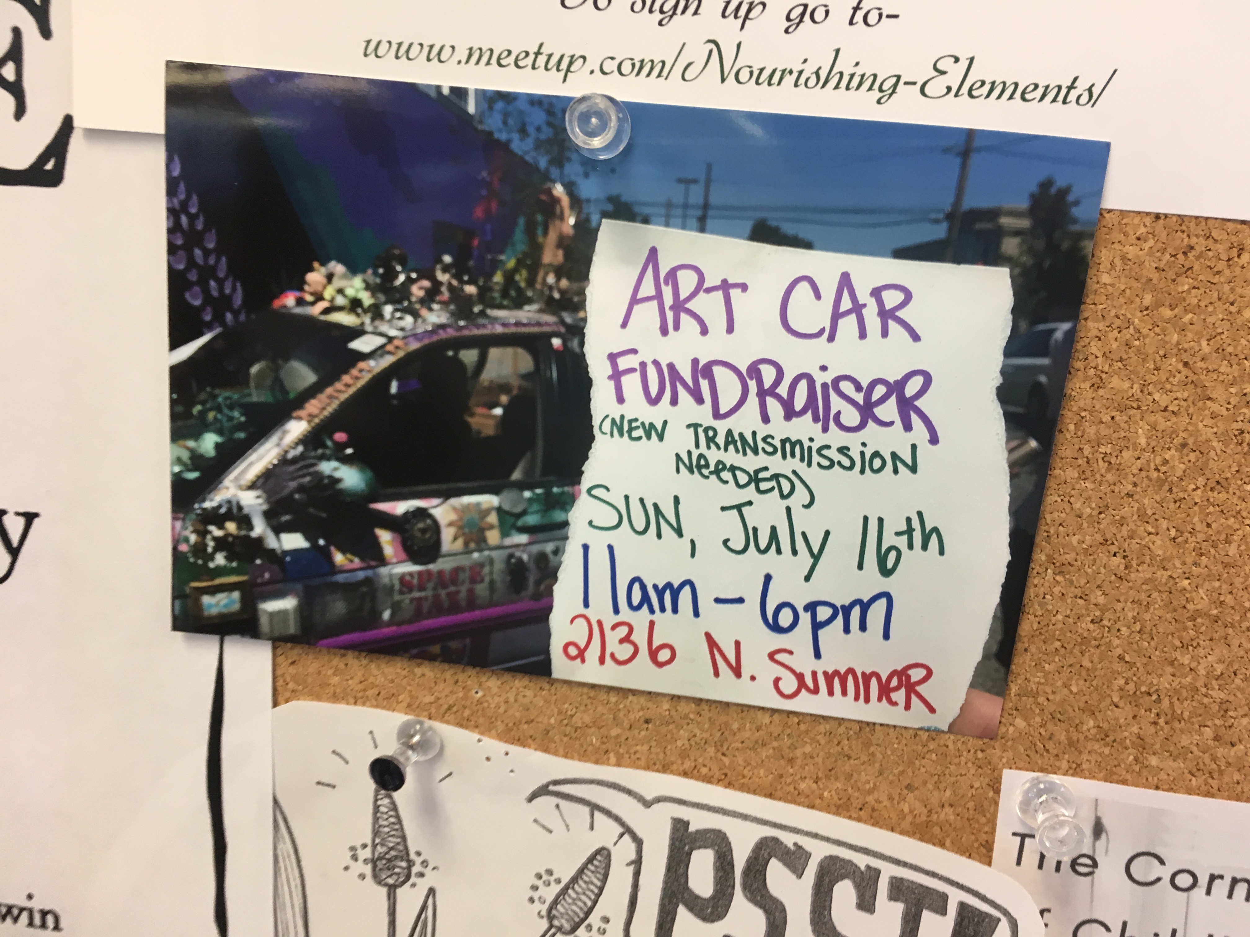
A photo on a bulletin board in the art supply store on N Lombard St caught my eye. A flyer advertised an art car fundraiser. I knew the car having seen it around town. It was especially memorable parked in front of Roosevelt High School. I posted on Facebook about the time the car drove past our house. I had long wanted to contact the people behind this car and now I had the chance.
In praise of the art car.
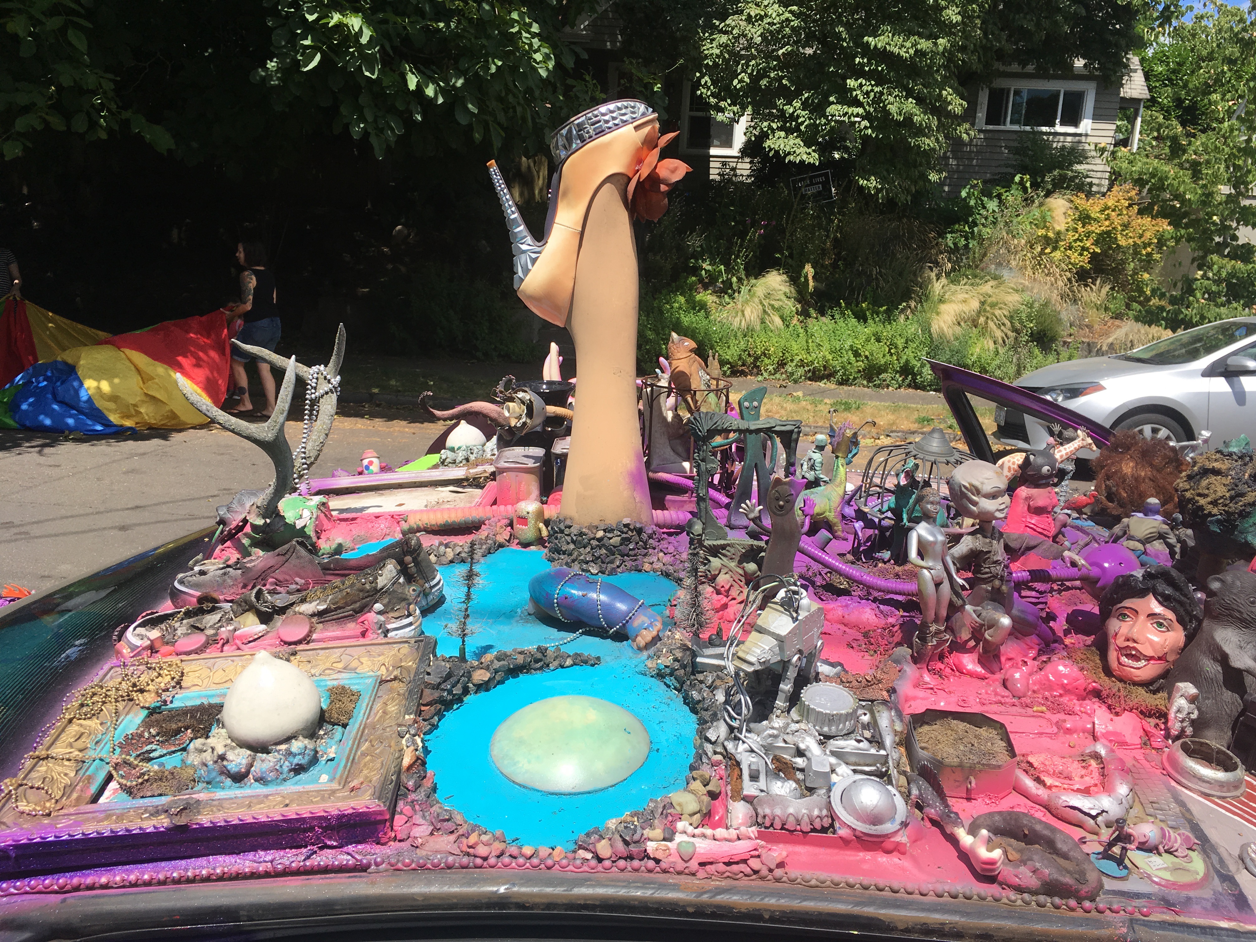
When I think about meeting people involved in outsider pursuits like art cars, graffiti or sticker culture, I fear the people involved might be subversive, anti-social or pretentious. It’s unheralded anxiety not based on experience. Myriah Day and Chris Landon owners of the art car Space Taxi couldn’t have been more welcoming. The fundraiser was a combination cook out, open house and opportunity to decorate, or redecorate the car. My wife, Ronna, and I were offered food and drink and friendly company. We were encouraged to contribute our own artistic touches to the car. Boxes of paint, glue, and art materials were provided.
Phone parts and more.
The inspiration for the art car started when the couple owned a fancy Carmen Ghia which brought them attention and compliments. When Myriah became pregnant with their son Harvey, it must have seemed like a time to make changes. Chris realized he was too tall for the car and got rid of it. Around that time Myriah received a car from her grandparents.
“It was a plain white car and nobody talked to us about our car anymore,” Chris said. Mariah pointed out that the white Chevy Lumina, resembled a police car so people were always doing the speed limit around them. “It was no fun,” Chris admitted. He had always wanted to make an art car. Myriah suggested the art car by committee approach.
Chris works with foam.
The original design was planned out. Myriah imagined it like a quilt. They started with a grid of 298 squares, it was organized, a map was made, squares were numbered, contact info was gathered but the plan resulted in an overwhelming bureaucracy that at least got the project started. Through the years the car continues to be decorated at art car parties. “I always say that (Chris) makes the car look better than I probably would but I bring the people together. I’m the social component,” Myriah said. One decorating gathering at a Last Thursday event on Alberta Street had them mobbed by eager assistants. The resulting chaos had Chris accidentally setting Myriah’s hair on fire.
The decoration committee.
Art car parties help with the upkeep of the car’s design. Damaged squares get painted over and new objects are added. Miffed about the “Keep Portland Normal” sticker peeling off the car, Myriah laughed at the irony of it’s message as she pulled what remained off the bumper.
The “M” train.
The car is now in the neighborhood of twenty years old with over 200,000 miles. It serves a dual purpose, not only is it a Portland Icon, it’s the families’ only car. After replacing the head gasket, catalytic converter and getting new tires, fixing the transmission merited the fundraising campaign. Myriah and Chris weren’t ready to let the car go. They felt a responsibility to the community to keep it on the road.
Somebody call for a taxi?
Not even a car crash could stop Space Taxi. Myriah had been hit in a parking lot by a driver who claimed not to have seen the car. A comment she found laughable. The insurance company wanted to total the car until she pleaded her case for its artistic value. It’s not just a Chevy Lumina, anymore.
A teachable moment.
Myriah parks the car in front of Roosevelt because she teaches Chemistry there. Students look out for the car and let her know when they think someone’s messing with it. The car made her conscious of the need to prove she was a good teacher and “not just a weirdo.”
Something to sing about.
Space Taxi’s charms can be found in the original quilt pattern with varied art styles and scenes found on the the hood and roof. Ronna pointed out that every time she looked at it she saw something different. I could look at it a thousand times and continue to see new details. I did wonder if decorations were capable of flying off, but I can attest to the strength of the glue used for bonding.
The car locator beacon.
“It’s really funny to look out at a sea of cars and see a foot,” Chris said. This kind of foot spotting can help them find the car in crowded parking lots. Chris recalled a time when they discovered a plain white version of their car in a parking lot which had them thinking, “Oh, no, someone took all of our stuff.”
There can’t be a dull moment driving an art car. Myriah mentioned how they collect facial expressions in their minds examples include the image of a scared parent dragging away a curious kid or an onlooker shaking their head in disgust, an expression that changed to a smile and a thumbs up sign when the person realized the scowl was spotted by the art car’s occupants.
Mariah had great advice on art car creation. “The biggest thing I always tell people is you have to make sure the engine works because you’re putting all this time in a car. People are like I have this junker I want to turn into an art car and I’m like why would you ever put all this effort to make an art car to not have the engine work. It’s heartbreaking.”
The first piece: Frog brains.
You can help Space Taxi by contributing what you can:
Last week, I was out of town but still managed to write a post. I wrote it using my iPhone and sporadic wi-fi. Talk about phoning it in! This may have me resting on my laurels. There’s a post vacation malaise that took over as I was working on this week’s piece. I haven’t totally envisioned the concept, and the theme is happening as I write. My “summeritis” is hitting a wall.
When I became a car commuter this spring, I started spending time on I-5 South and in SW Portland. I went from bike commuting to taking the train and bus to my current job. Once I had a car available, I drove. I began to see things in a different section of town, and stuck in traffic. This had me examining my surroundings.
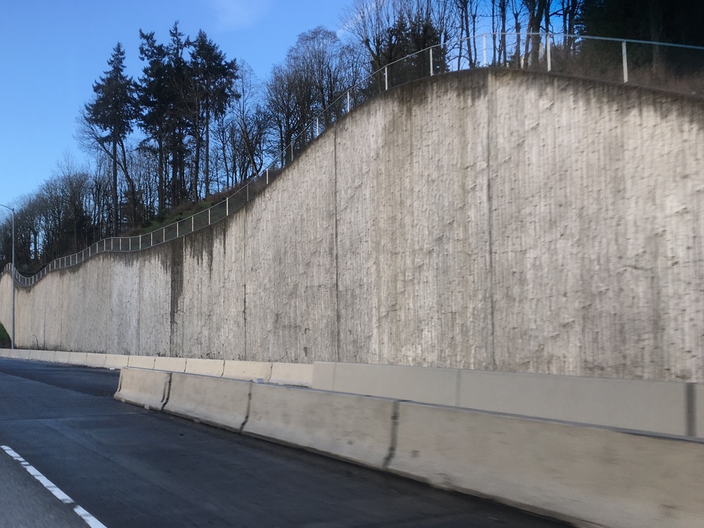
This post wouldn’t have happened if John Lennon hadn’t named one of his solo albums Walls and Bridges. That title was on my mind. As oblique and simple as it is, it had me considering the category. There were probably more walls that I overlooked but I discovered a bridge less glamorous but no less notable than other bridges in Portland. My summertime brain is mushy, but I can hear the cries of the universe begging for a blog post like this one.
It occurred to me one morning that this retaining wall along I-5 was well conceived. It’s not that I can’t point out a couple of faults, but most mornings when I looked at this heap of rolling concrete, I was pleased. Someone had executed a nice design. The wall’s grooved stucco texture and gentle curves look great. This slab did seem to be begging to be covered with impossible to clean graffiti. We’re talking about an accessible canvas in a high traffic area. I always try not to worry about the inevitable and enjoy the view. My only problem with the wavy wall of clean concrete is the chain link fence crowning it. Were there no other fence options? Anything? It’s not a classy accompaniment. It’s chain link.
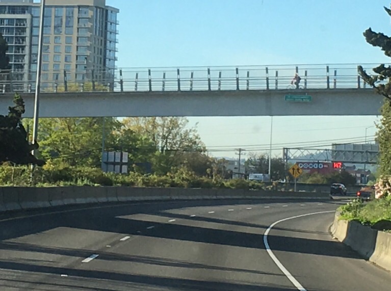
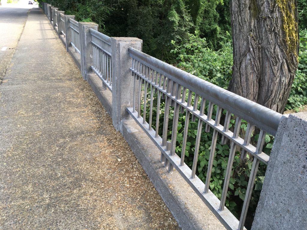
Bridges in the area are classy for the most part. How would it feel to cross a pedestrian bridge named after you? Darlene Hooley knows. The official name of the bridge pictured above is US Congresswoman Darlene Hooley Bridge. There may be only a few people who could name this I-5 crossing by the Tram station. There’s nothing fancy about it besides the name. It’s utilitarian as bridges go and gets the job done. Foot traffic passes over the highway without the fear that comes form dodging cars.
If I had a bridge named after me I would walk up and down it often asking people, “Do you know who I am?” Maybe that’s why no one has named a bridge after me.
I often road over this crossing on SW Barbur Blvd after work. The cement arches are aesthetically pleasing. The plaque piqued my curiosity, so I made plans to stop to take photos. It offers information concerning the Oregon Electric Railway.
The word in the second line is in shadow so I can’t make it out. I know it doesn’t say “ottercrossing.” Further research filled my head with information about the Oregon Electric Railway, the historical society and trolley cars. I almost lost an afternoon delving into local railroad history, so I will leave it up to my readers to take it from here.
Another bridge in the SW Portland area boasts impressive metal work. This is a bridge that carries SW 19th over I-5. I would have no problem walking across it often, perhaps if I were on my way for a bite at Humdingers. Pattern and detail are lacking in modern slapdash bridge designs.
Looking across to the other side, I noticed what happens when a car crashes into the railing. This doesn’t appear to be something that can be straightened without some effort, so there’s no reason to get bent out of shape about it. This post was desperate for a pun–ah, rock on anybody!
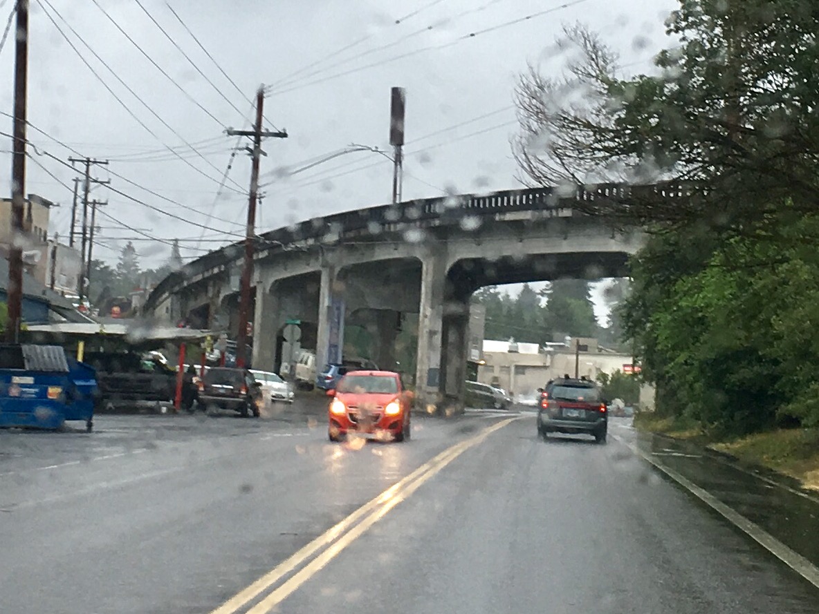
Who couldn’t resist the view of a bridge behind a rain splashed windshield? This bridge leading in or out of Multnomah Village has old world charm, nice curve appeal and looks sturdy. It allows for car traffic above and below. With all of it’s grayness, it almost blends in with the gray skies. There was something quaint about this image as I saw it looming through the windshield. Like the rest of Multnomah Village it has a certain charm even through rain drops and glass.
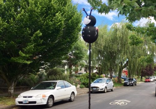
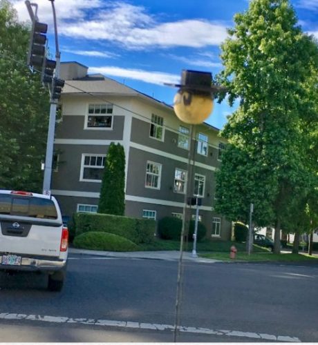
Antenna Toppers aren’t confined to Portland. They have the potential to top any antenna. Technology has made antennas much smaller. The newfangled shark fin antenna couldn’t handle a topper which would disrupt its aerodynamics and sleek appearance. It’s possible antenna toppers will become a thing of the past which makes our enjoyment of them all the more poignant.
It’s rare to see an antenna topper shiny and new. They get ravaged by the elements as soon as they are exposed. The short life span that comes with this rapid rate of decay makes them precious. Antenna decor falls into several basic categories: corporate logos, team mascots and helmets, unidentifiable animal characters and the occasional unknown. Allow me to present to you, in living color, a gaggle of antenna toppers spotted in Portland.
Keep Smiling
If anybody should be a topper it’s the ubiquitous smiley face that has no problem getting 3 dimensional since he’s always been so round. Even as the antenna impales his circular frame he keeps smiling. Maybe there’s a lesson here about smiling through impalement.
A Tale of Two Princesses
A princess topper starts off fresh and new dressed in her finest until exposure to the outdoors, wind and rain batters her pink felt, saddens her ears, and tarnishes her golden crown.
Logo the World
Why should 76 company not have an antenna topper that represents their gas stations? Most 76 signs resemble giant antenna toppers as it is.
Alien Mouseketeer
This one is a mystery. Not much of a face with giant eyes and a Venusian completion. But what’s up with the mouse ears? Aliens can’t get enough Disney? There’s not much of a reason to care other than to enjoy life on top regardless of the headgear you choose to sport.
Bug Me
Legless lady bug, some kind of bee, it hardly matters because it’s evident this topper is a free riding insect of some species and an awful happy one at that, as the giant smile can attest.
Top Cup
Looking styrofoam in nature, this topper is a reminder that I could use a cup of coffee. That’s the story of my life. I don’t recognize the brand but in a weird way cows might be as good as any other animal to serve as spokespeople for a coffee company.
Gaucho’s Revenge
It’s Zorro-like, this topper, but it could be anything you want if your imagination works. My first thought was a gaucho, one of those Argentinian cowboys, but his beat up face lacks a mustache or any other characteristics that would offer a clue.
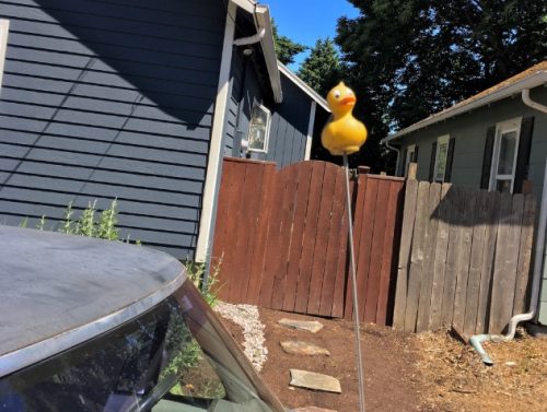
Rubber Ducker
You can never not have fun with a rubber duck so finding one on top of an antenna seems like the right place. If you spot this thing in traffic, which is difficult if traffic is moving, it will bring great joy to your world or at the very least someone’s antenna.
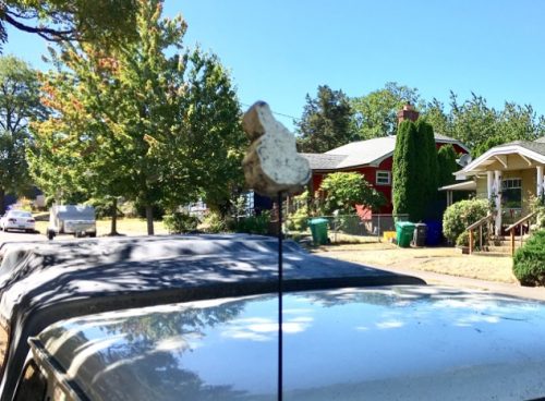
Rabbit Habit
This topper has suffered an elemental beat down so hard it’s unrecognizable. My first thought was the outline of an Easter bunny. I had another look and saw the state of Idaho. At this point I’m unwilling to take a third look.
Jack on the Antenna
A Jack in the Box logo wearing a tiny hat is a fitting way to end this post.
Capture the flag takes on a whole new meaning when you’re trying to get that shot, the one where a flag unfurls majestically revealing all of its stars and stripes in their full glory. It takes waiting for the right wind or snapping away hoping for that perfect patriotic tear inducing shot. Flags are out aplenty this time of year creating opportunities to make classic all-American images.
Unfurled in the reflection.
With an inflatable, wind sock and buntings the flag becomes secondary to this Uncle Sam scene but it does manage to sneak its way into the picture.
Porch breezes caught.
Stars are stripes are essential decorations for this holiday. Sneak them into an old flower pot and they’ll dress that up as well.
Ununfurled
Not every flag is in the right place to catch air. This flag is unable to display its faded glory. It can only hope to catch the right breeze.
Unfurling in a crazy wind.
The stripes of old glory here are encountering wind gusts from multiple angles making it tough to unflap its flapibility but it’s not with out effort.
Unfurling slowly.
A fun sculpture that attempts to heed a warning gets into the spirit of the Fourth of July with the addition of a small flag. Slow down, heed the patriotism revealed by this neon, plastic boy and dog and you’ll keep kids safe in the process.
Bright and sunny.
Taken from a new home built across from the Post Office, whoever gets this room is going to wake up to an amazing flag view. On sunny days the sight of this is sure to supercharge anyone’s patriotic fervor.
Barely breezy.
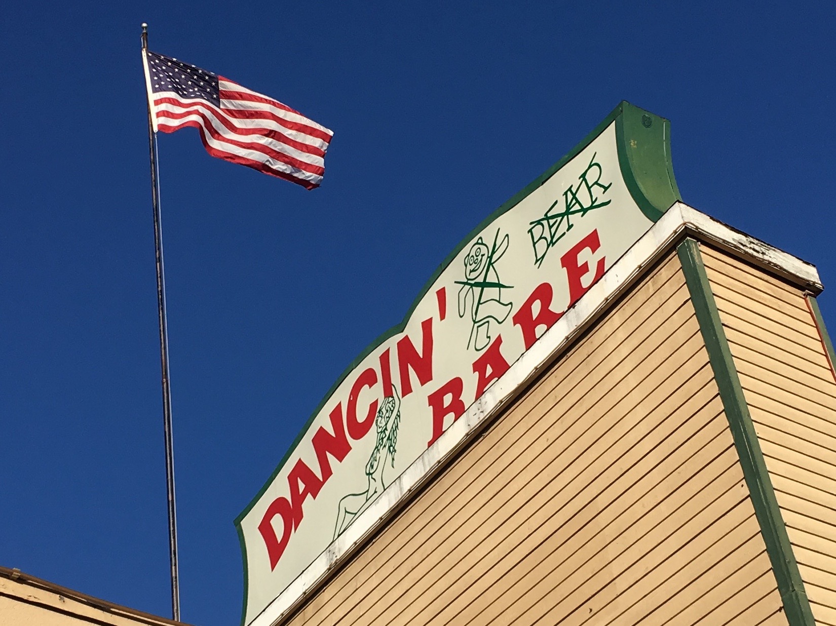
This flag speaks to me about rights and freedom of expression and respect for the goings on behind closed doors. This flag also gets replaced periodically when it becomes tattered. Regardless of what kind of dancing goes on in this establishment, even if bears dance bare, I salute this flag.
Bud Light drinkers unite.
This one goes out to some time Portland Orbit contributor, Will Simmons, who made a crack about Budweiser drinkers in Portland. Here’s proof that somebody is at least trying to inspire people to drink Bud and his cousin Bud Light in this town.
At some point this year it occurred to me that the American flag had been coopted, that it had somehow has come to represent those who use it as a way to show themselves to be more patriotic and even more loyal to American ideals. Sure flag waving has always been a thing but as I aim to keep things light and fluffy around here my flag appreciation remains unfettered. Things in the U.S. are in a state of flux but the flag still represents the hope and a determinations our founding fathers set out for this country in their old school, powdered wig wearing ways. This post, an annual one, is an attempt to extol the joys of flag displays. I want to see the flag as something all Americans understand as well as stand behind. I encourage everyone to get creative with Fourth of July decorations, if only for my entertainment alone.
It’s understandable. Signs can be difficult to take down when businesses move on. So signs from former tenants remain. I was struck by how much I liked some of the signs that are still lingering despite possible confusion.
The first abandoned sign I noticed, was for a nail salon. Not having been a customer, I’m was unsure when it was operational in the last nine years. It may have shared the building with the High Water Mark bar briefly. I have seen tenants come and got to this building at the corner of NE MLK Blvd and Dekum St. At some point I realized the bar had taken over the whole space. The sign is colorful, typical in nail salon style and design, but it’s cool in a kitschy way and the L.A. connection amuses me. On a subconscious level nail salons need to encompass all the glitz and glamor L.A. has to offer so why not be overt about it. The sign is nondescript in a way to be almost unnoticeable. Any one happening by, wanting to get their nails done will be sadly left with ragged nails and a continued search for another salon.
Given the size of some of the signs it’s easy to see why they haven’t been removed. It makes sense to cover up the name of a previous business with brown paint. The real solution may be to hook up a sign for the current business to the old sign.
The Boom Boom Room on Barbur Blvd had an attractive sign to go along with their amusing name. Who could resist saying that a dozen or so times? It feels pointless now with the place being closed. The internet will tell you otherwise but it also links to the Boom Boom Room’s MySpace site. I have a sense that this sign’s days are numbered. Odds are it will be removed. The new tenant seems to be making extensive renovations to the building and has already added their own spiffy sign to the front of the building.
The renovation to the building’s exterior revealed a previous tenant.
Mackin’s Auto body still has a presence in the Kenton neighborhood. This faded painted sign is either an advertisement or it marks a previous location. I like this relic of bygone days but it’s hard to watch it fade away.
The last sign that caught my attention was spotted on NE MLK Blvd. It’s not evident what this sign may have advertised. An added dash of a graffiti does not cover up what looks like a car tire, while a human figure can be seen below with a bit of imagination. The old sign seems related to the nearby auto business. It retains a certain character with it’s oddball geometric shapes while offering itself as a canvas for additional graffiti artists.
Post script:
On the second, third and fourth day of my summer vacation I can feel a creep of dog days engulfing me. It could be the warmth or the sunshine or that plain old summer feeling. If you notice topics getting less and less challenging to the brain, well, that might be due to the neurological melt (not an actual medical condition) experienced on my part.
When I first saw the statue it was highly recognizable. From my studies of Revolutionary War history, I knew it to be a Colonial soldier. The hat, clothes and gun all fit those times. I was born in the Boston, Massachusetts area, so I grew up surrounded by Colonial history. There’s also a hazy flashback to my father’s National Guard trophy with the Minuteman soldier standing on top. The statue seems out-of-place here in the west, so far away from that old history. It now has the feel of a monument to someone who got lost a long time ago as he wandered and stumbled about in search of cheap real estate and a decent cup of coffee.
On campus.
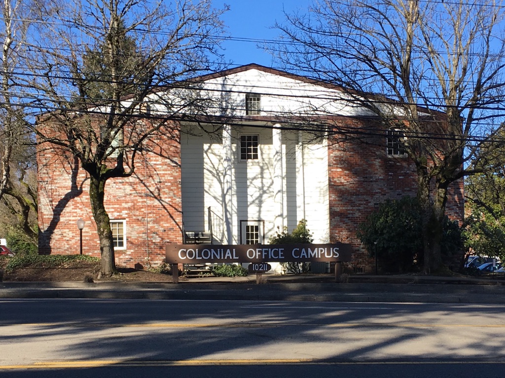
I noticed the soldier statue from the other side of Barbur Blvd. It’s a busy road with four lanes so it’s likely that I initially overlooked the Colonial Office Campus. It may have taken a second look for the colonial reference to make sense. The Colonial Office Campus is exactly what it says it is, office space for professional services used by lawyers and counselors. The statue can be found past the intersection of Capitol Hwy and Barbur Blvd heading towards Tigard.
Half a dance away
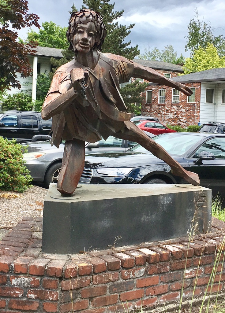
In front of the main office park building there’s another statue. My imagination had me thinking that this one was a child of the solider. The kid, dressed in what appear to be rags, gets to stay home and frolic while his father fights the war. Online I noticed a couple of the tenants mention the statues as landmarks to help clients find their offices. So eventually it made sense: Colonial soldier, Colonial Office Campus, Colonial columns on the main building; there’s a flurry of Colonial activity in a small section of SW off of Barbur Blvd. that’s subtle and unexpected.
Locked and loading.
The detailing on the sculptures drew me in. The soldier, with his sleeves rolled up, his burly arms fiddling with his gun as he stands as well as anyone could stand with knees stuck in a block. His permanent stance graces a plinth decorated with 13 stars in tribute to the original 13 colonies. The child had been holding a light on a chain which, I was told, will be repaired.
Wired and ready.
The young frolicker was created in 1974. The Colonial soldier followed in 1976 which had me wondering if Oregon had been caught in the throes of bicentennial fever like the rest of the nation. The artist’s name, Carlton Bell, is inscribed on the base of each work. The soldier’s base also had three other names listed. It’s safe to assume they assisted on the project. Carlton Bell proved to be a mysterious figure. I found little information about him online.
My research did lead to a blog post about Portland Public Art. I would suggest anyone reading this take a look at that post too if only to see an excellent close up photograph of the soldier’s face. There was some speculation on the part of the writer of the public art blog. I know my writing for the Portland Orbit often leads me to speculate but from what I was able to gather, especially after talking to the friendly office park manager, the statues were made for the campus and not for previous businesses. The comment section offers details and stories about the life of Carlton Bell that I plan to explore in a future post. One commentator made an effort to identify the gender of the kid sculpture as male because his brother had been the artist’s model.
Ready for my close up.
I like the folk art feel to these statues. They have a charm that livens up a drab section of Barbur Blvd. while adding a dash of intrigue. The soldier appears to be guarding a curve in the road or protecting against an invasion from the motel across the street. There’s a randomness that’s refreshing in the placement. A Colonial soldier, far from the pages of history, silently stands guard. My first reaction was to wonder why there were roadside statues hanging around on Barbur Blvd. The Colonial theme helped me make sense of it, and the question should really be: Why not?
The Portland Orbit office is closing early this afternoon in order to celebrate the birthday of our founder, contributing writer and photographer, Mr. David Craig. We’ll be back tomorrow with a post about a Colonial statue in SW Portland.
Listening to KBOO last week I learned about a pedalpalooza event, a bike ride and dance party led by Diablo honoring the musical legacy of Prince. The event was held on what would have been the 59th birthday of Prince. Pedalpalooza rides lean toward the amazing side of bicycle celebrations. Any time somebody straps a boom box to a bike while everyone rides and listens to music, things get spectacular, beyond the run of the mill bike ride, anyway. This ride promised periodic dance stops. I didn’t see myself participating in the non bike riding aspects of this ride, but then again the spirit would surely have carried me away. I wasn’t feeling the confidence it would take to jump off a bike and into a dance party, especially with my inability to approximate 80’s Minneapolis funk dance moves.
The Prince ride gave me an angle to present thoughts on the uses of purple around town. Now I have the opportunity to celebrate two synonymous life forces. Prince and Purple. In most cases you won’t find extreme shades of purple in Portland. Although they would be applauded, repeated exposure to richer tones might prove overbearing. For my purple inspirations, I’m keeping it in the family. Anything close to purple is more exciting than most of the run of the mill colors I encounter. Purple might be a bold decorating or wardrobe choice but Prince had the charisma to pull it off. He turned purple into his visual calling card going so far to make it feel like purple rain could fall from the sky. For that reason it feels necessary to honor him with an exploration of a few things purple.
Bikini Barista
How did I not know this place was purple? I never saw colors when I passed this building that sits in front of Roake’s, a retro burger joint on Columbia Blvd. I’ve always thought too many other thoughts about the goings on in a Bikini Barista Hut. Is it cold working in a bikini? Is the coffee any good or do people go for the view? I appreciate the two-tone purple effect. The building’s purple shades seems pretty enough to upstage the semi-clad baristas.
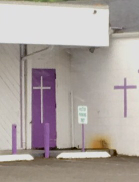
Purple Church
The purple in the Purple Church on Lombard St. looks great against the white background. I realize purple has deep significance as a religious color. Purple is used sparingly on doors and trim. Any color would pop against the white background but this shade seems so right.
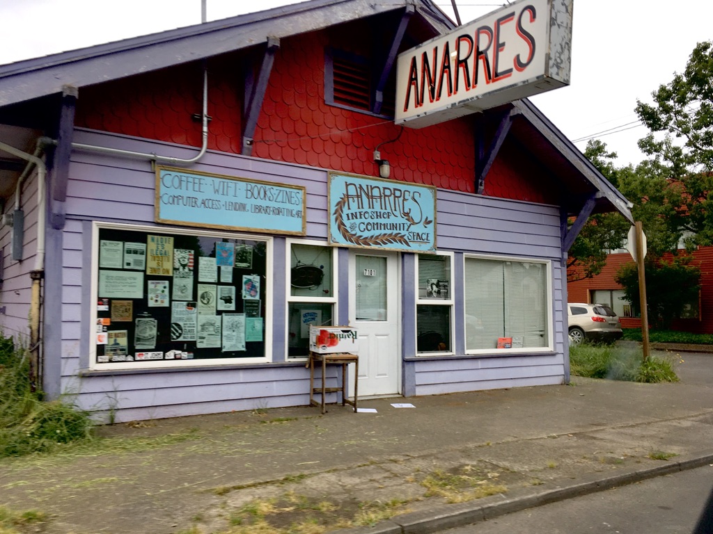
Purple Anarchist Community Space
This is another who knew and it’s right down the street from the Purple Church. The shade isn’t blaring so much as it’s easy on the eyes. The trim utilizes another kind of purple while the striking red under the roof eaves brings attention to the sign. Who says Anarchists can’t be welcomed with jubilant colors?
Lavender Barn Door
In the Kenton neighborhood I’ve developed an appreciation for what I’m calling a barn with a subtle paint job that almost doesn’t qualify in my purple tour. I had to wonder if my photo wasn’t a bit washed out but this is the perfect shade for this structure. Anything darker would detract from the barn’s rustic nature.
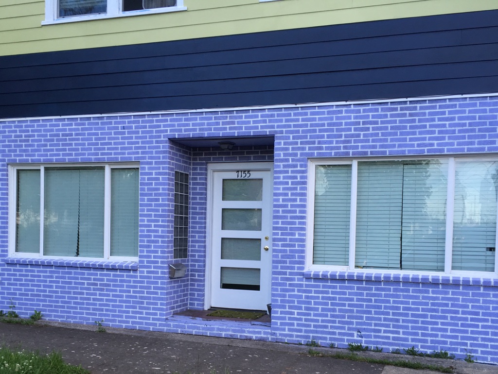
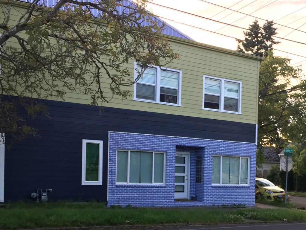
Purple Brick Facade
This building on N. Denver Ave always had a commercial facade. I spotted an upgrade with a more outlandish color especially since it’s a faux brick. It certainly brightens up a drab section of the street.
Purple Wall
The Metro PCS phone store on Lombard St., near the Aaron’s rental store, painted their side of the building a deep purple. If you need some eye-catching beauty in gorgeous living color to reset your brain stare at the wall for a few hours. Most people will think you walked out of the smoke shop next door.
Purple Highlights
A building on N. Kilpatrick St. in the Kenton neighborhood has been decorated with random graffiti but it still retains a shred of dignity due to the sweet and subtle purple border that offers up a tiny dash of salvation amidst the blight.


